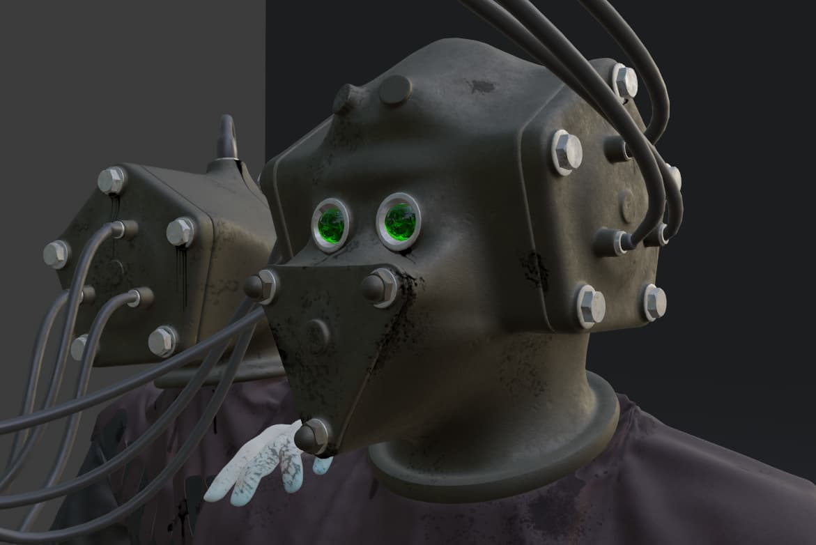
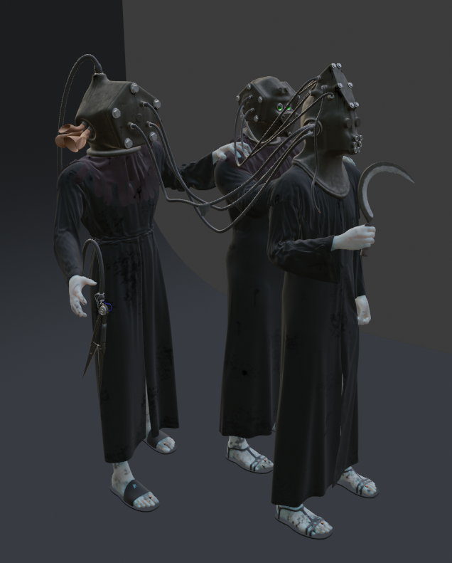
A project I have been working on this week. I had an idea for these “Oil/Diesel Priests” that walked around in trios - for now I’ve called them “The Gaffer”, “The Vision” and “The Listener”.
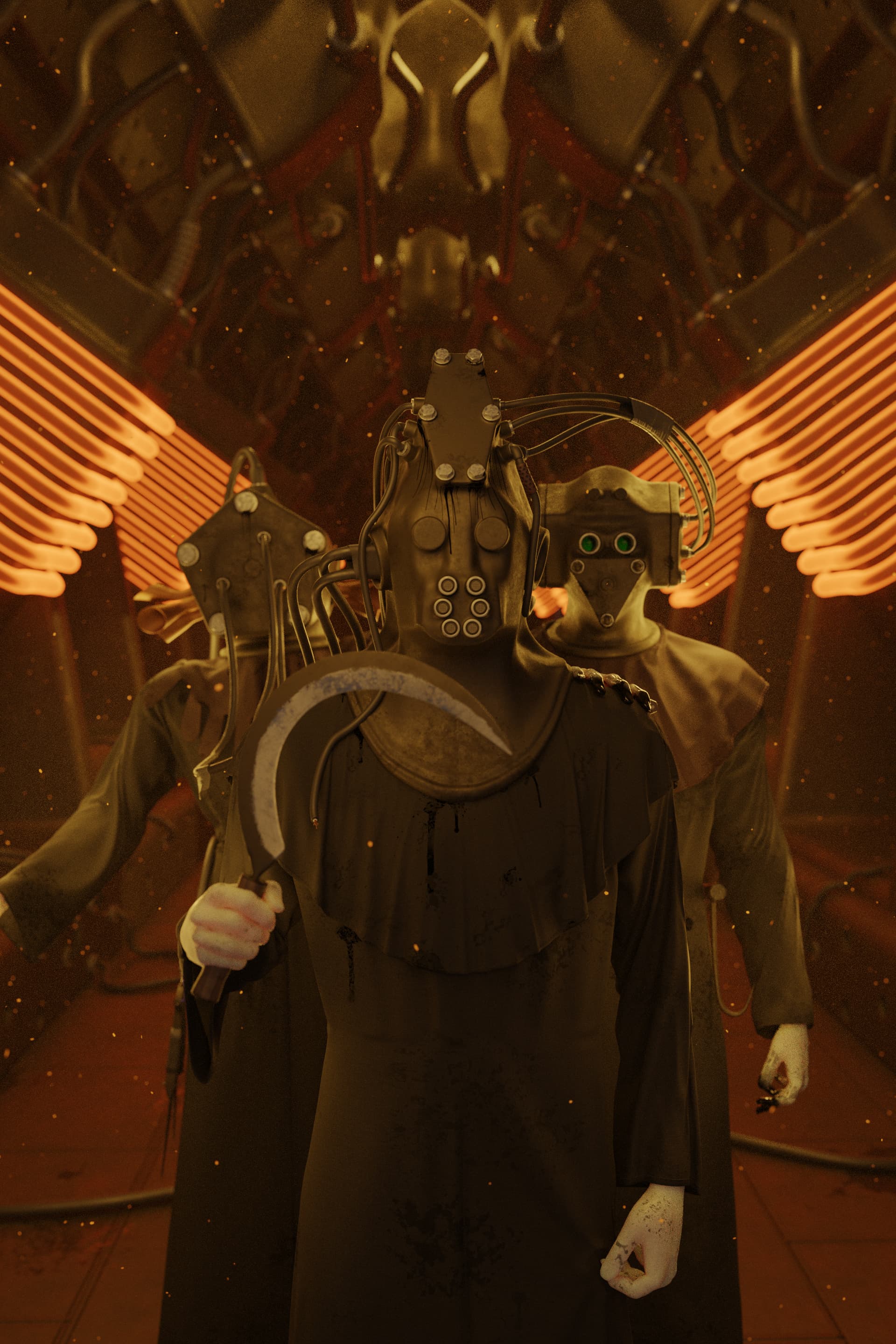
The main image is below, but I might also try a turntable render later as though it was a miniture statue/diorama. I initially didn’t intend to render from different angles, but I ended up putting in enough detail it might be worthwhile.
Criticisms welcome. One thing - I can’t really alter the positions of the models now, it was too complicated keeping these rigged with cloth sims etc.
Tasks still to do:
I intend to do something simple for the background and base.
I’m probably going to add stitching details to the shoulder robes.
Fix the skin - I assume more samples gets rid of the grainy texture when using subsurface scattering? I’ll probably redo the texture paint on this as well - I want it to look like their fingers and hands are covered in crude oil.
Very well done, it’s actually distinctly creepy already. I don’t think you need an elaborate set to make them look real, just a corridor with appropriate textures and some depth of field to make it more real and perhaps hide the lack of detail in the backdrop.
Thank you both for the kind words. I think a few concepts/workflows clicked with me recently, and so far this is my best work (imo). Now if I can just get it to the finish line without borking it, I’ll be happy
I think I need to adjust the lighting to the front of the models (it’s a little too dark perhaps). I also need to find a way to do lens blur better than using the camera to do it - it’s a bit fuzzy at the top of the image rather than “blurred”. And some overall colour adjustment. It’s hard to do at the moment as my flat is currently getting full sun and I can’t see.
I’ll also need to figure out how best to render the image so that I can do proper post processing. I still have trouble with Blender and collections, half the time things render in layers they shouldn’t.
Still a little more modelling to be done too - I don’t like the bottom transition between walls and floor, and the side “buttresses”. It’s a minor part of the image, but I think it needs something to tie it together.
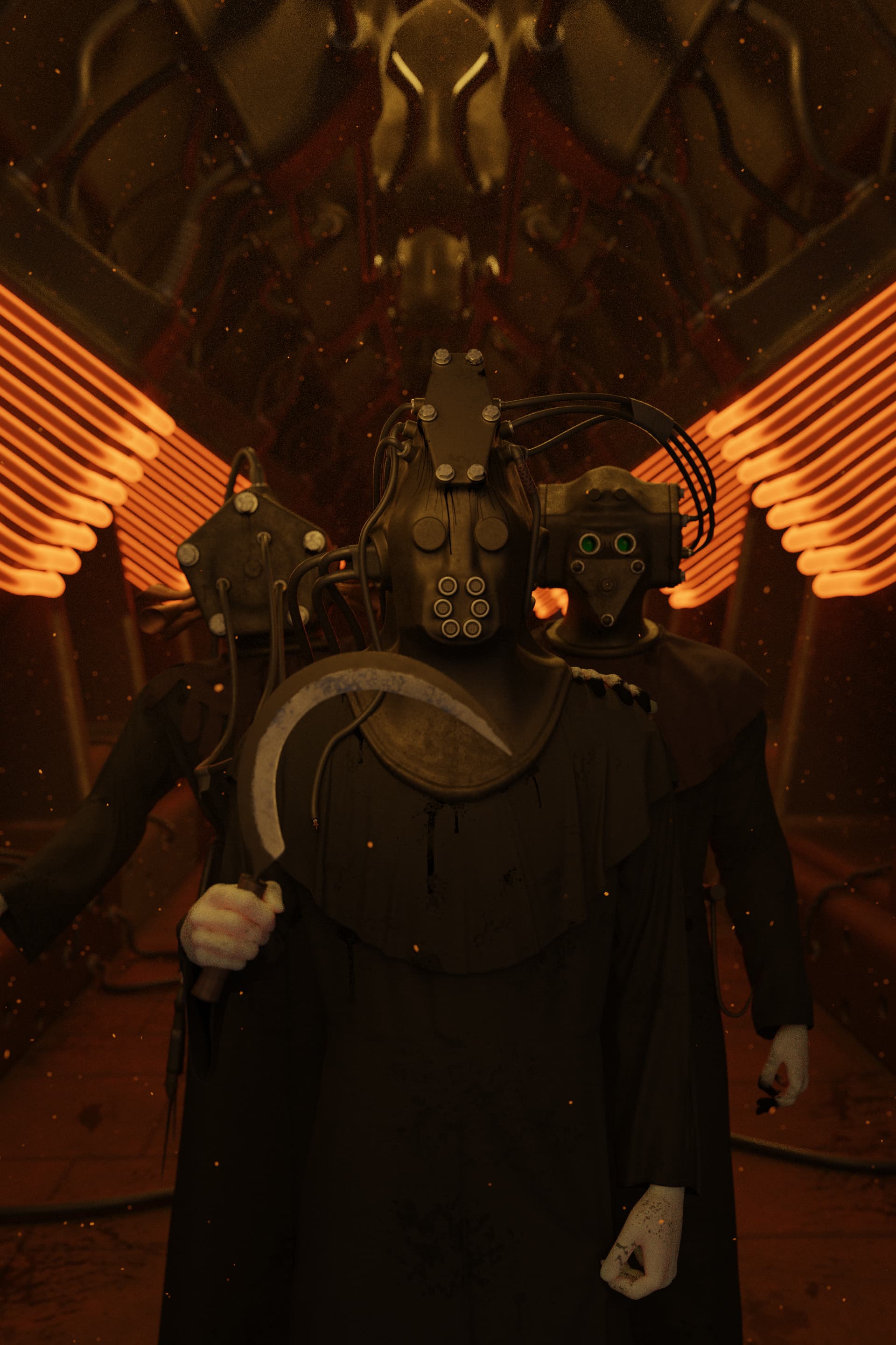
I like Priest side 6 I don’t like image 0001, 0001 does not give credit to the characters. however it does have a nice poster effect, it weakens the modeling of the bolt iron heads. and all the nice cables work.
priest side 4 and 5 is tops for me. Is there a can’t see hear speak theme with them?
Thanks for the feedback. Image 0001 is the main one, which I rendered as a full poster - the other images are sort of “background/WIP” shots, I probably should have labelled them better.
I should have linked to the final work here - here