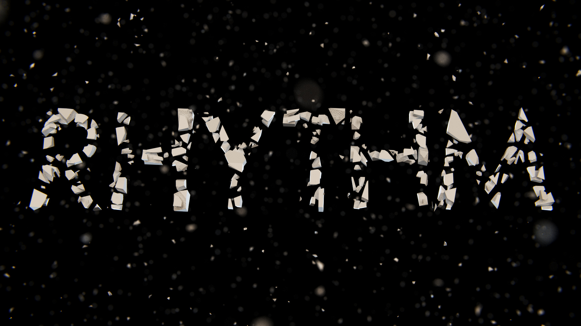
I am currently working on the follow-up of my Complexity animation. It is going to be a typographic interpretation of the word “Rhythm”.
I have attached an image to show you, what it looks like right now, and maybe you could give me some advice on the look? Should I add more contrast, should it be rather warm or cold? I am very thankful for any kind of advice, so don’t hesitate to comment!
Also, if you are interested in finding out more about this, you can read this blog post on my brand new website
I would still very much appreciate any comments on what I should do in post, because I am not quite pleased with the look right now. Looking forward to some of your opinions
Hello again!
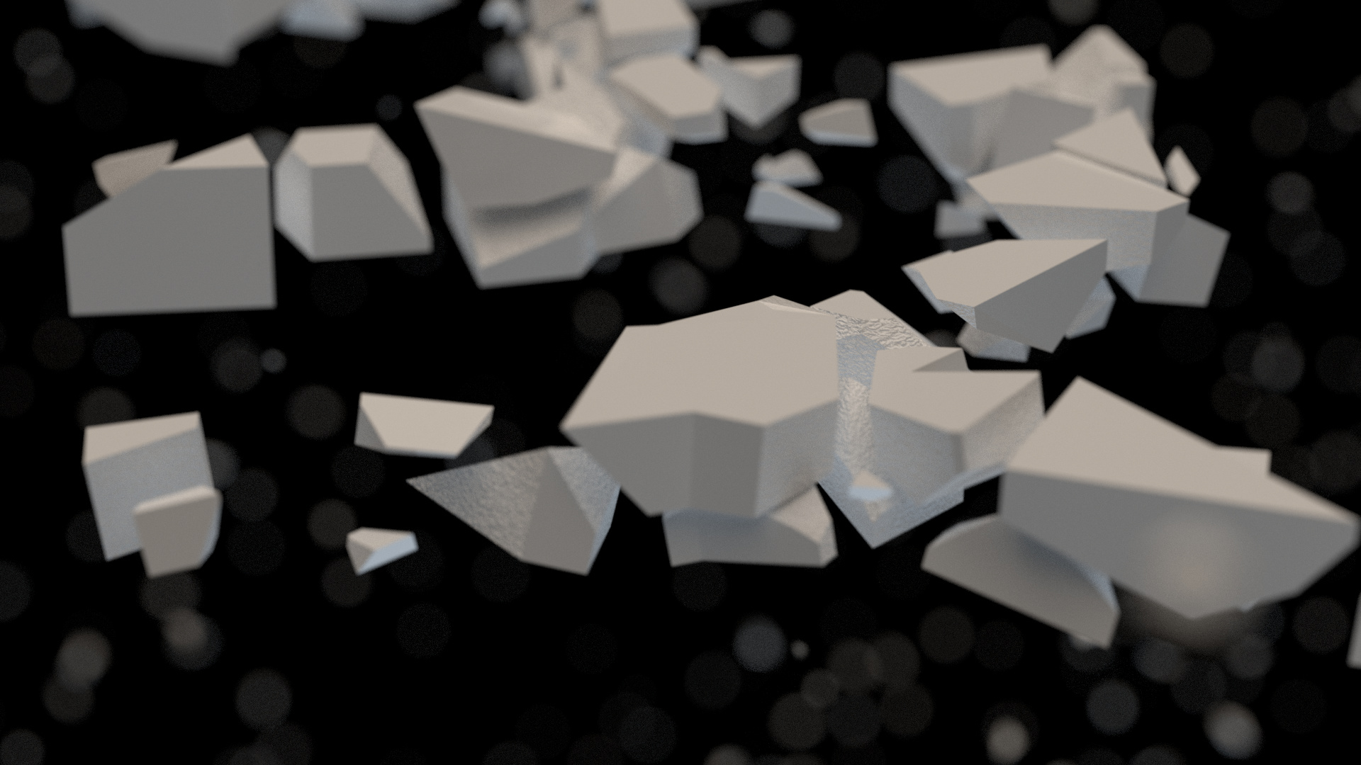
I am rendering the last frames, which I have to do myself, as the renderfarm did not produce the correct output files for some frames. In the meantime I have started post processing a bit, as you can see in the first post and in the image attached to this post.
What do you think? Does the grading work? what should I change?
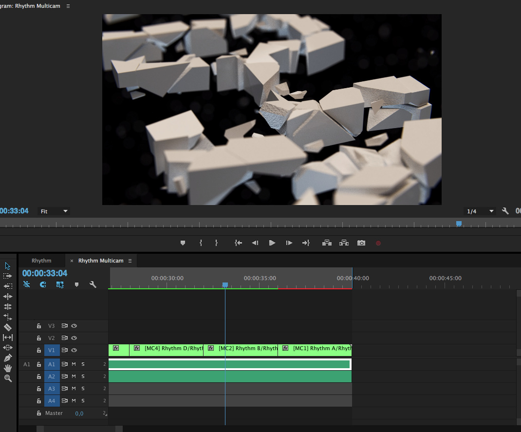
I’m sorry do post in this thread after such a long time, but I have finally found some time to start editing, after all the important render fixes have been done!
Hey guys!
This could be the final video, but first I wanted to ask you if there is anything I should change before making it public and calling it finished. Any feedback would be really appreciated!