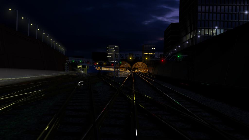
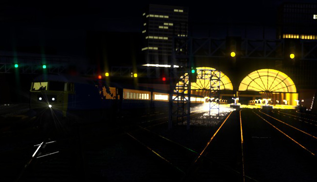
On the subject of darkness, I did intend it to be very dark, but having viewed it on three machines, I have to admit on some it is so dark that the shadowed areas are totally black, rather than just ‘dark’.
Oiyou has realised the point of the image is not that it is a picture of a train, or a station, or a man looking out of a window, but that it is a picture of the way light catches the rails. All of the surroundings are there to provide the reason for those reflections. The other way to view the image is as a snapshot of a late wet night.
The idea is not that the man is important, or that the other lights are important. Even the train is only there because it is, not because it is the subject of the image. I may have to alter it somewhat to make it seem more as though it is, to keep the balance.
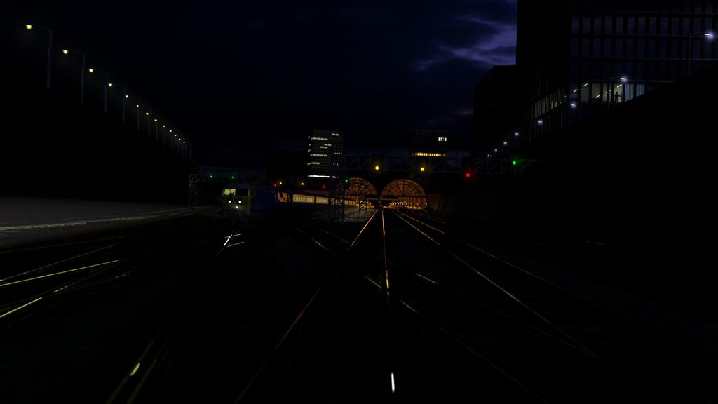
I think I will have to rotate the train, not because it could not be there realistically, but because too many viewers will think that it should not be there, or that it makes them uncomfortable that it is heading for them.
I have no problem with areas being dark. There is nothing wrong with having part of an image that has no content, if that emphasises where the content actually is. However, if you look closely, there should be something visible. This I will work on.
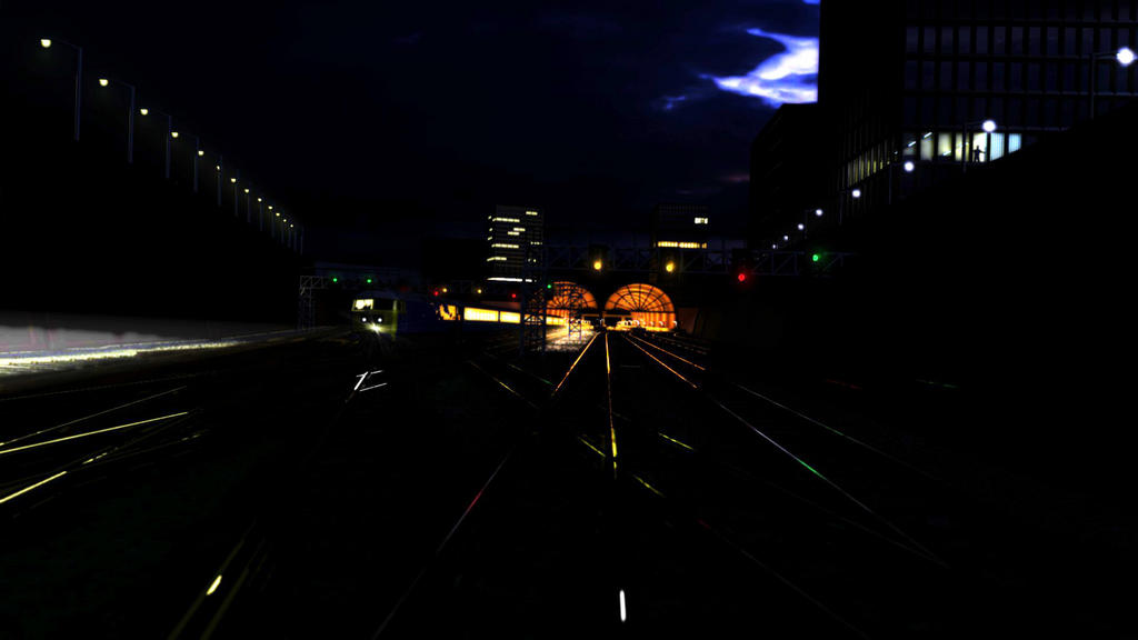
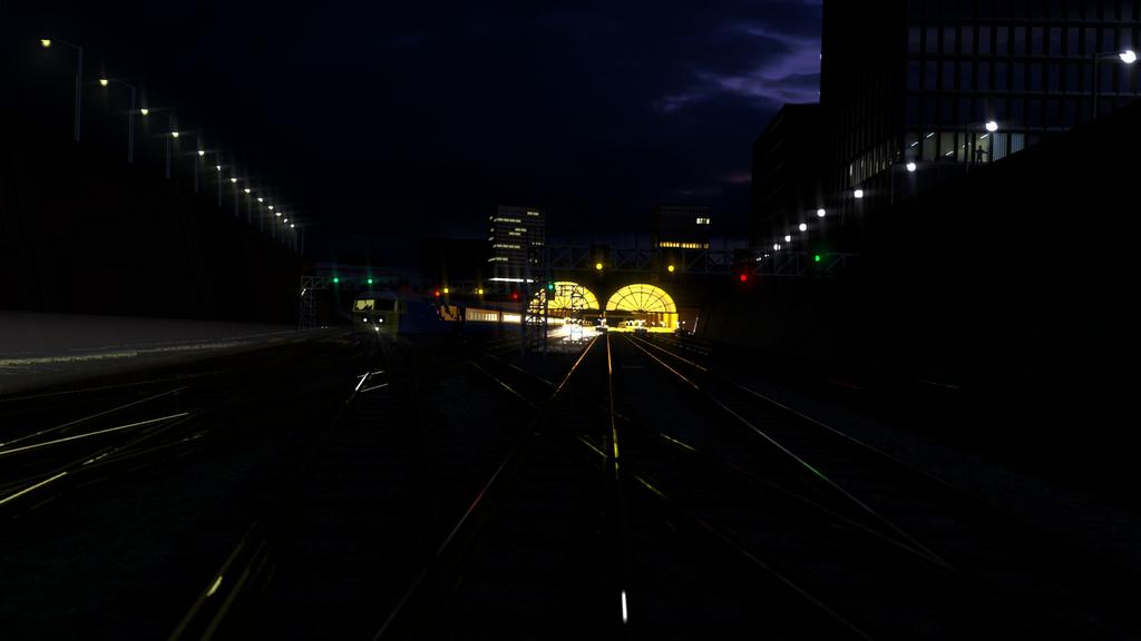
Finally after some arguments with Blender about crashing whenever I did any serious compositing, I have three new versions.
Firstly, is the composition any better, and secondly, just out of interest, who prefers which version? They are all the same, just different gamma settings.
Interestingly enough, after BA has processed the images, they are not only not as detailed, but seemingly darker.
the train, blurred and streaking off to the left, with its lights more colorful and much brighter.
try some depth of field, some interesting bokeh, etc?
all the emitting objects need to be 5-10x brighter (yes, the emit slider can go higher than 2, you just have to type the value)
the station/tunnel should have major burnout, the sky should be brighter, the lit windows too.
if you could get that silhouette of a person to be more prominent in the image, the title would make more sense.
Thanks for the comments. Glad you think it looks realistic.
I was trying to get more of a glare to the image, but I haven’t managed to get Blender to do a good glare yet without crashing ( Evene 2.49!) Emit only goes to 2 on 2.49b, whatever you type in. Anyway, I Photoshopped the image a bit to get a little more atmosphere, May try to get Blender to do the same thing, only more controlled.
I like all of them. The different darknesses look like different times of night. The only crit I might have is that as the ambient light gets darker the reflections of the signals get stronger, sometimes to such an extent you could think the rail is a mirror. This is because signals throw strong straightish beams thanks to the Fresnel lenses used so that the signal can be seen in adverse weather such as fog or heavy rain.
I don’t really have anything I would call reference as my point and shoot camera is not very good at capturing dark scenes. The nearest I have would be http://www.flickr.com/photos/oiyou/3403406387/
This has quite strong reflections of the light to the left under the bridge and the green reflection on the middle rails at the bottom which is actually reflecting a signal the other side of the bridge rather than the one in the photo.
This is of such little importance I would leave things as they are. Excellent job. Well done.
You’re right to call it finished. The blurred full pic is the best that you have done. I’m very impressed. What really lifts this above the previous versions is the glare. That extra bit of realism makes it. I was wondering what was missing before and I knew it wasn’t much. Well done once again.


