I finished this a while back, and I just found it again, so I figured I should put it on this forum. This was my first finished project, it was so nice to see something come together after so many months of work on it.
I used Blender 2.43 and PhotoShop CS2. Rendered with Blender Internal. Enjoy.
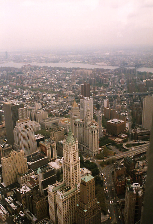
Really nice, but maybe you should add more detail to those two towers? Looks like there is no windows. Also the blue roofs there dont fit in. Other than that it is nice! [REMOVED BY ADMIN- Not cool at all. Don’t even go there]
Well, that’s actually how the Towers looked, they didn’t have huge windows, the architecture covered them up, there were vertical lines that ran down the faces, but they didn’t really come out with the AO. As for the blue roofs, they take on a green/blue look during sunrise/set.
Good point. Actually this was the lighting set up I liked the best, because too much light didn’t look right, but not enough made it unrealistically dark. Before I did it, I imagined the lighting to be like the clouds were just parting after a long rainy day, during senset. So that’s where the grey and darker sections came from, but this was the setup I personally like the most.
Digging the heady volumetric feel, momo. Actually really like the murky atmospheric feeling that you’ve pulled off with this render. Did you experiment with different lighting setups to simulate sunset or sunrise? Imagine a splash of colour from a setting sun could really work with this .blend. Good show!
Ah. Hmm. Not to make suggestions for a ‘finished’ piece (I missed the WIP, sorry), BUT…
If the clouds were just parting… then where’s the light? The clouds parting idea does sound very nice, but as it is, it just looks like a dull, foggy blur, and a bare hint of actual sunlight on a few edges. A swath or beam of rosy light cutting across the scene would work wonders.
If you were going for a mostly oppressive feeling with a bare glimmer of hope, then I think it’s pretty much there. If you were going for a dawning or achieving hope - you need more light in my opinion. And that would make it would much a much more satisfying and inspiring picture. I suspect you can even get away with doing it in post-pro. A lighten layer with a mask might do it and still keep the noisy-mist feel.
Also, I’m not sure what it is, but between the green dome and the green pyramid on the right side, there’s a round turbine-ish-looking structure. Is that supposed to have facets visible on both ends or should it be smoothed a bit more?
That said, it is very good otherwise - your hard work and patience is evident.
Ah! you took the words right out mf my mouth! that’s what I was going for, just because I wanted it to be ominous, because of what would transpire, but have that last little bit of twilight… kind of like a goodbye, i guess.
Actually I was thinking of calling it ‘Twilight of September 10th’ now that you said that, I really want to call it that.
Thanks, dgebel!
David_Mac: I experimented with different setups, yes. I got the fog in PhotoShop, using Diffuse, and added a bit of noise for an aged feel.
Very nice composition…
I like the colors, the interaction o fthe shapes and… the green roofs !
Maybe (maybe) the streets are too quiet and empty. I’ve never been there, but iimagine it to be more lively… even at this time of day.
Well done !
Nice render, very atmospheric,especially as its was your first finnished project. I would have liked a little more building model detail, but ambition is something that grows on you after you’ve completed a few projects.
Dont start an argument people, this piece is too good for that to happen to it
I don’t think you’re taking this seriously enough. You do know what happened, right?
This peace has great atmosphere, but the lines on the towers definitely need to be accented; it looks way too smooth without them. The AO samples also need to be cranked up a lot.
I have edited three posts due to uncalled for comments. People, don’t even go to there. You will be banned for one month if it keeps up, or if anyone else makes the comments about the attacks.
I have edited three posts due to uncalled for comments. People, don’t even go to there. You will be banned for one month if it keeps up, or if anyone else makes the comments about the attacks.
-thanks, very respectable action
i have a question, did you model every building or are some of them only pictures. i noticed that some buildings appear out of perspective…
Yeah, the windows themselves were barely wider than the average woman’s shoulders.
Looks like a morning render, however it’s really dirty.
Here is a picture of the morning view from one of the towers. Notice that while things are indeed murky and there are no sharp shadows - the atmosphere as a distinct orange color.
Hey, thanks BgDM for the edits :yes:. I was getting a little worried.
NJROTC: Yes, some of the buildings are textures from google earth, I’m not running a very fast system and the modeling/rendering was getting almost too slow to work with. Had to resort to textures in post-pro… bummer, huh?
Howitzer: I want the pic to look dirty, I wanted the towers themselves to stand out and the upper area with the bay to shine with the sun. I set my sun verry low in the scene, i wanted a very contrasty appearance from top to bottom, but if I was doing a render for film or photorealism, I’ll keep your advice in mind, thank you!
Welcome! Good thought for the name too.
In that case, I would definitely urge you to play with the colour a bit. The yellow is more morning-looking (except for the direction of course). Try using just some post-pro to save time - and make it more of an ominous red than rosy-yellow. (adjusting the highlights only, adding some red, would be my first guess, and then probably need to pull down the yellow a bit)
If the sun were just a tad lower, you could have the top of the towers tinged with a little… er, bright-red direct sunlight. (ack. I keep thinking of too-vivid colour descriptions!)
I like the name, except not sure about the “of”. I’m guessing you’re going for the documentary/commentary tone. Something like:‘Twilight on September 10th’
‘Twilight: September 10th’
‘September 10th, Twilight’
or even try some different words than “twilight” (huh. what a strange word that is!)Final Light, Sundown, Last Light
I think I like “September 10th: Last Light” the best. If you care
