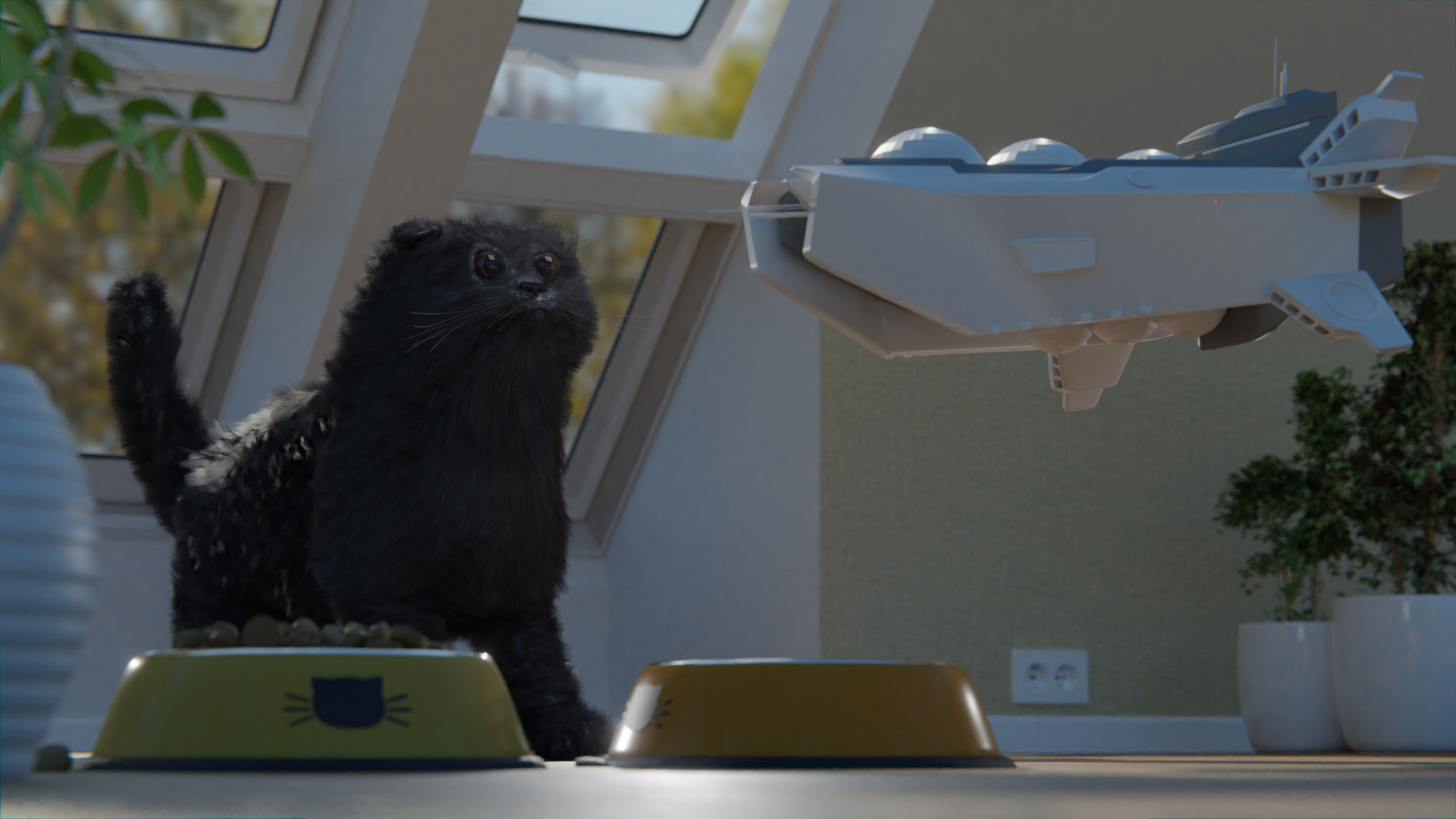
hello there, I need some critique about the overall composition. The deadline is almost around the corner, got to work more on the actual space carrier…so far any suggestions? thx.

As the subjects are the cat and spaceship, I would suggest trying to make a separation with the background. It only needs to be a little to allow for the subjects to stand out. They are the focal point of the composition.
Additionally, the leaves in the top left are too distracting as the actual subjects are much less bright. Either tone it down or remove the plant altogether would make it much better.