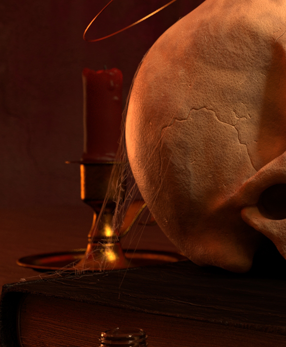
In an attempt to further my sculpting skills and understanding of the human anatomy I decided to sculpt a skull.
It was a quite pleasing experience sculpting with dynamic topology.
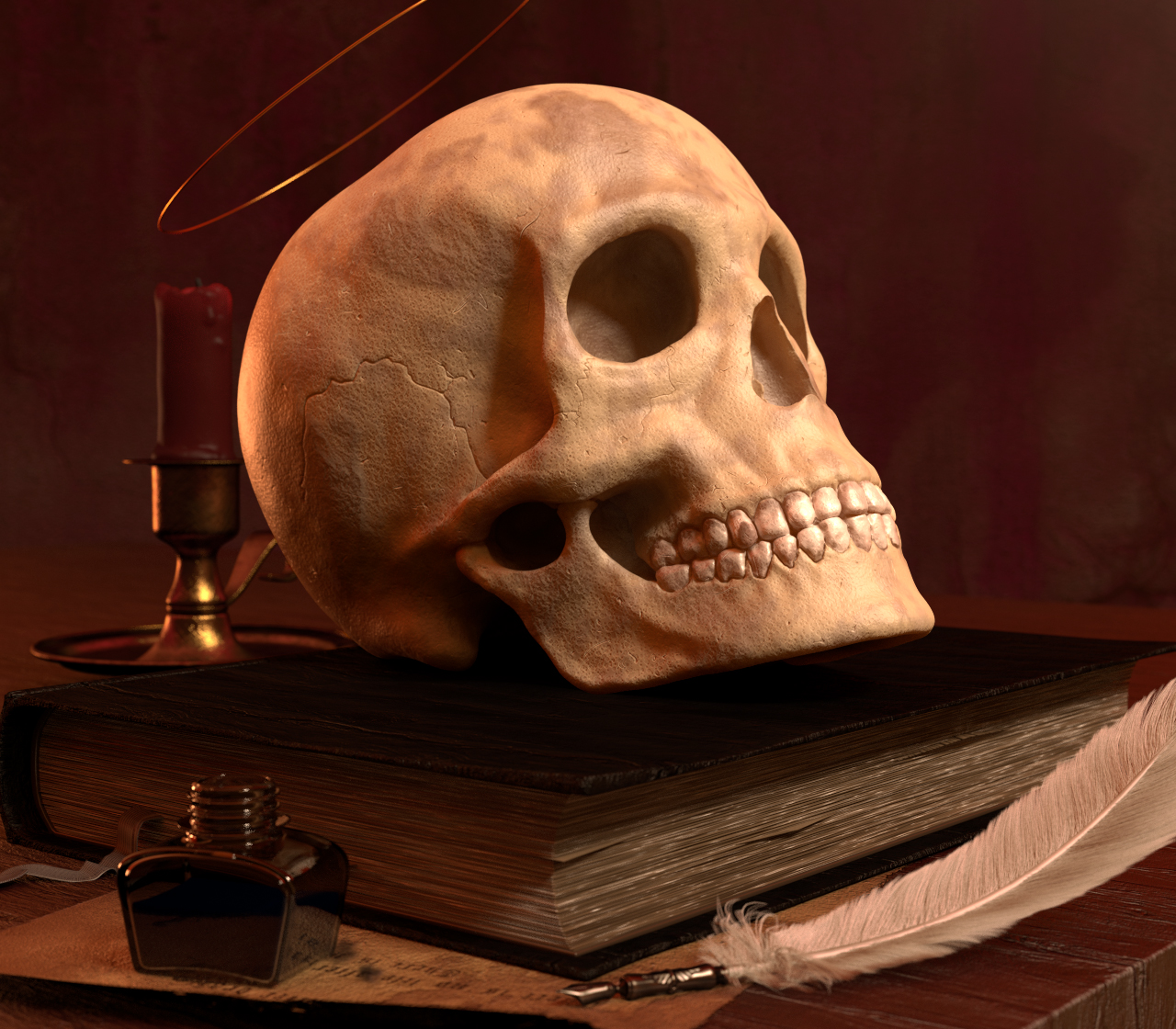
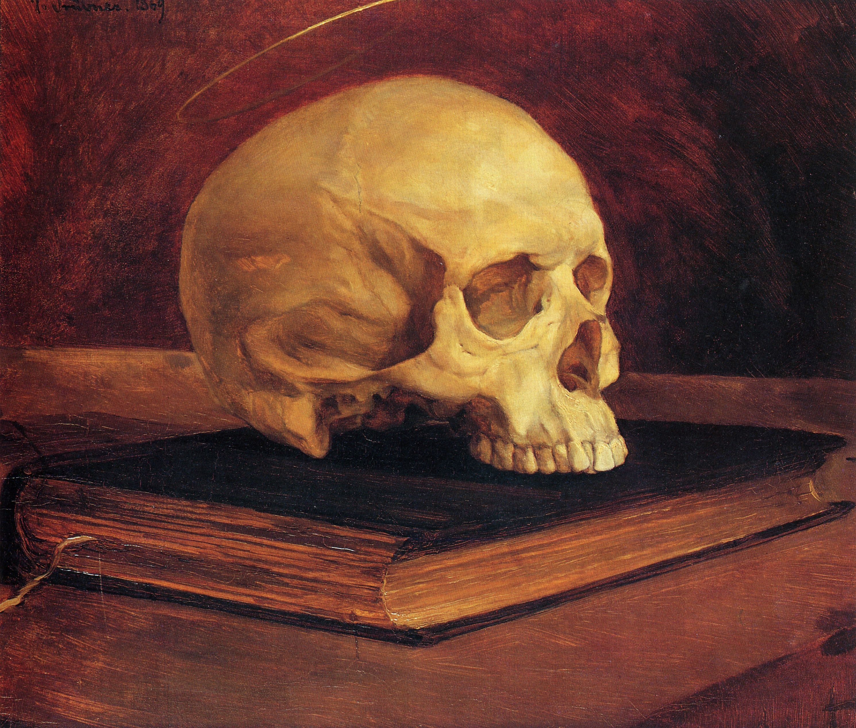
After that I decided to roughly imitate a rather dull still life of Wilhelm Trübner hoping to deepen my artistic skills.
The original artwork.
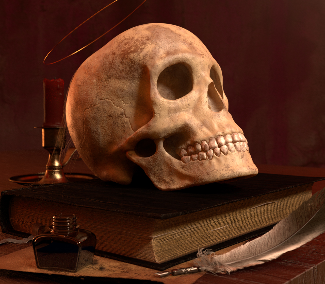
Although the sculpt and especially the texture of the skull could use some more work, as well as everything else, I was rather pleased by the early results, although not being special.
The whole process took me a weekend and I learned quite a bit.Hope you like this render and please help out with critique.
The modeling is quite good, and the overall impression matches the reference.
Regarding texture, of course the teeth have a different texture than the bone does. On the skull, many of the small pits in the bone are muscle attachment points or openings for blood vessels, so they vary over the different areas of bone. I think you should look at putting a different texture inside the eye sockets, the nose opening, and those caverns under the zygomatic arch, as a start, to see whether it makes a big difference. You may want to model in some of the larger pits in the chin and around the eye sockets rather than try to texture them.
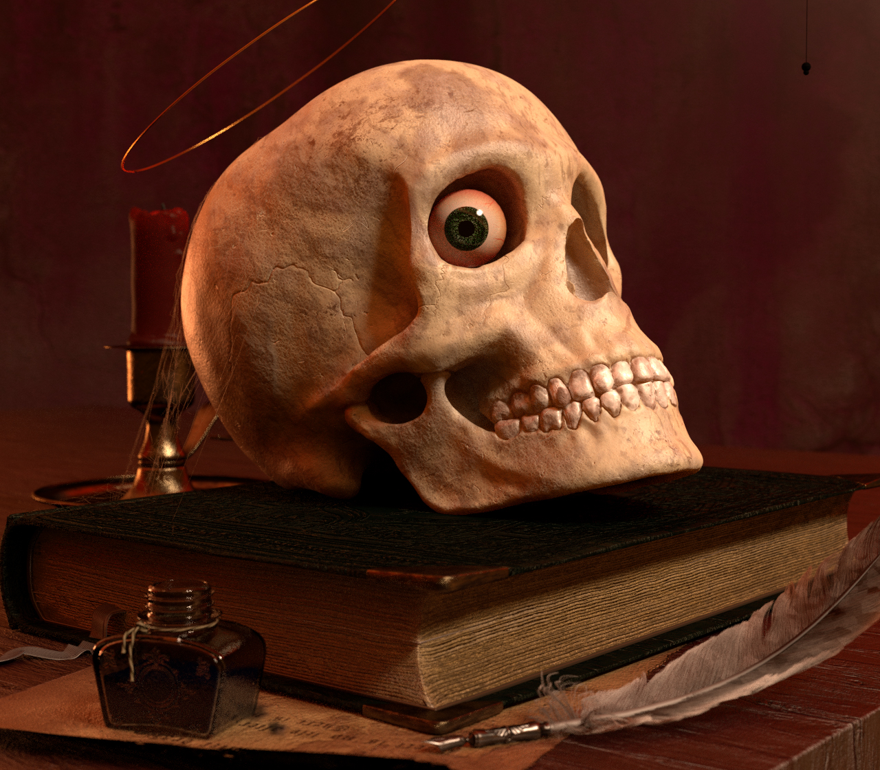
Didn’t plan to work further on this, but it happened… this turned into a Work In Progress.
Thank you for your critique Orinoco.
I worked further on the dynatopo model of the skull, carved in more details and accentuated the forms more. I made the mistake to sculpt the skull in one single piece for which reason I am not yet able to give the teeth a different shader without retopologizing the model or going through the horror of selecting and/or seperating the high-poly dynatopo-teeths from the skull. That’s also the reason why I am not yet able to put real openings in the skull. For now I tried to “carve” the holes into the skull.
Regarding the texture I do have the problem as said, that the skull is still a high poly dynatopo sculpt and not a retopologized model. Therefore I couldn’t really UV-Unwrap the model yet without crashing blender and I am not sure if I will come around to do that.
When I have more time and motivation I will approach that and I would appreciate every hint, for I am still kind of a beginner in that regards.
My question basically is: Is there a easy and fast workaround I could use instead of retopologizing?
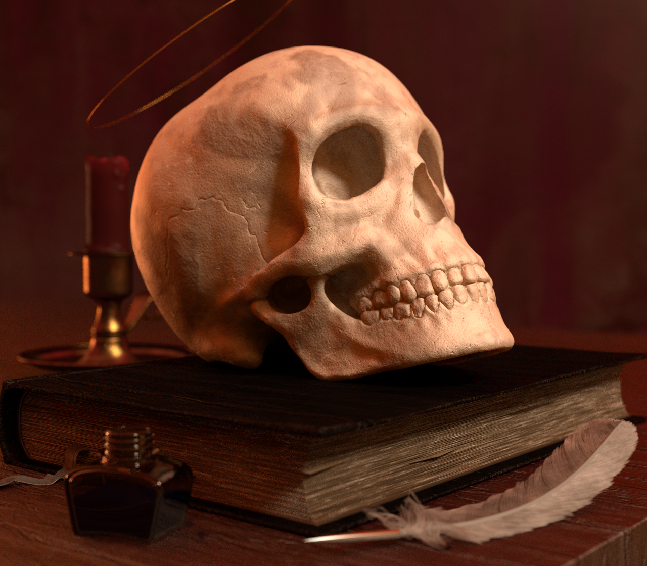
Because the scene looked rather boring I added some new models and details to the scene and tried to apply some compositing rules to the positioning.
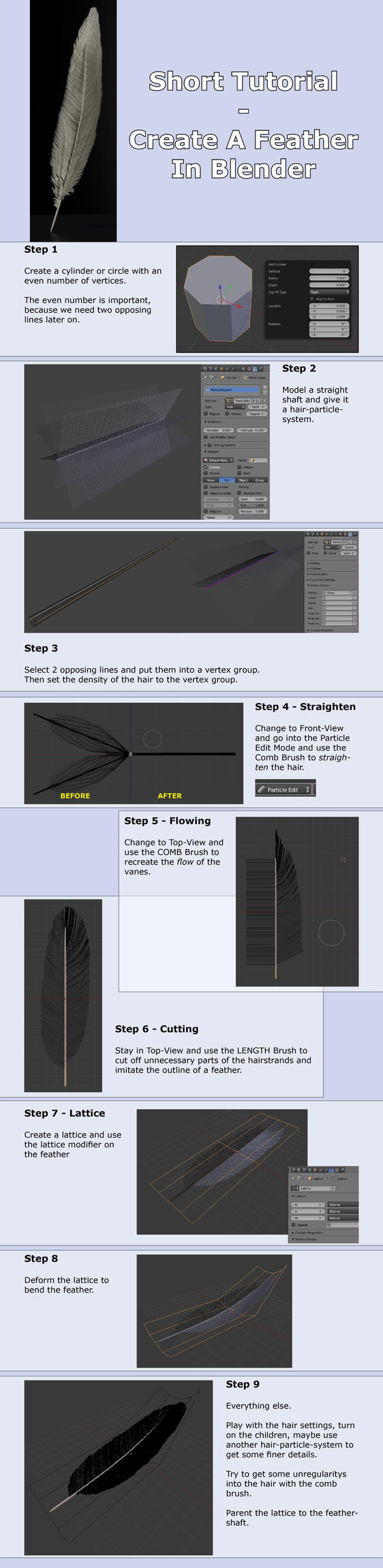
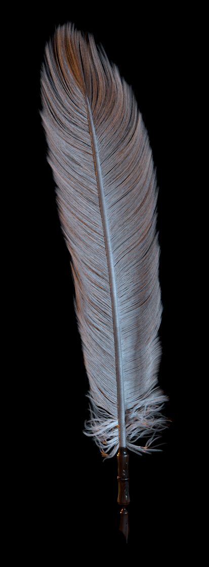
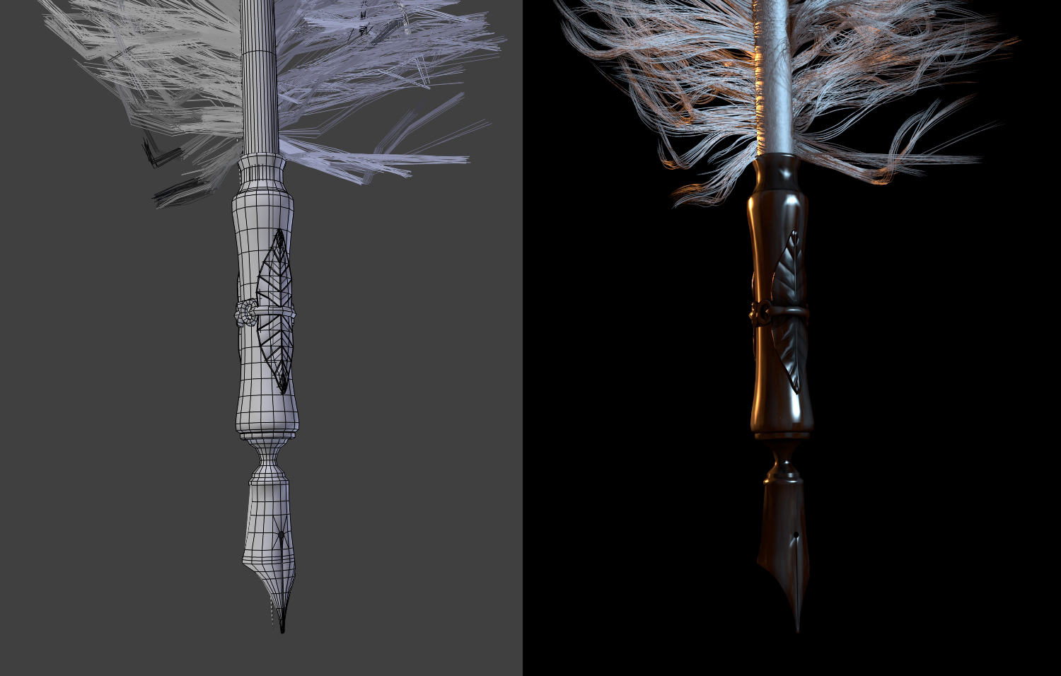
For the feather is used blenders hair system.
The qill’s writing head is not yet modelled.
Personally I’m more impressed with the surrounding you have set the scull into. I like the idea of a nimbus on the scull, though as it is it appears somehow wrong. Such a metallic like nimbus i tend to attest to the real world, which would therefore need a fixture.
Can you go a bit more into detail on the creation of the feather? I made one myself a few years back, but that on just does not compare to yours.
New Update:
The first thing I started working on is the teeth.
Since I sculpted the scull in one part I couldn’t really treat the teeth indipendently. To do that I would have had to do one of two things:
Either I would have had to retopologize the head and retopologize the teeth extra or I could use a texture mask to control single parts of the mesh.
Retopologizing would have been a sh*t ton of work and I would have had to bake a normalmap in addition to preserve all the details of the sculpt. And since I am lazy and don’t plan to animate the scene or change the camera position, I decided to go with the alternative: a texture mask.
With that decision came the first problem: UV-Unwrapping and/or painting on the scull.
The sculpted mesh is made out of several million polygons, which is impossible to UV-unwrap in Blender (as far as my tests showed) and a real pain in the ass to paint on.
Therefore I decided to try something I had never used before: Vertex Painting.
This worked by far better than expected. Altough painting on the many vertices wasn’t smooth at all it still was smooth enough to work with.
At first I slightly darkened the skull, then I painted the teeth white just so I could darken them again afterwards with painted impuritys.
I then proceeded to use a ColorRamp-Node in the skullmaterial to get a mask out of my vertex paint.
With the mask I could tell the shader, which parts of the skull are “skull” and which parts of the skull are “teeth”.
Maybe later I will paint an extra vertex-mask for that, but for now this works good enough in my opinion.
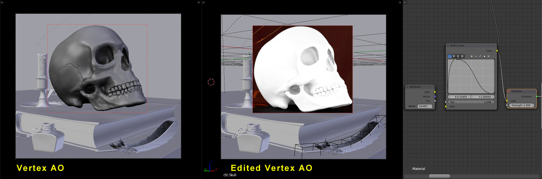
After painting the basic skull-colors I tried out baking an AO-Map with the Blender Internal Renderer, which worked okay I guess.
But it was still too dark for my intentions.
All I wanted was a easy way to darken the gaps of the skull without having to do that manually.
With a RGB-Curve Node I was able to turn up the contrasts so that the AO-Vertex-Pass could be muliplied with the color-pass, without darkening the whole surface.
By the way: The whole shader of the skull was completly procedually generated until I vertex-painted on it.
It won’t be seen up close, so I guess this level of detail is enough (maybe even too much).
I’ve fallen in love with vertex-colors… no more need for uv-unwrapping ant texturing everything. Also the option for Dirt Vertex Colors rocks!
Maybe I will get rid of the nimbus, which I guess is the symbol for life after death. Instead I thougt about adding smoke coming from the candle in the background, which could be interpreted as a symbol for a recently faded life.
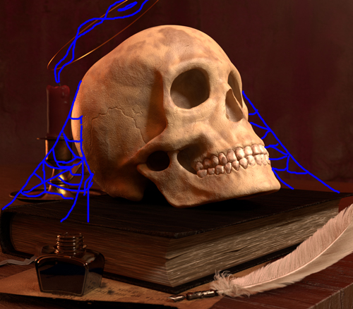
Additionally I thought about attaching old spiderwebs to the skull to “say” that life in todays world is getting longer and longer (at least in some countries) and death has to wait longer and longer.
This is really nice! I don’t know about that halo above his head. I like the smoke idea from the candle. Cobwebs would look really cool! however, if you do them, consider that the skull has been sitting on that book for a while. (I don’t know how long it takes for a spider to come along and do its thing) or at least cobwebs give the imprsssion of being there for a while even if the spider decided that day to make a web. Since it give the impression of being old, I would add lots of dust, and make the feather look a lot older.
Also, the pages look a bit hard. It would be cool if they looked softer. I don’t know how you would do that though. Maybe play with translucency or SSS? I just think there is something off about those pages.
Thank you Scotchtapeworm for your valuable feedback!
I hadn’t noticed anything weird about the bookpages until you pointed it out. I’m definitely gonna do something about that (and already have ).
Dust is something I also considered, as well as making the feather look more old.
I’m not too sure yet if I want to add dust to the scene… but about the feather I completely agree.
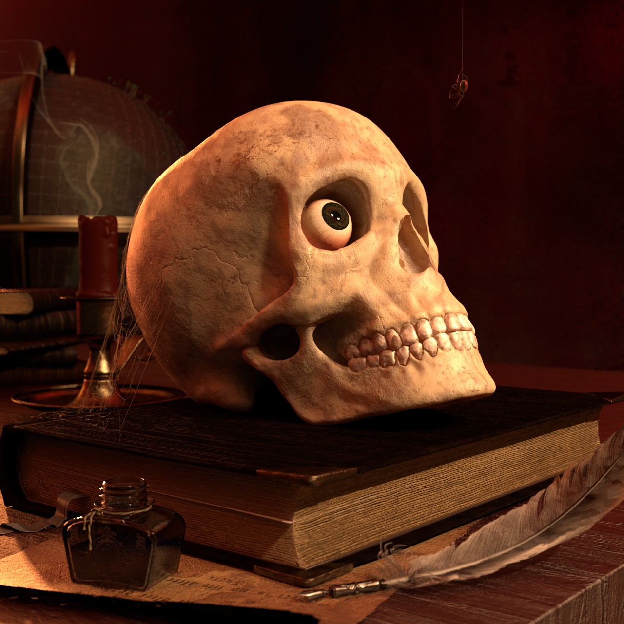
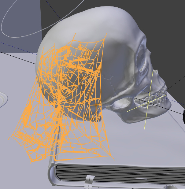
SCENE: Added a cobweb. Thinking about adding more cobwebs, because I like cobwebs… but then again they are reeaaaally hard on the hardware in the creation process, which is really annoying.
=> Do I really need more cobwebs? Does the cobweb even add anything to the scene?
FEATHER: Changed the texture of the feather a bit… I don’t know if I like the new feather better.
=>Could really need some feedback here! Pls help?
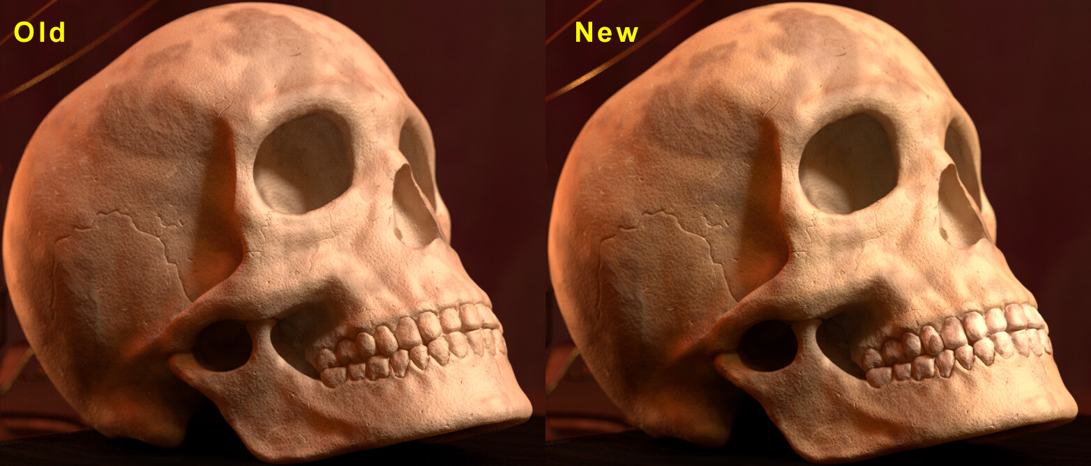
SKULL: Gave that skull a grunchtexture. I think it’s way too much. Will have to reduce the grunge again.
=> The texture will definitely help with the realism of the skull, but will it be enough?
BOOK: Changed the procedural texture of the bookpages for a imagetexture and added a little bit of translucency.
=> Is it better than before?
I’m in too deep and can’t really pinpoint the flaws of the scene anymore. Therefore I would appreciate every bit of feedback and criticism!
The cobweb is nice! I think adding more will look better.
I kind of like the first feather texture a little bit more. maybe make that version older, and the hairs not as intact.
I think with the skull grunge texture, have it be less strong, but more widespread.
The pages look a lot better now! The pages that stick out are too thick though.
Also, how long has everything been sitting here? Has the ink bottle been there a long time? It looks new. Give it some dirt/dust, and put some ink stains near the bottle opening where it dripped down and collected a bit in the screw ridges.
The paper under the book and ink pot looks like its floating, and lifting the ink bottle.
Also, there is somethign missing in regards to the book shadow on the table. I’m sure its there, but right now it looks like it could have been placed in the scene in photo shop. I thin it needs a more visible shadow to ground it to the table.
Woha, that was quite an edit you did there Scotch
I am going to look into all those points, thank you!
For now I did only really changed the sticking out pages part and the feather.
I tried to put some more cobwebs into the scene, but it kinda looked “Wrong”. Each cobweb looked completely different, so different in fact, that they didn’t work together. So I let it be.
Not sure if I will put more work into the cobweb part of the render.
Other Stuff I changed or didn’t change:
=> still didn’t get rid of the nimbus. I dont like the message of that thing, but it just serves the composition soooo well. Tried candlesmoke, but it looked weird.
=> Material Change and bump map on ink bottle. Also a weird “rope” thingy.
=> additional Booktexture and colorchange. Also added metal-corners.
Up until now, I found the scene simply boring!
It was driving me nuts and in the heat of the moment I decided to change some things up.
I don’t know if its better or worse, but look for yourself:
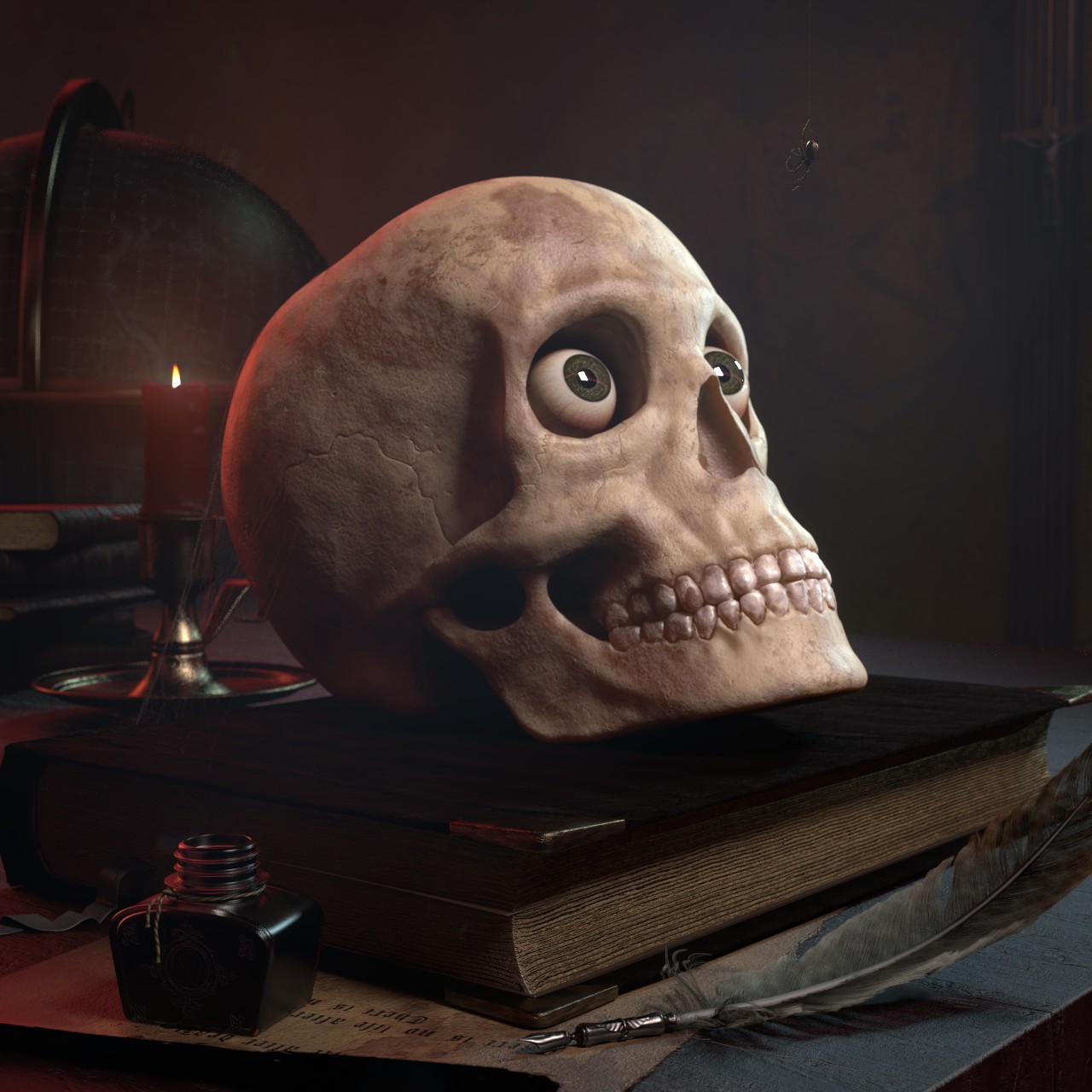
I do like the eyeball staring out of the skull, but now it looks a tad cartoony. Maybe move the position of the eye a bit so it no longer looks like he’s staring at you?
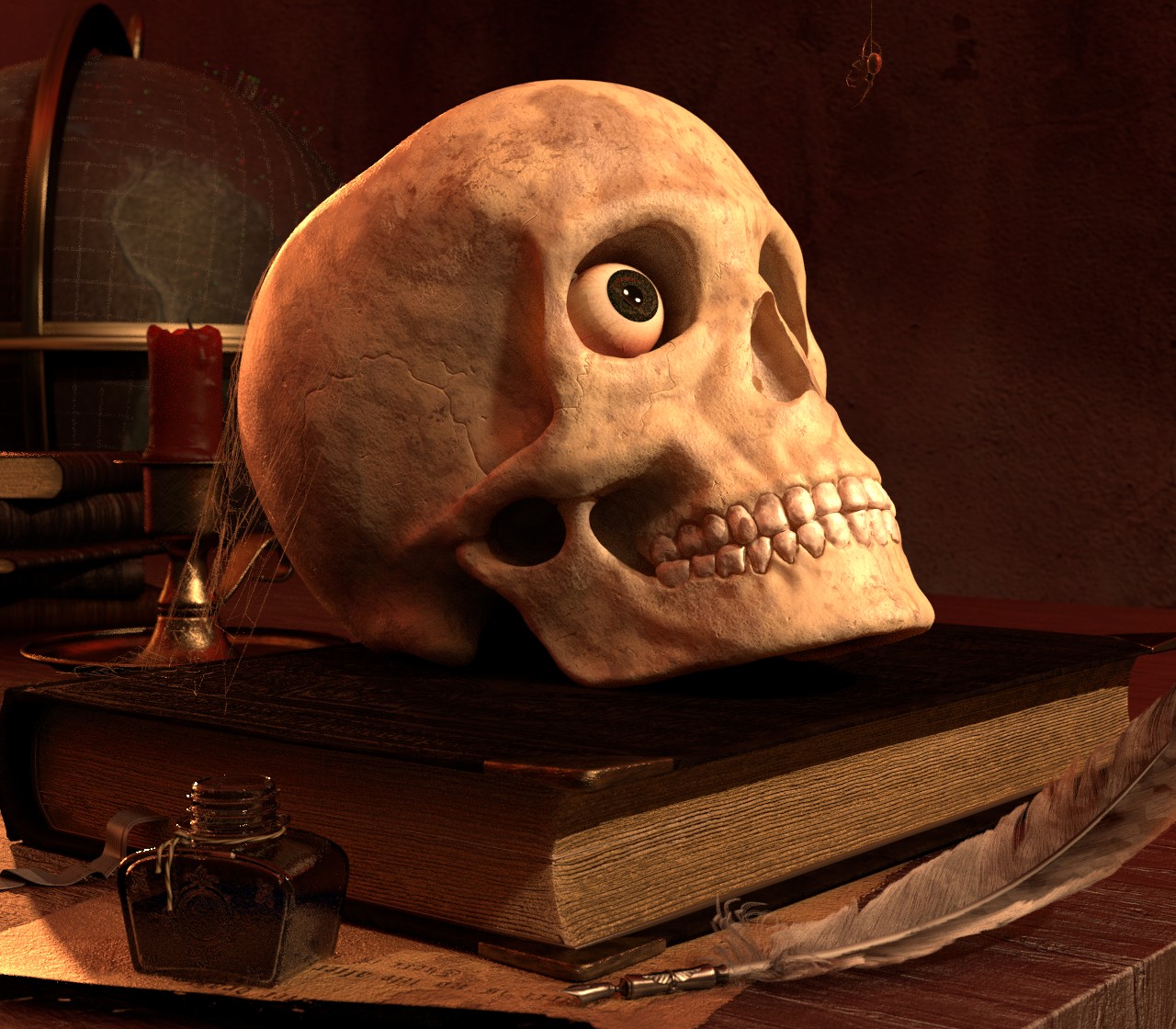
All objects are added now.
I made a major update of the composition and finally got rid of the nimbus.
I changed the lighting a bit and added more books, a globe and a spider.
The bookcover-texture could use some work, nontheless I think this render might be near completion.
Smoke from the candle is missing and will be added in post.
 I love it!
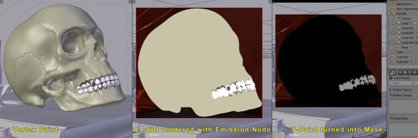
 ).
).
