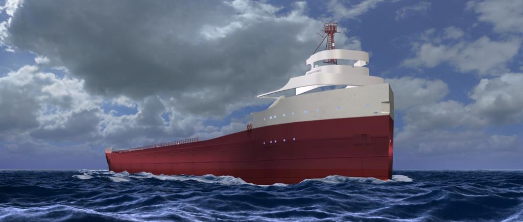
Another update… decided to dump the stormy skies and go for more of a “common day of work” look. Dropped the camera angle closer to the water to give you the perspective of being in a small vessel as this huge ship passed by… Did quite a bit of work modifying the wake and tension of the water… still need to add particle spray… but getting closer…
The waves look very good already - can’t wait to see with particles.
The sky still seems too dark compared to the reflections on the water Also, it looks like a zenith part of sky rather than a horizon and maybe a bit too close.
The camera seems to be slightly above the anchor holes - that’s still quite high up, isn’t it?
Basically, wat Sidcom said:
The sky is dark, brighten it up, and “drop” the camera(move it down a bit) and point it slightly up(that way it will be like you are looking up from a small boat)
The water looks much better, well i mean the foam, cuz the water was good in the first place.
Oh ya i think that looks better. But the camera(if you still care about the position) still doesnt appear to be close to the water. Actually if it is, you will probably not see the whole ship…
Hey, try to add the Bloom effect, go into compositor and blur the sky a bit, add a rgb curve and make it convex(like a facing down parabola shape) instead of a straight line. then combine the blur witht he original using, screen node i believe with factor of 1. and then combine that with the rest of the scene. (I think that is the way to do it, try it out tell me how that goes)
This is kind of a strange suggestion, but maybe more sky above the ship would look good.
(Like, keep everything as it is, but moving up the upper frame border - if you know, what i mean).
Because as it is, it feels kind of depressing with the low clouds and all.
Spent some time today with the family at a picnic, but when I got back in this evening, I set down and went thru those images and tutes. Hopefully, this is what you meant…
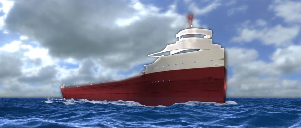
Personally for me, I am very pleased with how this image turned out… but of course, I will listen to opinions…
I added the bloom effect as discussed, and tweaked at it about a dozen times before getting this (which I like)
I also turned up the emit value of the wake (which got darkened in the new setup)
Again I like this look… The other images looked good… but the sky looked almost TOO real (being a photo) and it didn’t blend well I don’t think with what I had in the boat and the lake water… I think now it is balanced better and looks better…
This is a great project:yes: i love it. Doing the sea is is on my list of things to do with one of my projects so its very interesting to see how you’ve gone about it.
A very informative thread thanks for sharing.
My only crit is that the ocean is looking a much better colour but i don’t like the bloom effect on the ship, just doesn’t do it for me. It looks a little too high contrast.
The sky turned out pretty good(exactly what i was hoping for), but the new sea color is darker and doesn’t go with the color of the sky.
The waves are set for a storm scene i think, while the clouds are set for a sunny scene.
Bring back the original waves(the latest ones before the bloom) If you need help(you said they got darker b/c of the compositor)show me your node setup, i might be able to help.
And yeah, the ship got blurred with the clouds, so … if you need node help with this too, show ur nodezzzzzzz.
Also, i would love to see a storm scene using the new waves!!! Use that Making rain tutorial i sent you!
This is coming along very nice
Another note:Is the ship finished?(I am asking, because of the holes in the white structure(the helm?)
Hmm, i think the first one looks like an almost perfect overcast day, the second one needs more brightness both the clouds and water.(well really the water is almost the same color the sky is cuz for the most part it is reflecting the sky) Gd job sitcom, these gimp edits really give you a new perspective, that should help him out.
The ship… 90% complete… all forward areas are complete… BUT for this work with the water…I only imported a partial model at this time to give me a idea of the look without the slowdown of the full model…
Water changes… the only real changes to the water over the last 3 pics… were that I darkened the water slightly (.100 per rgb) and added back in the tiny chop waves… and as a note… the waves have no REFLECT on them at all… the reason is this:
The sky is not done like the one in tutorial DDD posted… it is more like a cylinder with open bottom and top… that wraps around the scene… (my thinking was this would allow me to do 360 degree images). I did not use a image in the world environment. I only had the mist set up and AO (both of which are now turned off in the last image with the bloom).
I will post my Comp. node setup in just a second for you guys to see…
Aaaah, I see what is happening, you are not blurring the ship after all, it is just the blur from the sky that gets mixed in!
Ok, so i dont see where the compositor makes the waves darker though…
Well at any rate, if you think that the blur leaking onto the ship is not what you want, you can try out different nodes in the last “combining” step. Maybe “screen”(sub option of the Mix node), or Alpha over Node.
When in the compositor, you generally have to experiment a little.
Lets see what you get!


