I had actually forgotten that you were using a human skin shader, so expressions like this will work fine. The smile is much better now.
The teeth look so much better amazing! the after is def better to me, the first one to me I couldn’t stop looking at the mouth for some reason, I think she looked a little like she had dentures as the teeth and gums were so perfect and that didn’t go with how young her face was perhaps. Anyway second one looks really different and a lot softer to me so much better, it’s hard to tell for sure not knowing what she is looking at so intently and with the temp skin shading but looks really good to me, I’m looking forward to seeing that very brave going for such a bold human emotion ![]()
I didn’t even realize you had started a new thread until now, minoribus! It’s a very different and interesting project- I like that you’re using real mechanical systems as reference. I think doing that always helps to increase the realism of your work. Your materials look very good, even under a range of HDRI maps. I’ve found that when I change from one IBL to another, often the realism in my materials seems to be lost. Your project looks great already, and the addition of facial expressions gives it something new and fun.
Harleynut, Umii and James, thanks for your comments. Umii, it’s very nice of you that you took the time to answer my question.
It’s so easy to get distracted with all the possibilities offered by CG. Should I model the whole body, should I put further details on the plating, show her coming out of the machine. That had been questions I considered today. But it is important to stick to the original concept. I started to show the encounter with the masks and that shall be the topic.
So I made a step further in the completion of the scene. The next image is basically a block out. Her pose, expression, the lights and so on are all subject to changes. And please keep in mind, that I haven’t spent much time on the shading now, except for the hex-mesh. But what will remain is this face to face confrontation of the character and the mask. I feel that this is already giving a sense of intensity.
Good call to stick with your original concept. It will help move you closer to completing the project (something I seen unable to do). I like the general idea for the scene that thou have set up. I hope you also stick with using the 3/4 front view as you mentioned previously. Right now you have set up a profile angle that I think taKes all the movement out of the scene. it will also be harder to show off those inner show parts in a profile shot…I think you need that soft back lighting or value contrast in 3/4 view to get that effect.
And, since you asked, my trailer project is still creeping along.  I find myself having to frequently stop and learn how to do something for the next scene so it is taking a while. I wanted to do all the modeling and stuff myself but I may end up using some blend swap assets just to finish the project. Next time. … smaller project.
Anyway, you are showing great progress! Keep up the good work!
This angle definitely pulls you toward concentrating on both the robots face and the wall faces. I would have to agree with jdover, that the inner parts aren’t fully appreciated in this angle.
I have been really busy jobwise during the last week - therefore no update with new images this time. Instead of that some considerations as a sort of focused self critique 
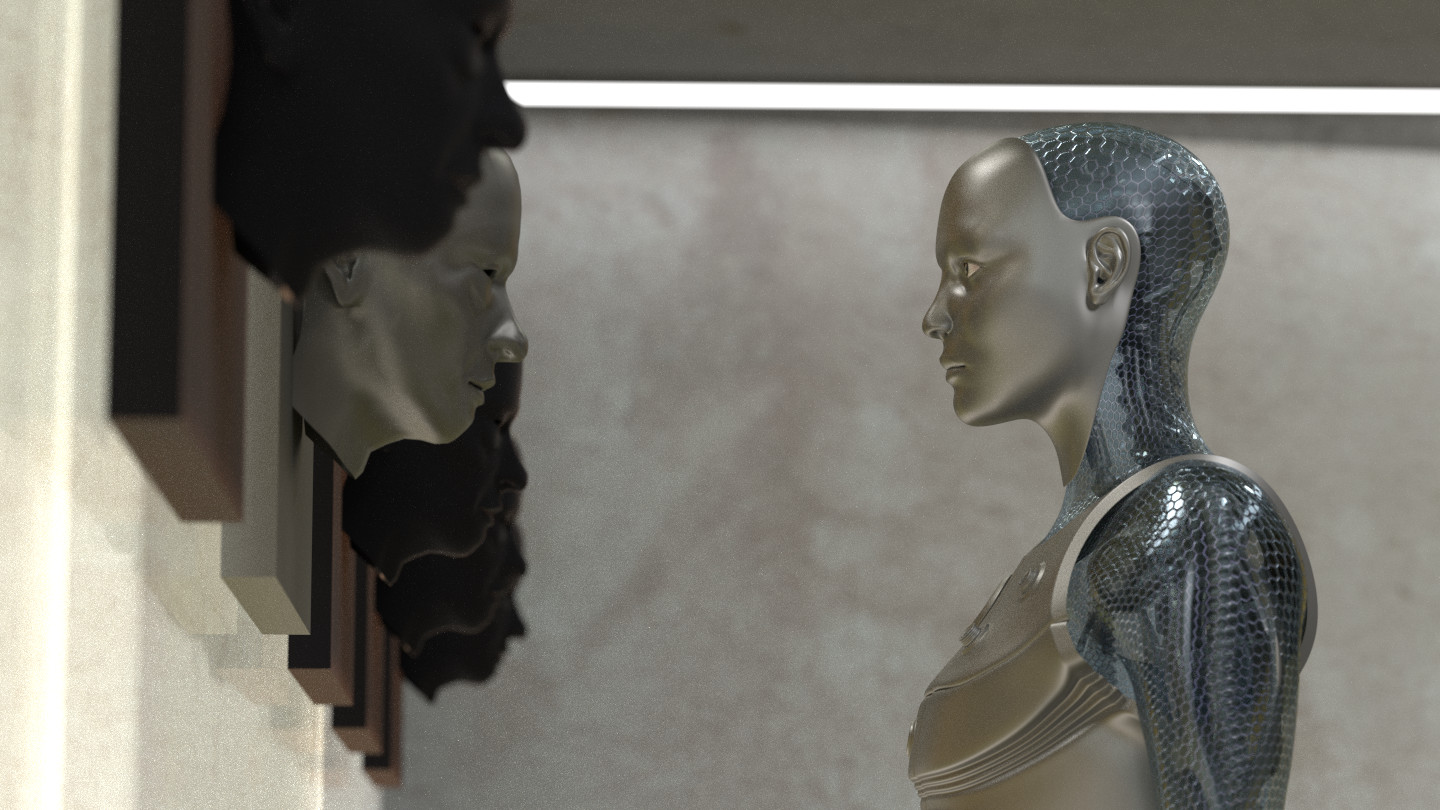
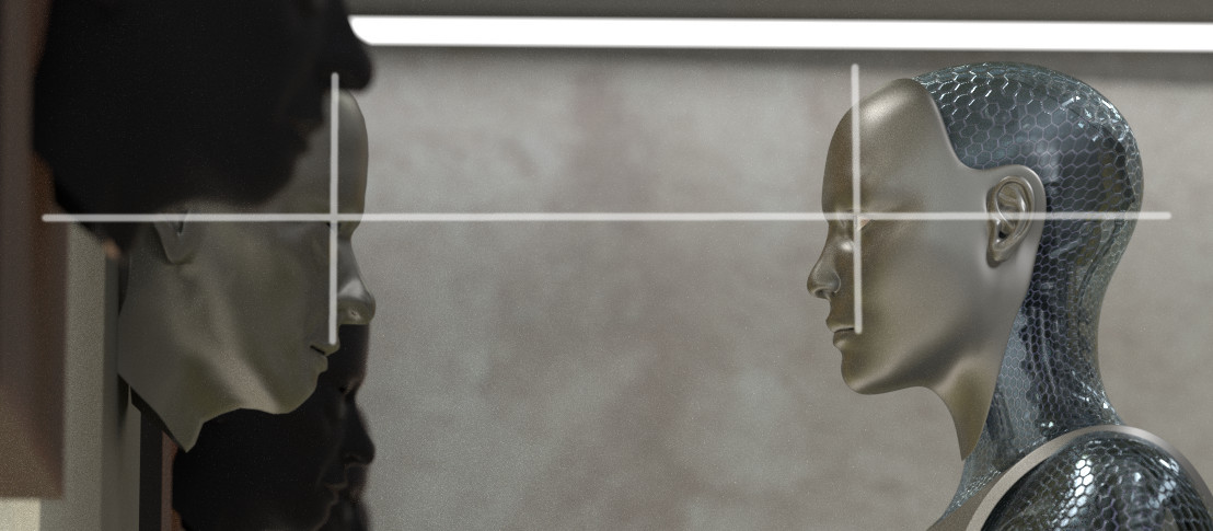
As you pointed out, Harleynut, the viewers eye is directed to the eye of the robot and the eye of the mask in the last composition. That is proving nicely how well the rule of thirds is working The camera was positioned (and the focal length was adjusted) in a way that the lines of the upper thirds are crossing right at the eyes of the two heads.
That’s not too bad and it gives the image a certain intensity - methinks.
But on the other hand it is weak in terms of story telling. Focusing on the two heads in such a manner literally cuts every context away. But the context might tell something more about the characters and their situation. Without giving much context it leaves much room for the viewer’s imagination. On the other hand there is not much in the image to guide the viewer’s thoughts.
At the moment I think such a close up would work very well in an animation or a movie because the story is told by a whole sequence of images. You don’t need to put everything in that one image, because you can show the context in other frames. But if you are doing just one still image - that one image is the only one chance to tell the viewer everything he needs to know about the story, the time, the characters and so on. That’s requires a completely different approach.
By looking at the last image you can say “A robot is looking at a wall mounted mask and there is a concrete wall in the background”. Everything beyond that would come from the viewer’s own imagination.
Therefore I shall try to make the scene more complete and to populate it with hints about what the viewer is seeing here. That will also offer the chance to show more of the robot’s show parts. As you both, jdover and Harleynut said, that chance was given away in the last render.
I laught a lot with the smile expressions, the second is much better, and nice improvements on the chest armor, this is a animation project? keep it up the good energy with this!
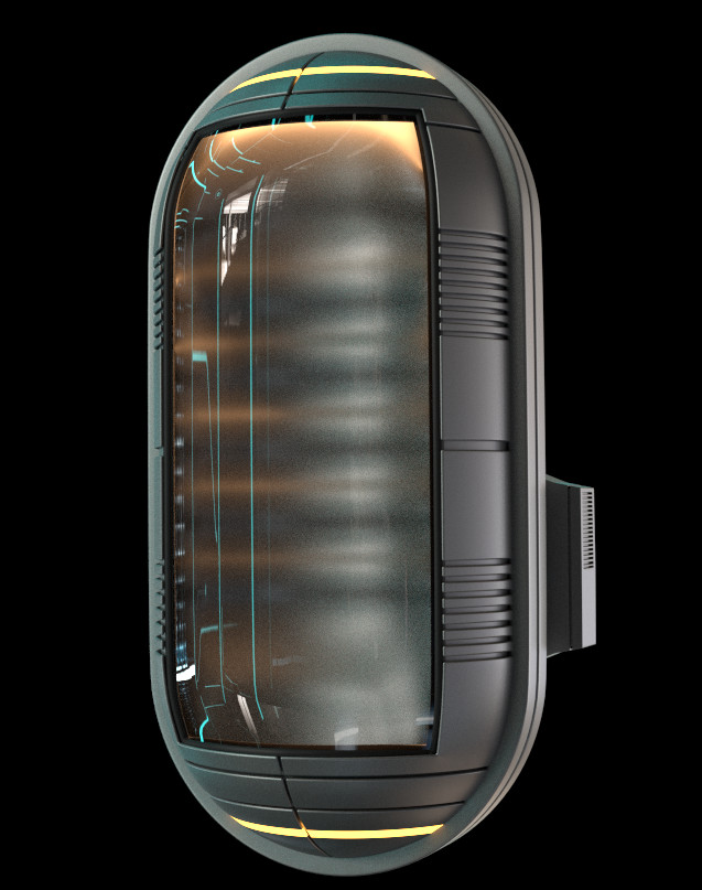
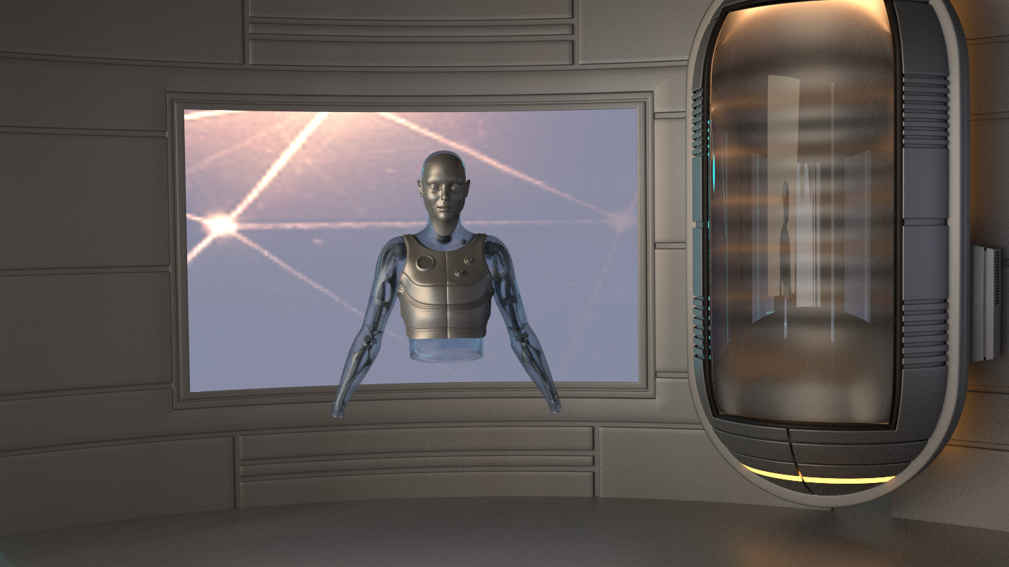
Thank you José. No, I don’t want to do an animation. At least not now. Instead of that I want to incorporate enough story telling elements in one single image. The environment will change from a concrete corridor to some kind of lab. Here is the first prop, that I made for it today. It’s a kind of robot storage/rest/recharge box.
‘minoribus, this is the Forgotten Harbor calling’ ‘Why haven’t you called back’
Man you are fast approaching the ‘Uncanny Valley’ here. But, in this picture that is the whole point. The modeling of the robotics is amazing and I was disappointed when you really covered it up. That spine is made for Cycles!
It’s exciting that you are attempting an actual illustration here. With a story being told in one frame. May I suggest a pencil and paper for thumbnail sketches. No bigger then half the length of your ring finger and millions of them.  The possibilities are endless when you throw in a floor or ceiling view. And, having to tell the complete story within just four borders is truly a bitch.
Kudos for now using the original scene as a jumping off point. You are now in the wonderful world of illustration. Where the planning stage is everything. And, composition and lighting rule. Man a hologram might be appropriate in a scene like this once the final composition is pinned down. And, my first thought on mood was simply sterile. But, suppose there had been an explosion of sorts and some lighting was out. Immediate shift from sterile to dramatic lighting.
The nice thing about thumbnail sketches is one can be quickly done anywhere in seconds. A scene made for Cycles and who better to do it. And, not only that but now you are attempting something Cycles fans with modest machines can really get into. So off we go once again.
Just getting back from a couple days away to find some big changes you have made. The recharge station looks very solid both on it’s own and in the new environment. I’m curious to know if the original face masks that were hanging on the wall are still going to be in play within the scene?
Either way look forward to seeing where this goes.
Hey, Ghost, thanks for having a look and for your appreciated comment.
Your idea about drawing several thumbnails is great and for sure a professional approach. Unfortunately I haven’t learned how to draw a single reasonable line yet. I tried with the help of Andrew Loomis great books - but even a stick man went terribly wrong. I should try harder and at some time I will, because I feel this is limiting my workflow. But for now I lack the time for drawing exercises and I wouldn’t be able to lay down what I have in mind. Luckily there is the possibility of doing a kind of blockout.
Harleynut, thanks for your always welcomed feedback. I can imagine that this change was a surprise for you. Especially because I said, that I was settled on the confrontation But the original concept wasn’t working for me as I tried to explain. The mask will still play a role.
Now, folks, let me first show my current progress with the room - before I try to illustrate my current idea in some way.
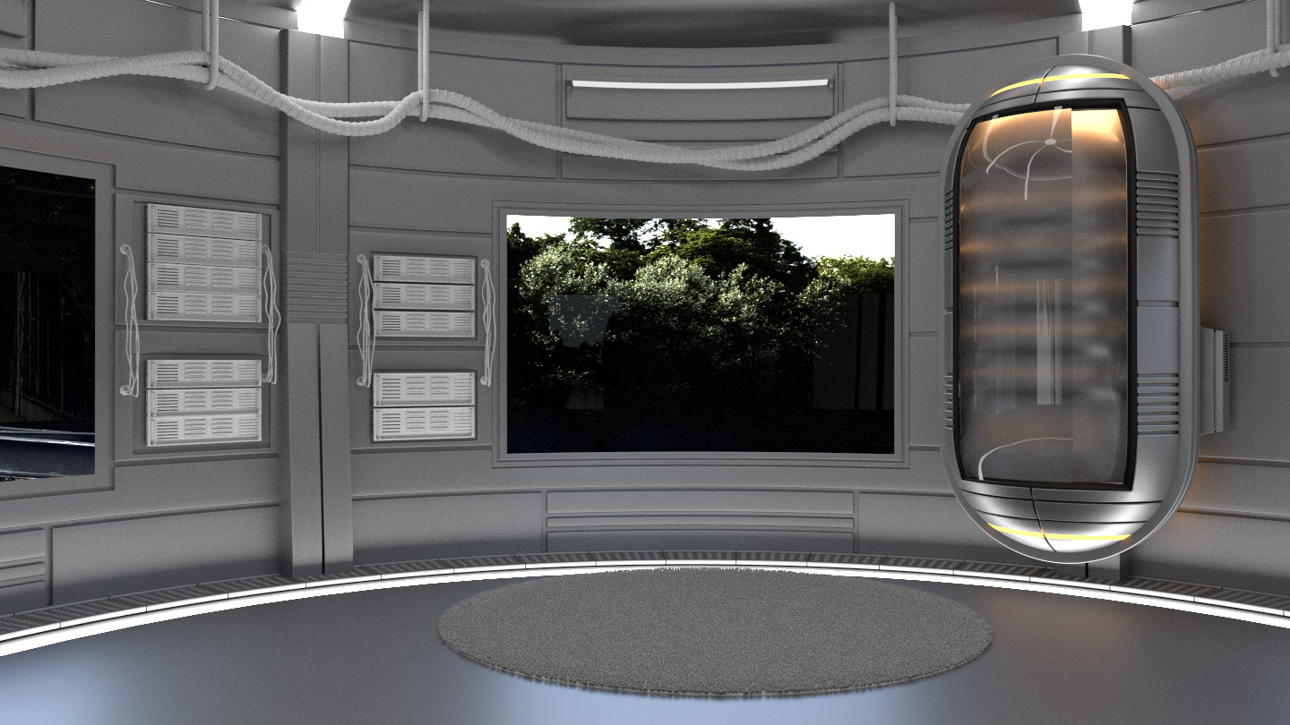
You see, I went back to the modeling phase. I’m not through with the room. And I must say again, that I haven’t done any texturing yet. Everything - except the transparent materials - is not much more than a clay material. The same goes for the lighting and the environment outside the room. Mats, lights and environment are really WIP.
Now for the idea. Here is a blockout of what I have in mind.
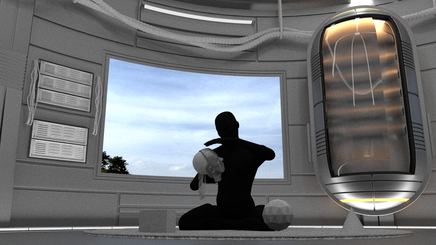
The black silhouette is a placehoder for the robot and the primitive forms around it are placeholders for little mechanical/mathematical gadgets like an abacus, a spintop and more advanced engineering things like perhaps thrusters and so on.
When I’m through with it I hope to have an image of the robot sitting in her “child’s room”, surrounded by her toys, deeply immersed in a play with the mask, tearing it apart and analyzing it bit by bit. And somewhere on the wall you see a cinema poster of Fritz Lang’s Metropolis. (Hope that is no copyright issue.)
I’d love to hear your thoughts on what I have so far and what I planned  Thanks for commenting and watching to everybody.
The blockout with the sitting pose works really well to my eye even as it is with the suggestion of what’s going on it works and having the poster will really add to the human feel. Another darker take on it could be that it’s not her room and she’s holding the mask of her own face and the recharge chamber is broken so not only has she found out she’s an artificial intelligence where perhaps she was programmed not to realise but there are identical versions but that might be all a bit melodramatic ![]() I like the child like inquisitive idea as well! That scene def looks a lot better really tells a story, can’t wait to see more!
I like the child like inquisitive idea as well! That scene def looks a lot better really tells a story, can’t wait to see more!
I have to agree with Umii and you in that there will be a certain mystery leaving the viewer some leeway with their imagination. This is nice in my opinion. And, I know you are in the early stage of blocking in your composition. Just a reminder don’t forget about visual weight and balance. Just keep that little fulcrum in mind. I can see the white panels and dark tree outside so that is being keep in mind evidently.
With that thought in mind maybe a console of sorts on the left side angled at 35 degrees or so might also provide a nice line leading right to the center of interest. Not to mention some depth. The left side would be outside the frame. As you remember large objects breaking the border suggest a world outside the picture.
Have you tried a less wide angle lens by any chance. Or, less angle. Something without the severe perspective. Just a thought. For all I know this might work best. Which brings me to this. Your picture is shaping up well and the modeling will be just amazing I’m sure. Which leaves me uncomfortable making any suggestions. Especially at this early stage. Then again if I stumbled on a valid point this would be the stage… This is looking really nice, minoribus. And, I think you nailed the story line.
I’m glad that you like it, Umii I have the feeling that I’m heading in the right direction now with this. Good idea with the broken recharge chamber.
But this time I have some difficulties to find a pleasant composition and therefore I took up your suggestion, Ghost, and made some thumbnails. Thanks to my fast card, simplify and only 200 samples I can generate them faster than I could draw them.
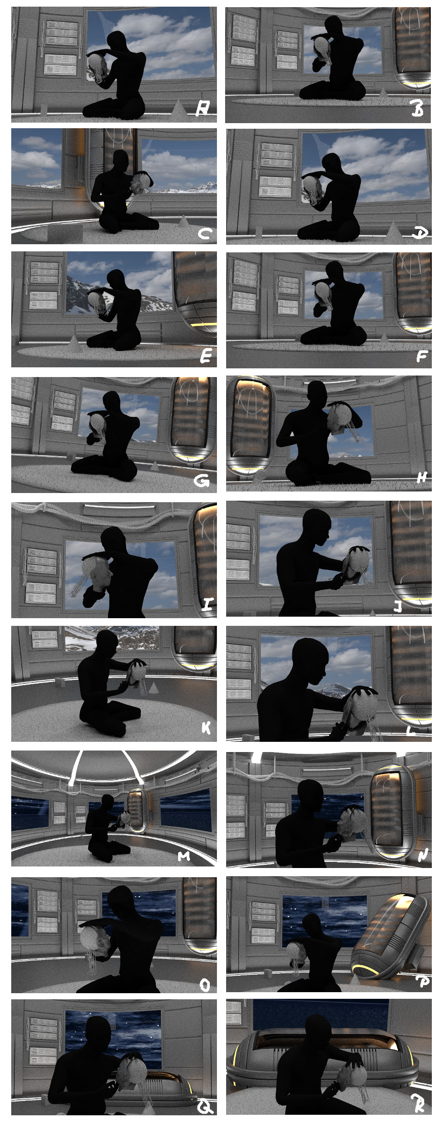
Thanks for the reminder about the right balance, Ghost. F is much better in this aspect. Comes closer to the idea of balancing a heavy weight through some light weight objects.
I also like G because of the little tilted camera angle.
Besides that C, K, and L are my favorites from this collection. Most of the images were done with lenses between 35 and 50 mm.
Especially C is very pleasant to my eyes. But the problem is to combine enough room for story telling hints, the backlighting for the transparent mesh, and a more or less close up of the robot - cause that’s the hero character of the scene. C lacks the right backlighting, but that can maybe worked around by changing the lights/mats of the recharge box.
So many options you have presented. I guess it really depends on what you want the viewer to really focus on. I think L is a good choice because I feel you are going to see the “insides” of the robot better and it really is the main focus. But the downside I guess is you lose, the ability to have a bunch of things on the floor surrounding her like you mentioned in a previous post.
C is a good choice as well, but i think I would change the background so there is less window and a better view of the transpoder or whatever that thing is called ( can you tell I’m not much into scifi )
Point well taken about ‘The Monster Card’ from hell. That bitch would tear through my little animation like _ _ _ _ through a goose Harley has hit on a problem I would have if I had modeled that amazing android or whatever. And, that would be I’d want to showcase it with placement and size. As in about eight (8) of the thumbnails. However, doing that completely looses the original idea in my opinion. The playroom mystery with the viewer filling in the dots. Even her size there suggested a slight sense of isolation.
I don’t think I’ve ever completely disagreed with you on anything so here’s a first. C is pleasing to the eye and there lies the problem. It’s a almost static composition. With no viewer eye movement around it except for the toys. #54 had eye movement and interest. Center-right-left-center.
And, by moving the ‘Transponder’ slightly to the right and her slightly to the left maybe the flow would be even better. Her rotation in C however brings up a possibility. Move her to the left completely off center and have her looking back to the right border as in C. And, her placement in front of the window (Contrast) means instant center of interest. With her placement in #54 and the contrast she would be the center of interest at half the size which is stating the obvious.
Minoribus I was disappointed to see the perforated mesh covering up your modeling work even with her well in the foreground. And, I would imagine in #54 none of that would be visible given the size of the holes. Which brings up another thought. The modeling alone could carry a picture. So whatever you decide will work. I just personally like the original story line as if that wasn’t evident here. If I had modeled her this wouldn’t even be a conversation. ‘Put that bitch in the background. Way in the background. Yeah that’s it with her peeking through the window’ Once again amazing work.
Wow, great work minoribus! Really love the futuristic theme. From the first post to the latest one, you’ve achieved so much in that little time. Character development is one of the more difficult aspects of CG art so I can appreciate how much hard work that went into this. And that too especially for a futuristic-robot character. I may have missed this somewhere but I’m assuming you are planning to make a film out of this? If so, it would be great to see the final result
Thanks for your replies guys and sorry for my late reply. I was on a business trip during the last days and had only limited Internet access.
I see what you mean with your comments on the composition and that is one of the problems that has to be solved. The story requires a greater camera distance. And it would be nice to show as much as possible of the robot at the same time. Now the outcome of the experiment is: I can’t have both. And something in between would be worse. “One death one has to die” as we say in Germany (literally translated).
I think I’ll go for the option which has more opportunities for the story. Therefore I have to complete the body with a lower body and legs in the next step.
@Solowy, I don’t plan an animation this time. Perhaps some turntables, but nothing else. Just a simple still image - or not so simple as I see now