thank you agrmrs : )
And a big thanks to you to Sirgazil! I really appreciate your tips and I’ll try to use them in my future drawings. I can agree to everything you say and I’ll try to chech the Basik Guarro out in my art store : )
thank you agrmrs : )
And a big thanks to you to Sirgazil! I really appreciate your tips and I’ll try to use them in my future drawings. I can agree to everything you say and I’ll try to chech the Basik Guarro out in my art store : )
Hey you made me jeaulox 
those sketches were awesome!
How long have you be drawing?
thank you Geilarin : )
the whole story is in the first post but I’ve been drawing off and on for about 6-7 years now. Important to know is that I really havn’t drawn all day long during those years. : )
Okay, I know that it’s been some time now but with the school back in progress it’s hard to find time to sit down and do some scetching…
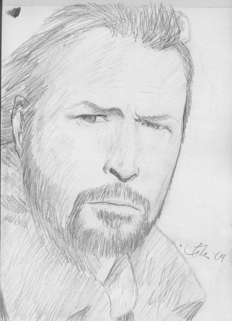
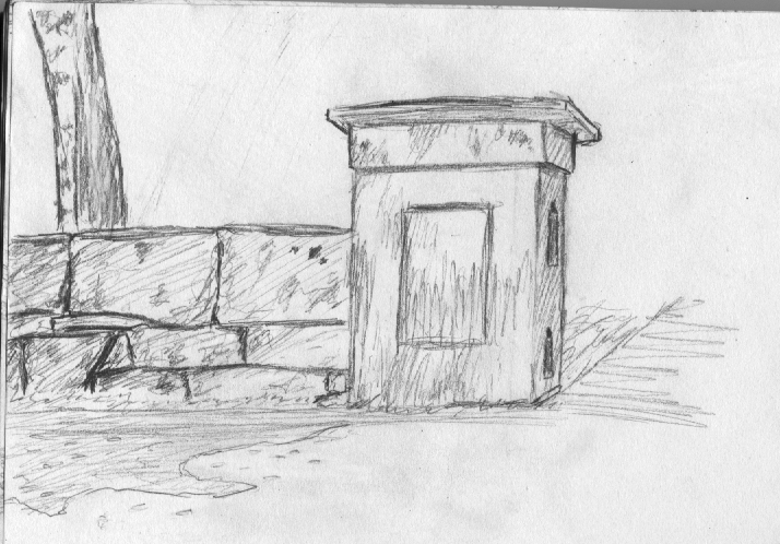
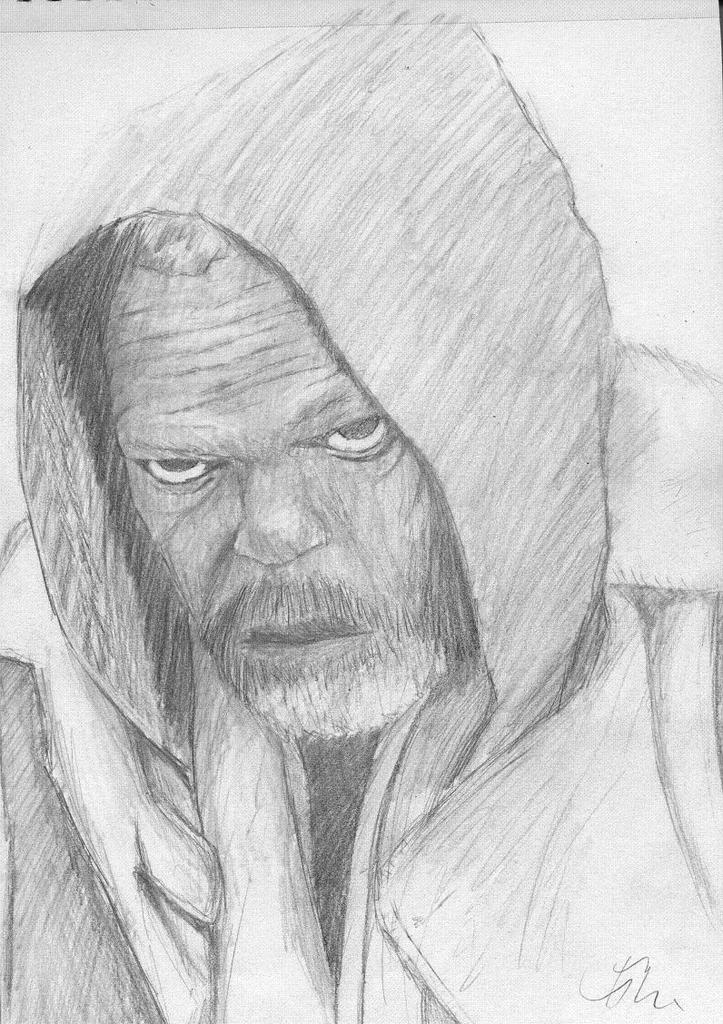
-------A german actor (don’t know who…)--------------------------------------------An old wall nearby-------------------
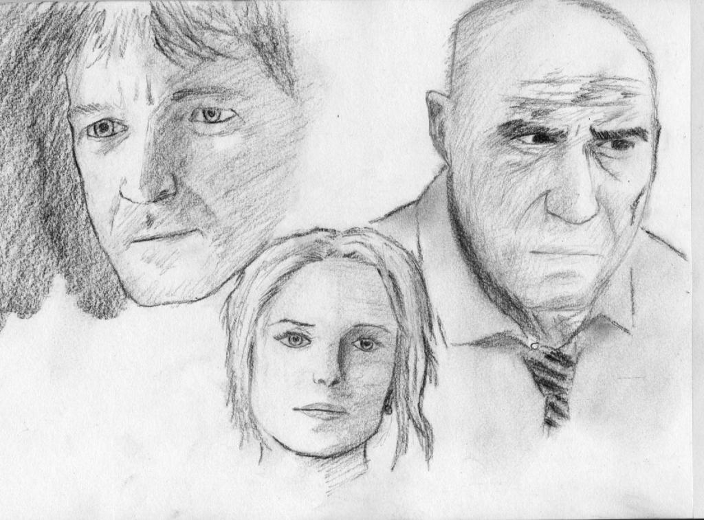
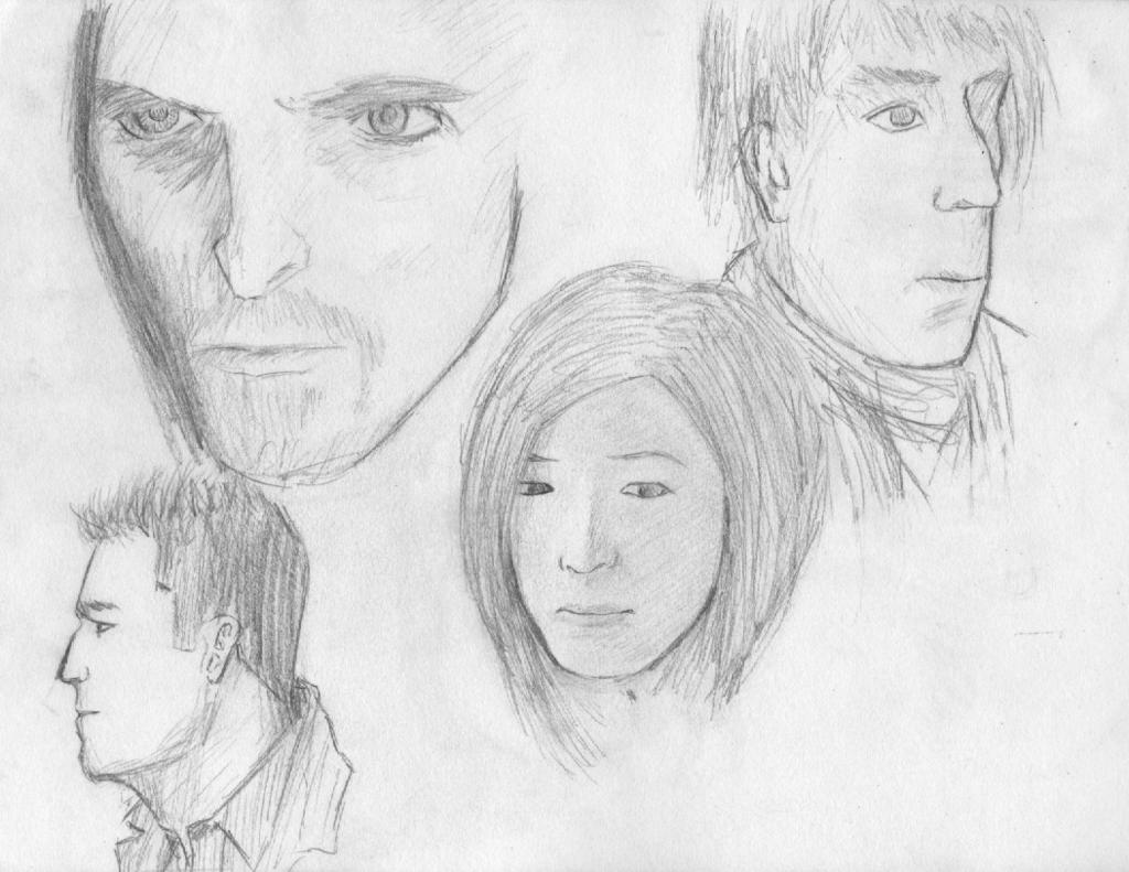
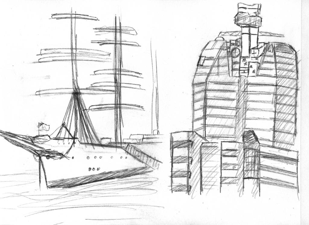
---------------A lot of quick scetches (with charcoal)------------------------------------------A lot of quick scetches (with pencil)----------------
Very nice work! I love your style and it’s clear that you are good at finding the essence of what you are drawing.
Your shading looks really flat.
there no contrast in any of your drawings and it makes them really boring.
I think it has to do with you shading one way.
Following the lines of your subject will help out.
Try shading with circles, lots of circles overlapping to get dark tones.
Takes time, but I think it looks great
And check out this pencil grayscale, you’ll see how your shades are only in 3 boxes.

I had one more thing to say, but I lost it…
Oh well, keep practicing!
Nice sketches, especially te Pixar characters! Keep it up!
Good drawings.
thank you everybody for viewing my work! You’re all a real motivation boost : )
@ cire792: AARG! I’m really trying to force myself to go darker in my shading, you can see at the picture of the german actor that in the upper left corner is a small greyscale, it was meant for me to look at an to remind me of going darker but it obviosly failed. My only hope is that I remember it for the next sketch. : ( Thank you for your tips! : )
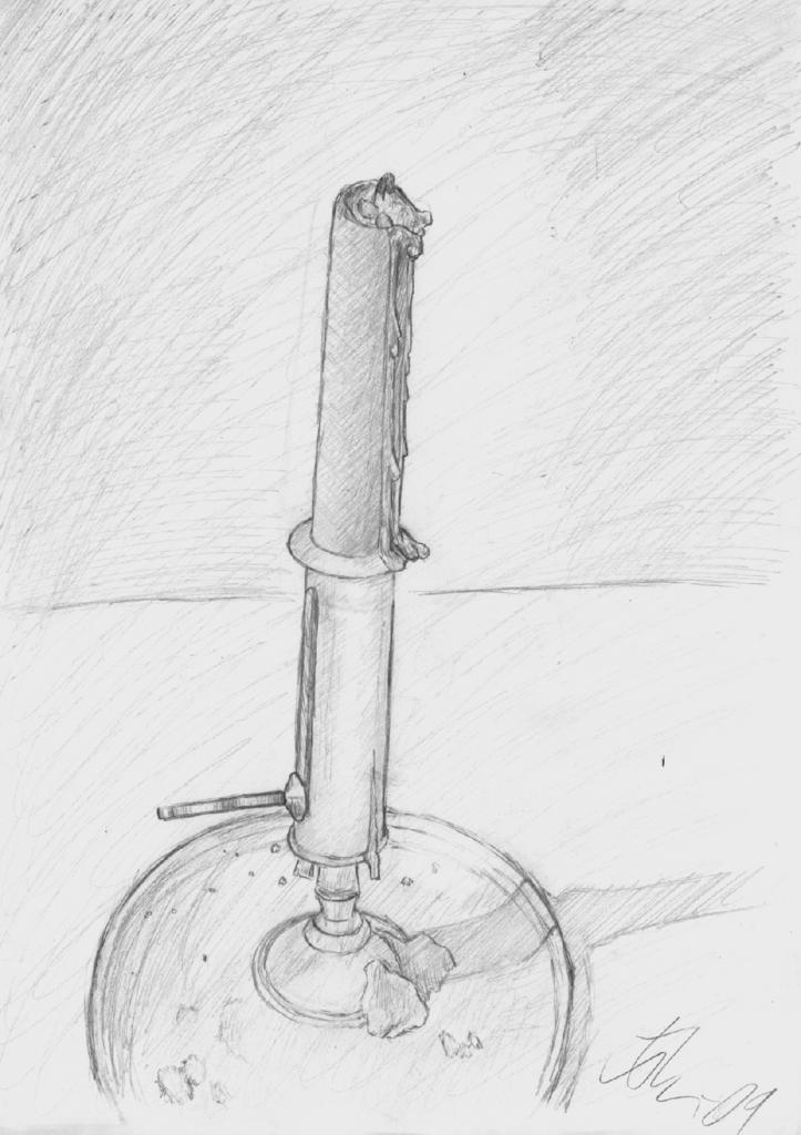
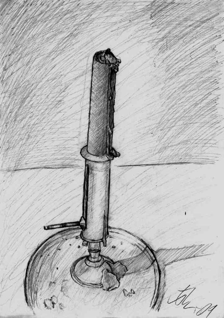
Ok, I’ve resently made this little christmas sketch of a candle, I gave it to my grandma as a christmas gift so I hope it is good enough… 
--------------------- A candle ---------------------------
Something about your drawings bothers me, and I think it’s the balance between outline and shading. One drawing book I have doesn’t use outline at all but only shading. You’re using mostly shading but the occasional outlines seem too heavy (referring to portrait pics here, not the candle).
@ averil: Yea, I can definitley agree to that but I think I really need the dark lines as a reference for my shading and that’s probably why they are there. It will be hard to work that habbit of but I will try…
The black oil based pencil which goes on much smoother than charcoal.
I love these drawings! The only thing I would think about the candle is the dish seems a bit out of proportion to the candle…I think it needs to be facing more towards the roof than the camera if that makes sense 
@ spacetug: Yea, I should probably go for a scale that’s somewhat similar to that… 
@ Keith M: Thank you, I know it looks kinda weird in the sketch and it’s probably since I was very close to the candle while I drew it which made my own perspective change a lot during the process.
I’ve kinda put all the sketching on a hold right now but I hope I’ll soon start again and hopefully produce some quality goodies : )
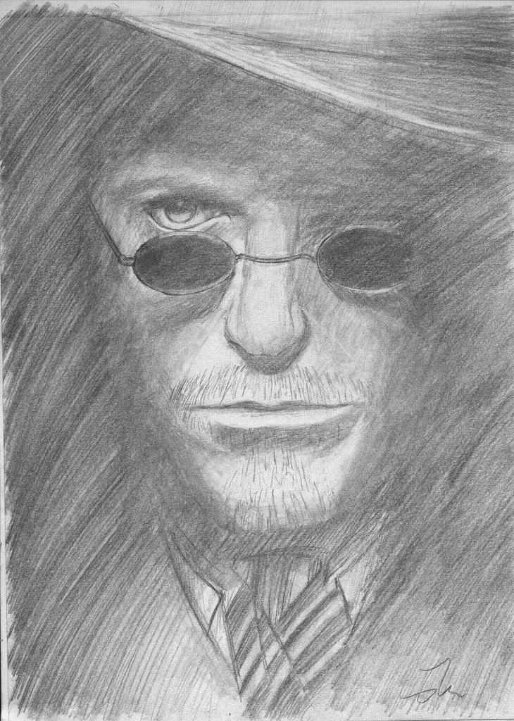
Ok, I’ve really tried hard on these ones to make the shading darker and I must say I think I’ve got it! I’ve got some real good crits on these from my friends at school so I’ll definetly keep on going with the force in my pencil 
Say what you think about them please!
Now thats a big improvemnt.
47, the one with the glasses, thats great.
Nice contrast with the glasses, and the highlight in the eye.
My only crit, but I guess its your choice.
Is that you can see the pencil strokes.
Now i’, guessing that its all supposed to be hair, and I can see why you’d slap it on like that.
But if you wanna push your level again, find those tones.
Here’s a website you might wanna look through, theres some nice tutorials in there to.
http://www.dueysdrawings.com/
@ cire792: Haha, thanks but the strokes aren’t supposed to be hair at all but simply dark shading, look at the ref: http://resensi66.files.wordpress.com/2010/01/sherlock-holmes.jpg
I work only with a normal pencil, I’ve looked at your website and seen your impressive stuff, I think I’ll need to go get some softer pencils and change my whole workflow.
I wish the website was mine, its one of those inspiration sites I go to every now and then.
But one pencil?! That explains why your drawings are lacking contrast.
Go buy a set! Althought you probably won’t use all the pencils
The main ones I use are 7B, 4B, B, and H, recently I also bought a charcoal pencil, for those pure blacks.
My art work is in my signature, I havent updated in awhile but yeah.