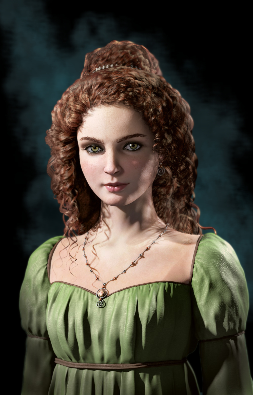
Thanks to everyone for the encouragement (and for the help… Tonatiuh) alec munhapa thanks for the hint too. I have tried a brownish background, but in the end I decided to go for some contrast, to make the hair stand out…
Pieriko: yes, the lighting could be improved. The fact is that with Blender internal is very difficult to get a good lighting! Probably I should try to remake the materials and lighting on Cycles, sooner or later.
I don’t know why, but I like the initial render more than the postprocessed one. Yes, indeed, the skin looks more real, but probably the lighter shadows made the character look way less attractive, even a bit angry. This is more visible in the eyes region.
@Darksider: yes, I think I know the reason she looks angry or less attractive, it’s the pupils. In advertising and character creation is a well known trick, dilated pupils make a character appear more attractive and trustful, but here it’s the opposite. The light and fair eyes make the pinpoint pupil more visible.
It’s not intentional but I kind of like it, it makes the character look less “sugary”, giving a bit of contrast.
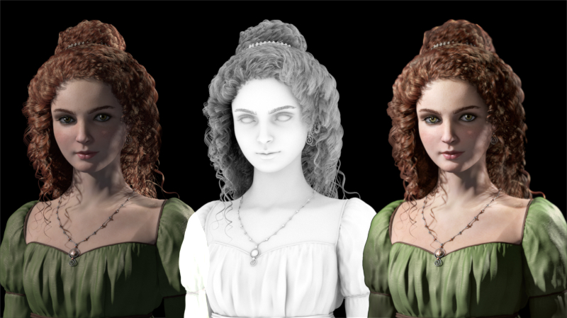
 otherwise the render looks well done
