Some feedback:
DM9: I really loved the lighting and colours here. That statue looks like some mean alien. Those two astronauts were a nice addition, giving the image not only a reference for scale, but also adding to the suspense of discovering such a statue.
RayVelcoro: I liked that little army of statues (is it based on those Chinese statues? Or was it Japanese?). DM9 already gave you some nice tips on how to improve it, so I’ll just mention one thing that I really liked: The brightness contrast on those poles in the bottom right.
fdo: It looks a bit like those archaeological findings, where you need a certain creativity to see a face in a mostly eroded stone. Also, the daylight is pretty nice.
kaidoe: I liked the blueish like and the fog. But I think the beam of light is a bit too homogeneous. I would expect some glow around it.
purbosky: This really looks like a screenshot from a game. The snake is really cool, and the little person in front of it added a nice tension to the image, as if they were confronting each other. Since you opted for a monochromatic scheme, some additional variation in saturation would be nice, like for example some gold strips somewhere.
Shenfara: I liked how you mixed modern statues with daily modern life. The cars look pretty cute, and even though I only see the feet of the statue, I can imagine it must be very big!
fcharr: I liked the face. The proportions remind me a bit of an ape, specially the big hands. Also, I find it quite curious how the ladders are placed in a way that people need to walk a lot to reach the base  I just think you could’ve used some trick to hide the empty horizon. A simple wall, for example.
beau11: The density of the vegetation is quite impressive! Also, the way you distributed the flowers is considerably better now than in the first version. I also liked the story here. Who knows what the statue represented long ago, when it was built. Now it is only a ruin being swallowed by nature.
Munno101: Haha, despite the similarity, that house isn’t exactly blend in. The stone heads are pretty cool, but they look a bit too identical. Well, except for the blue one.
Hondo: I suppose WIPs were not very popular those times! I liked how you cast the shadow precisely at the opening on the wall.
frig: Those statues look pretty cool. It reminds me a bit of one of the book covers of The Lord of the Rings (which featured a boat going through a river with one huge statue on each side). I just think the stone needs a bit more colour variation.
caz747: Those models are pretty nice, both of the guardian and of the ships. The materials are also quite nice. But the ships seem to be just hanging in mid air, as if from an invisible wire or something.
putr corps: Really liked the atmosphere and contrast on this one. I can almost feel the tension that the guy must be feeling!
BillyA: Those sphinxes look cool. The sand is also nice, but it is lacking some tracks behind the horse (and dust).
Helge: Very subtle. I did not notice the head at first, but coming from you, I just knew there had to be something hidden here! That rock material is pretty cool. And I suppose it must be a bit disgusting to sleep below the nose of a giant, but I guess it could be worse…
david.speer: I think you managed to give a nice feeling of low light, end of day scene without making it too dark. The little story is nice, too. I wonder how that guy is going to come down from there…
rawstar: I liked the face of the statue. It reminds of some African cultures. I just wonder what those grid lines are doing there.
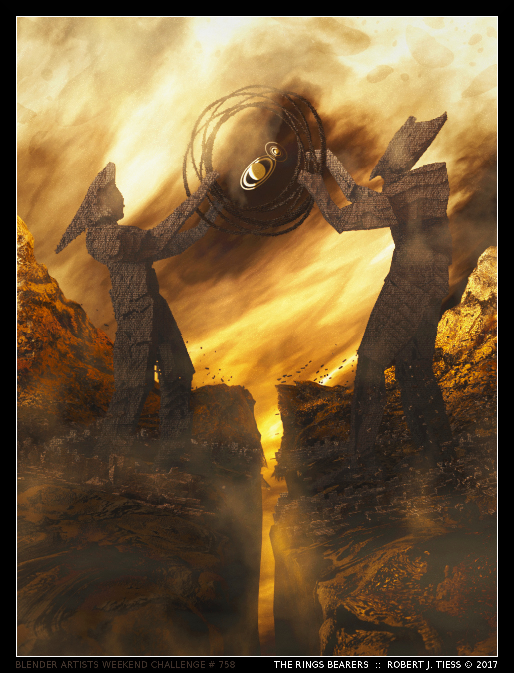
RobertT: Really nice monochromatic image. I liked how the statues are made of rough shapes, yet they seem to have some kind of personality. I wonder whether they are fighting for the ringing, or helping each other in keeping both sides of the chasm “together”.
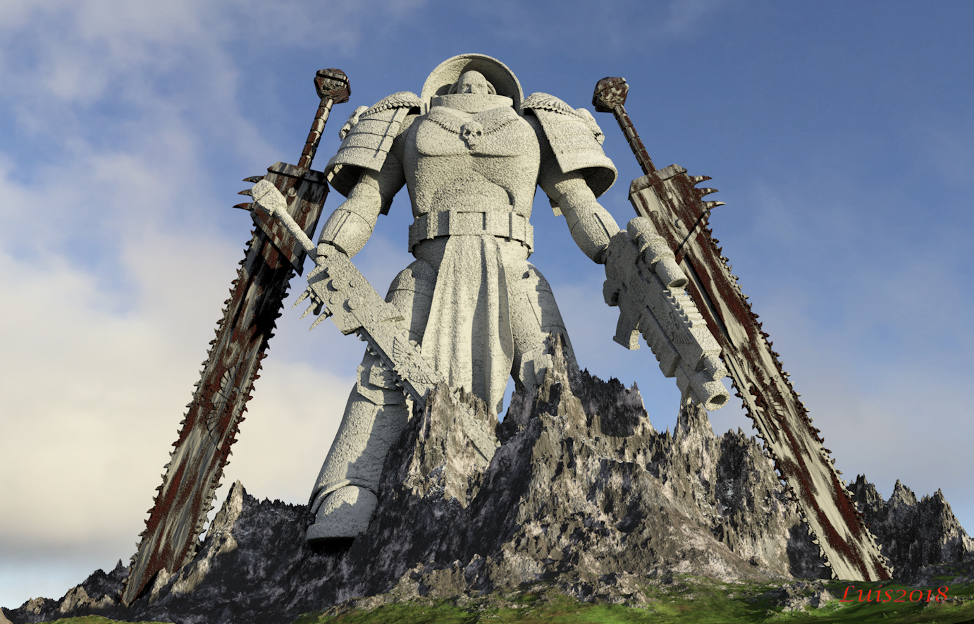
OLG: Impressive modelling. The stone material is also pretty cool.
 ]
]