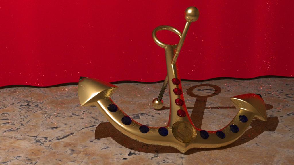
This is supposed to be photo-realistic, but im not sure how… im looking for critique for photorealism. my bro said it looked animated because it was “too perfect” and i agree.
btw the pic is in the attachment, and this is my first post, not sure how everything works yet, just saying
just a few points:
-if you’re aiming for photo realism, but you might want to try an external renderer [like luxrender] for things like caustics which are’nt supported in blender just yet
secondly, the scene is looking a tad wierd: why would you have a red curtain, a golden anchor and a concrete floor?
thirdly, you might want to try using the cloth sim for the curtain, you can get some tasty effects with that.
finally, the final, but sometimes the most important step is compositing; you should try to add some small lens distortion to break up the perfectly straight edges, and I think a viggnette might look good here. colour correction normally goes down nicely as well.
ok i used blender render for the first one, the pic in this post is using luxrender
yeah, i was aiming for a marble “counter top” type thing and i added the red cloth for a background. the scene is supposed to be in a museum and this thing is on display. its not concrete lol.
and i actually did use to cloth sim for the red cloth, but i couldn’t get it to fall very realistically so pretty much edited the mesh itself.
It looks like your off a good start with this. I would definitely echo the previous comment about using the compositor to spice the scene up a little. A little bit of lens distortion, color correction, maybe even a bit of depth of field.
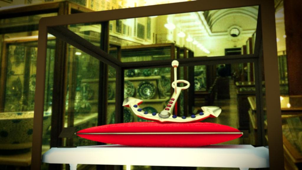
I would also suggest that if it supposed to be in a museum it would most likely be sitting on a little red (or purple) pillow or something, and would be in a glass box. I would suggest that giving it a background image as opposed to the red curtain might help place it a bit better.
In addition try and keep in mind camera angles and the rule of thirds when your framing your shot. The rule of thirds helps lay things out in a more meaningful way, and the camera angle can play a big part of how people feel about an image when they look at it. If you are looking down at something if feels less significant, wheras if your looking up to it it makes it feel more powerful. The lighting and colors you choose also have an impact on how people feel about it.
now it’s time to focus in on details, like creasing the cushion where the anchor is, adding some frills maybe…
[hint: try to make your foreground match the colours / lighting of the bg as much as possible, or the correct the bg to match the foreground before post pro. then you can do things like colour correction without messing up the bg image.]
This is definitely looking great! Like Casio23 said, try and get some more of that detail of how the weight of the anchor pushes in on the pillow and work on the color and lighting of the scene compared to the background, or vise versa.
Another thing that I would point out is how grainy the glass looks, I’m not sure if this is because of the material that you have or not, but I would suspect that a museum would want to have the glass as crystal clear and clean as possible so that you can easily see into the case.
Other than that it is looking great, I like how you’ve used the rule of thirds and I definitely think that you have chose an appropriate camera angle.
alright well, i didnt work on detail, thats coming next. but this time, i rendered out this one for nearly 1 1/2 hours and then started working on the composition. i realized that the comp nodes i was using werent doing anything because the render wasnt even finishing so i set up nodes in a separate blend file, with an image input and normal com out and a big set of nodes in between. i even added a vignette this time! its kinda slight, but i did.
obviously, i changed the bg. ima tryta match the bg by putting wood around the glass, etc.
for the glass, timothy, i noticed that, and i didnt like it either lol. but i think i fixed it this time.
thanks guys for the compliments, constructive criticism, and comments! its really helping me become a better blenderer. and sorry about this paragraph. i do definitely dislike it because alliteration is always annoying.
but now i must focus on those details. i think ill try to get those details on today, then render it out through the night. we’ll see.
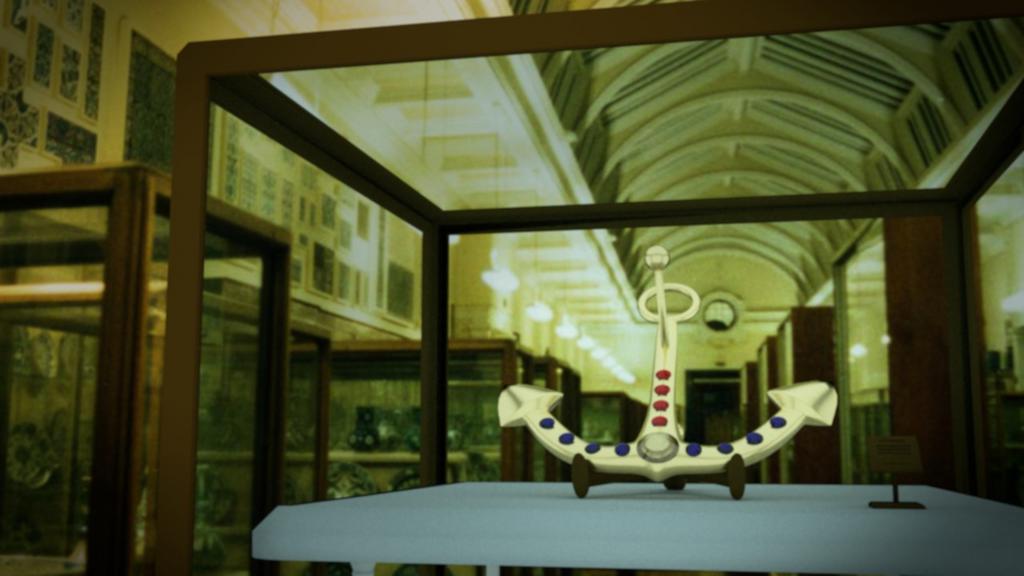
here is the picture, i rendered this all night (it still wasnt done, but oh well, its good enough for now) i added details like the wood around the glass, a white stand like in the background, a little stand in the glass case that has information about the anchor, the cusion is creased now, i tried to make the glass nearly the same as in the background image, etc.
i think the angle is a bit off, but im not sure how to fix that.
i think this time its more than 95% prefect. but i want this to be so realistic that it makes ppl think its actually real then be like “wait, what?!” so idk if its that good.
but anyway im getting pretty pleased with my results
when i get a perfect setting, ill turn up the quality and render overnight and i think ill have a finished piece of digital artwork
changes:
i added a texture to the table, making it darker
i changed the bg, making the angle much better
i tampered with the nodes, changing the color bal, and focusing the vignette on the anchor