Did not quite turn out as I expected, the table is so of shitty.
But thoughts?
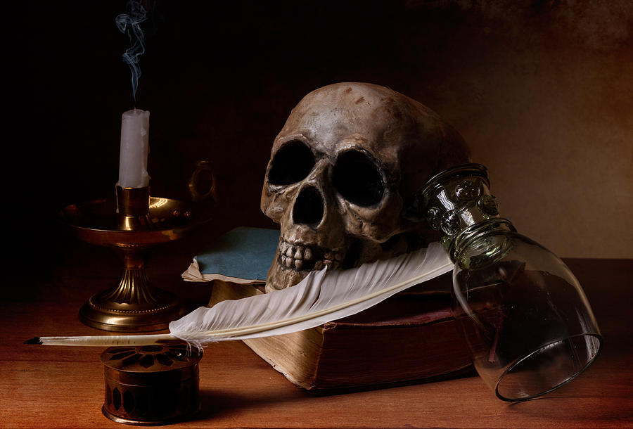
Interesting image. The composition seems like it could use some tweaking. The forms are pretty interesting. Lighting is dull looking and some of the textures could use some work. The modeling looks pretty good though. particularly the details on the cup and the skull looks pretty good. The teeth could use some work I think. I’d say its definitely a good start. I would angle the skull so you can see more separation between the eye socket and nasal cavity.
The glass is in an awkward position. It has to have been placed there deliberately, which is an unusual place to set a glass, propped up on a book on its side. It cannot have tipped over, because there is not enough room between its base and the skull for it to have been upright.
Unless the feather has a weighted tip, the upper part of the feather should be in contact with the glass stem, with the tip off the table. If the feather is supposed to be a quill pen, the tip needs some shaping.
The candle is nicely done, but you are missing some dramatic lighting possiblities by leaving it unlit.
The table is a pretty easy fix: turn down the bump or normal influence and make it darker wood so it does not distract from the other objects. Also move the table away from the wall.
I agree with Scubasteve, its a good start.
Thanks for the tips. I am reworking on the skull / teeth a bit.
The “flat” lighting, not sure entirely what is meant by that.
As for the glass… the image is a remake of a 1600s by Pieter Claesz. If you google his images he almost always has a glass - roemer specifically - tipped at an angle. Some of the glasses in his works are more realistically tilted others have obviously been placed to balance there.
For the unlit candle. I have considered lighting it but this was more a sort of demo /’ semi finish in between my school work so until the weekend and/or after classes don’t have quite the time to work on a candle / cycles lit.
I wouldn’t call one out of eight ‘almost always.’ But he does have tilted glassware in many of his still lifes.
Flat lighting: if you squint at the image until the details blur and all you can see is value, you will notice very little variation. That’s ‘flat’ lighting. Try the same experiment with one of Claesz’s works (perhaps the one you are working with) and you will see the difference.
Decent modelling and texturing work for the biggest part.
But the papers and the book seem to be too “smooth” an could use more wrinkles, edges and details.
The biggest point of criticism right now would be the lighting, as others before me already stated.
The scene seems to be lighted too equally from all sides. (Although you only seem to be using one light)
I would recommend to use only one light (preferably a spotlight?) with warmer colors (more yellowish/reddish) for this scene as Claesz’s works seem to be lighted that way.
Also you could turn the world-light much darker to get stronger contrasts in the lighting.
EDIT: Double Post, please delete this one.
Decent modelling and texturing work for the biggest part.
But the papers and the book seem to be too “smooth” an could use more wrinkles, edges and details.
The biggest point of criticism right now would be the lighting, as others before me already stated.
The scene seems to be lighted too equally from all sides. (Although you only seem to be using one light)
I would recommend to use only one light (preferably a spotlight?) with warmer colors (more yellowish/reddish) for this scene as Claesz’s works seem to be lighted that way.
Also you could turn the world-light much darker to get stronger contrasts in the lighting.
Nonetheless a good start so far.
I’d say the skull needs some work on modeling and texturing. The glass looks sweet! 
