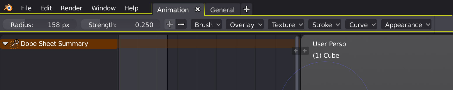
I really like the idea of workspaces in 2.8 but I’m finding it’s current implementation confusing especially when coming from another task (such as sculpting). The current tabs are visually designed to look as if they correspond with the settings of the top bar, when in fact they have no relationship whatsoever.
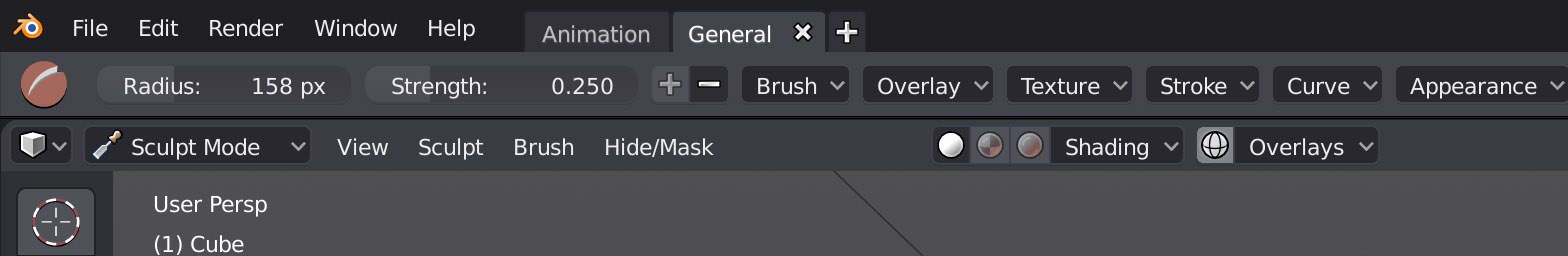
Moving from sculpt mode to then an animation workspace shows what I mean - even more confusing is the sculpt icon disappears but all of the other settings corresponding with the brush remain? If the icon is not necessary why repeat it in the general workspace - when a user selects a tool in the general workspace should it not be obvious that it is selected?
i jsut downloaded it and indeed its confusing. I also dont understand why the options for the tools appear on the top… the prior method at the bottom was bad as well, may be worse. I think a popout or popup is better. Horizontal layout is not reading nice.
I also find i very hard to find everything, they almost changed everything. Its not only new for new comers, but core users cant pick it up and just go with it. It takes quite some time to get used to.
The icons need a lot of work, they dont popout and distinguish themselves properly. They need a secundary color like the tool icons have
It is not the same thing as what it was when thread was created.
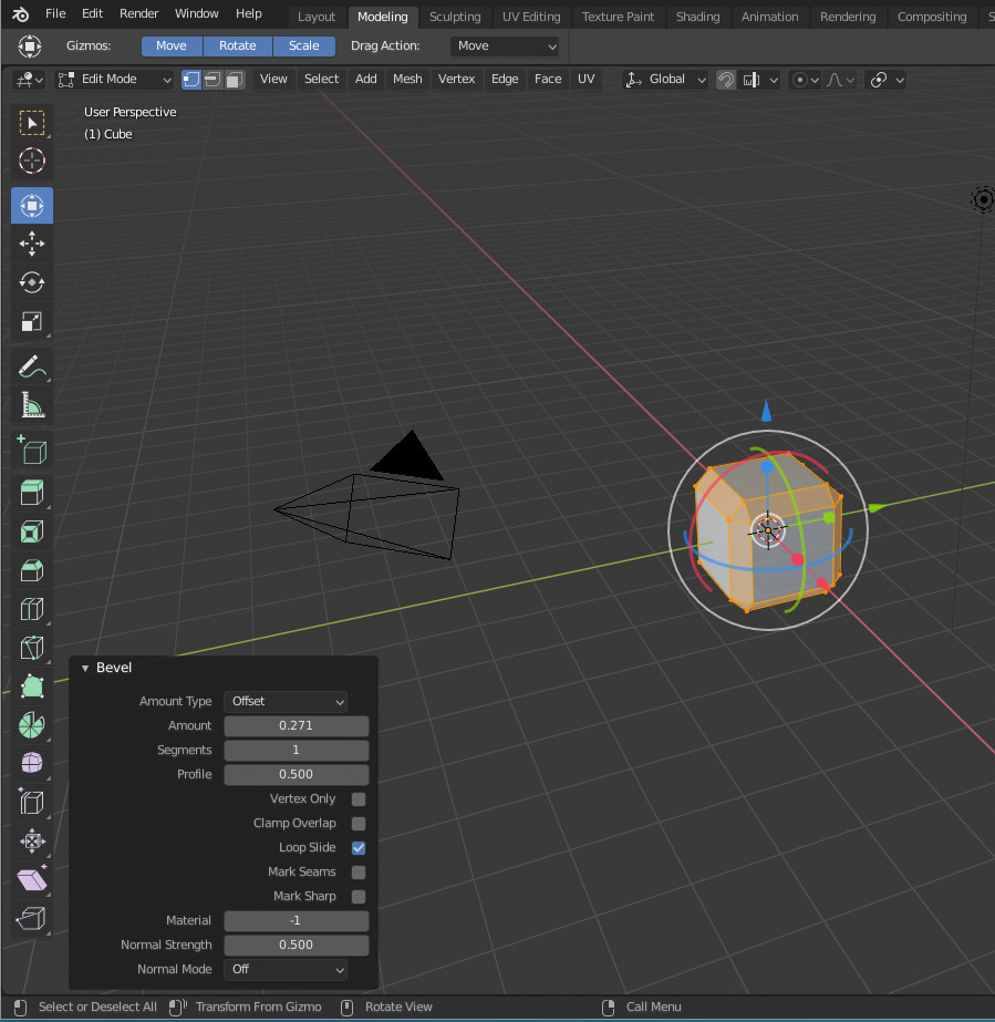
In Topbar, you have settings of active tool. The settings of tool corresponding to displayed gizmo.
At the bottom, you have settings of Last Operation. It can correspond to last operation done by using gizmo but also last operation called by using a shortcut (in that case, left bottom panel and Topbar are showing different settings).
Active tool may be Transform tool showing Move, Rotate, Scale buttons in Topbar. And at same time, last operation panel can refer to a bevel operation called by using Ctrl B.
Sorry but they dont are in line with the new tools icons. They work ofcourse better because they are bigger. But they have a second color, which makes identifying an icon easier and faster.
That horizontal menu is not useful, its hides all option and needs more clicking. I saw this video with Julien Kasper, he works with 2.80 for a year he stated and still hasnt adopted properly as i understood. He also sort of points out the issue with the horizontal tools menu. The fac that he mentioned that PIE MENU aadon is sort of him showing the flaws. See much easier it is when the settings are visible in a vertical method. All settings can be viewed at once, no need to click the menu first to see what settings are in there.
Also the weird alignment of the horizontal tool menu. Why are some settings all the way, almost hidden, to the right??? You hardly notice them there. Why does there need to be this bug gap??
This new workspace aproach also has its flaws. Now when you add a second “new main window”, this window will show the tools from the other workspace???
See when you set that second space to say sculpting, that the first window workspace gets sculpt tools while its in layout mode??
I agree that is not best choice. But it is not what was intended.
Stop talking about menus to qualify panels and popovers.
Take a look at 2.8 design proposal made months ago to adopt correct vocabulary.
I would like to have redo panel inside Active tool Workspace tab or a dedicated tab or N column.
I don’t understand how it can’t be obvious that is core part of UI for most of users.
I can’t understand why Campbell could close it as default.
But except that aberration, the rest of UI makes sense.
So please read William’s proposal and try to understand what he tried to do to be able to distinguish between new stuff from old stuff.
Because without understanding what is an active tool (new stuff) and what is redo panel(old stuff still there with another goal than new stuff), you would not be able to make useful bugreport.
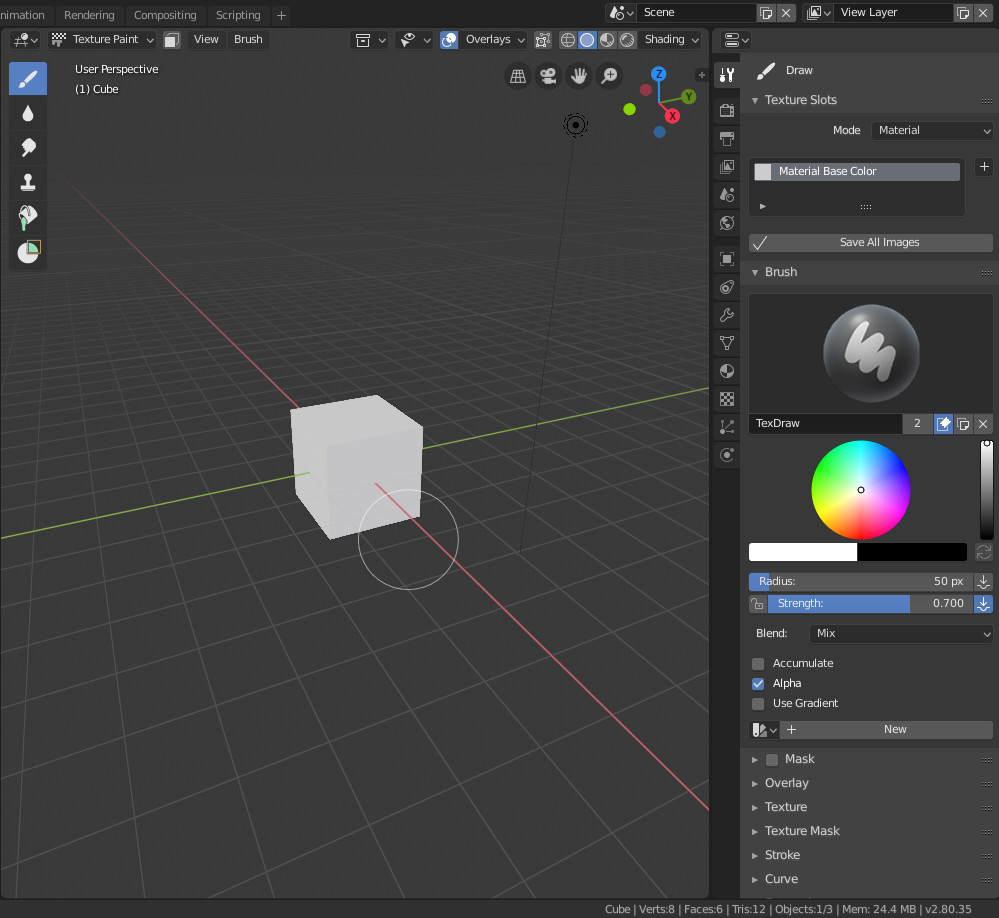
I have noticed that there are not showed to be chosen all the brushes in the Properties Editor, it only shows the current selected brush when you click there. Do you think that this is working correctly? How can I make it work like in 2.79?
That is the choice of categorization of brushes by tool. That is not a bug. That is an UI choice.
You only have access to brushes using same tool by clicking on brush selector under Brush panel.
But that is same behavior, if you are clicking on brush selector in Topbar.
I am against the idea of categorization of brushes by tool.
I am in favor of custom sets of brushes created and managed by user. And if a brush set is selected, all its brushes should be displayed in toolbar.
I don’t know if somebody will be able to provide an addon for that.
But now, you can’t make this part works like in 2.79 without asking to Campbell.
Ok, We are not being forced to use Top Bar, but then we are being forced to use Active Tools panel? (or whatever that panel is called when you are in a mode that uses brushes).
Not having all the brushes available when clicking there in that tab is not useful to me.
A brush is an active tool. It is button in toolbar in texture paint mode.
The settings of active tool which is a modal tool (you set settings of this tool before using it) are available in Topbar and in Active Tool settings Tab.
You may choose to change these settings under Topbar or Active Tool Settings tab or by calling a shortcut (F for brush size for example). You are not forced to use specifically one of them.
But you are forced to choose one of them.
The design doc has good points but the new design brought up more issues than it wanted to solve in the first place. This is a classic example of overthinking. It is fine, but they need to be willing to nurture this and cut the fat down.
For instance, my mouse pointer is always going from left to right, top to bottom to click things to get some action going in 2.8, thankfully I am a tablet user. However I have a large tablet so if you look at me from a distance while I am working, I might look like I am swinging a sword against some invisible enemy while working in 2.8
If you are a shading and rendering artist only you will love 2.8. If you do heavy modeling, sculpting well 2.8 can be a struggle interface wise.
I think that since codequest, most of issues have been solved, have a workaround or a solution as a todo task on d.b.o.
I would like to be able to move redo panel to the right of the screen.
The same way, I think that it should be possible to flip Topbar groups of settings (mode options to the left instead of current situation with mode options to the right).
But except that, you can still design your own workspace if default ones are not satisfying.
And there is ability to create shortcuts calling menus and pie-menus under mouse pointer.
This part is up to user. 2.79 have several bundled addons to enable pie-menus.
Currently, 2.8 have none.
To be fair, 2.8 UI is a step up for sure in general but in couple ways it is step backwards which just comes from overthinking it and overworking it which makes things look strict and boring, this happens in all areas of intellectual activity, be it visual arts or design.
All those icons spread like wild weeds in a garden in the 3d view is a result of overengineering in my view, I am naturally entitled to my own opinion. This issue is similar to assigning multiple modes to the left or right click based on how you set it up. Now I can either be in select mode or transform, or tweak, this is not organic it is very mechanical, if you need to use these modes constantly you might see how tiring it gets to constantly change the modes using the space bar. The UI has some of that feeling and tightness in my view.
I can modify and get rid of some of those bars etc, but the thing is it that then gets hard to find things, or get the functionality going at lest as of now.
You can get rid of Navigation gizmo. And you can close toolbar. The new addition of 2.8 will just be the group of popovers about display options on the right of header of 3D View.
I agree that if you are using Z pie-menu, the 5 icons about display modes could be one like in 2.79.
But in general, the use of icons instead of buttons with names is reducing space taken by theses buttons and freeing more space in 3DView.
The overlay render On/Off button is equivalent to the 2.79 render only option that was hidden inside the display panel inside N column.
In 2.8 with transfer of panels from N column to header popovers, main 3D View region is winning space.
Active tools of toolbar are modal. But if you set tools in a toolbar, they are forced to be modal.
I don’t know if you either tried to do a scale from toolbar in 2.79. You don’t have control on the origin of movement like when you are pressing S.
In 2.8, it is slower than pressing S (still available) but you don’t loose control of location of ignition of movement.
Most of shortcuts for modeling tools are same in 2.8.
If you want to access an active tool by using a shortcut, you can create such shortcut by using a right click menu over icon button. You are not forced to use spacebar for all of these active tools if you don’t want.
That is not supposed to be more difficult to find something in 2.8 than in 2.79.
Just take a breath. Relax and pay attention to menus items.
Menus are more numerous in 2.8, to be shorter and easier to read.