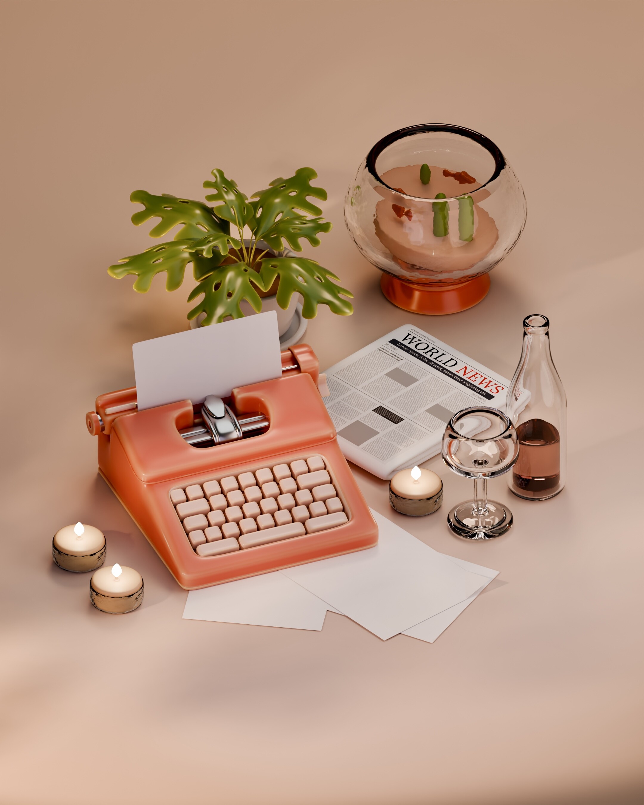
Splendid renders, I see different ideas implemented quite neatly
What I’d recommend:
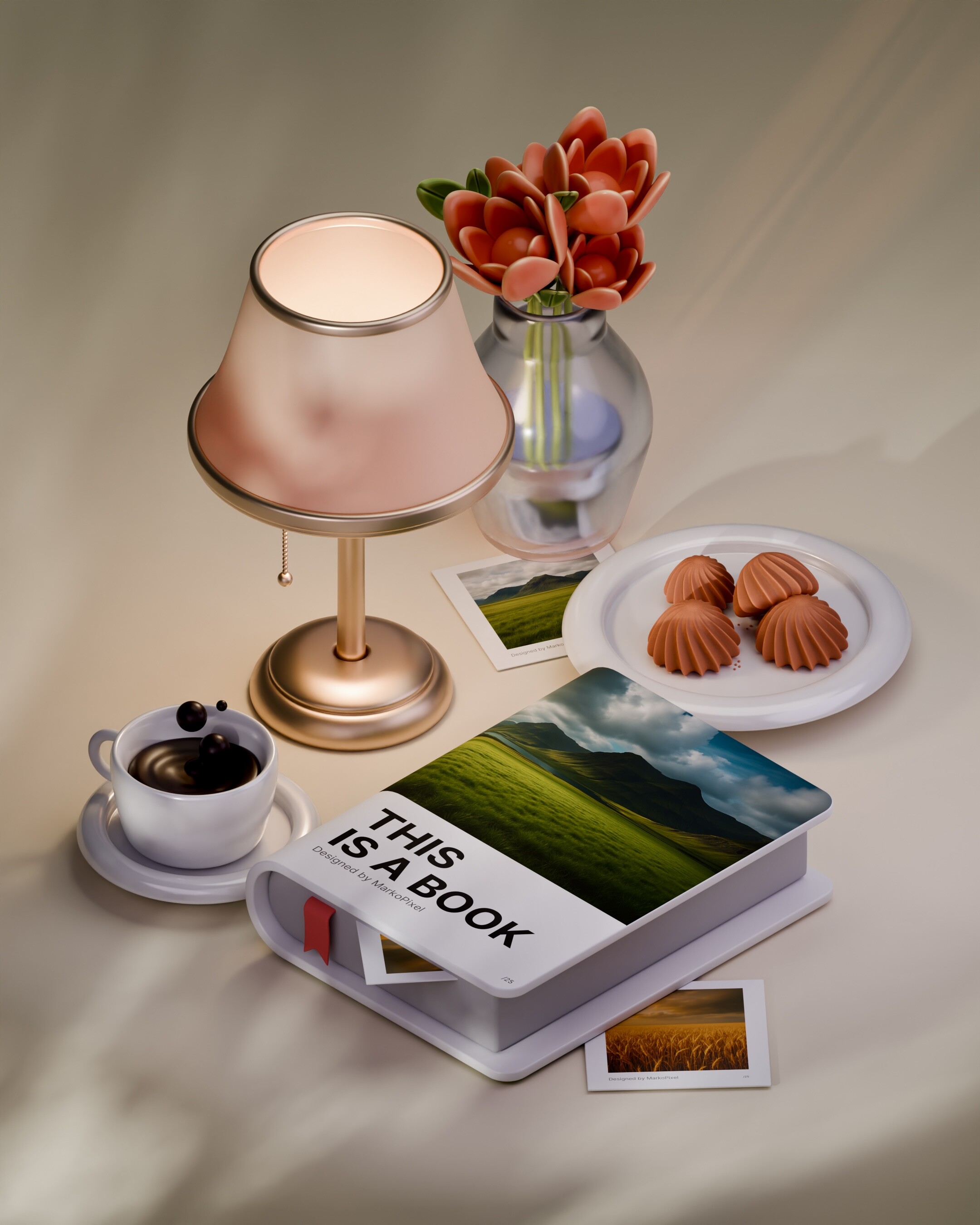
A bit higher contrast in each artwork + more variety in background colors. For example, an orange background would suit “Let me type that” more
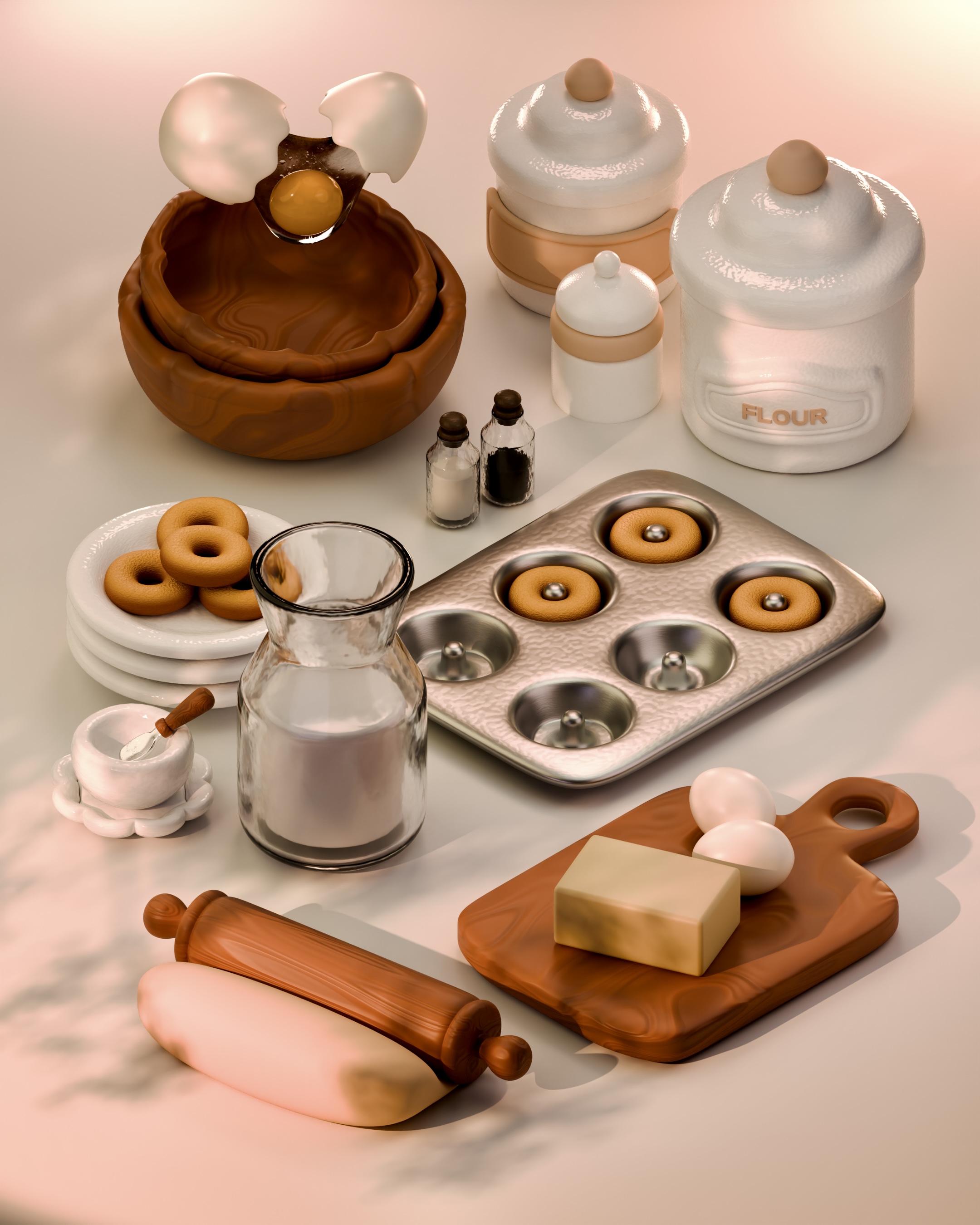
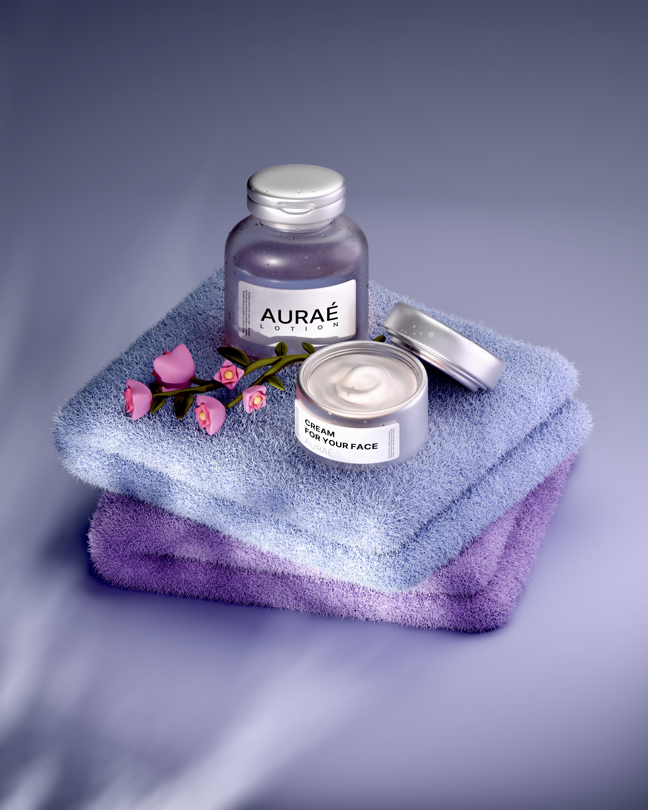
Organic objects could be done better. For example the butter on the “Bakery”, looks really solid and stiff, you could try cutting it in a more interesting shape. Donuts should feel fluffier and softer than bagels. Flowers on “Spa Set” look like they’re made of plasticine
The work is still spectacular, it’s a delight to see it, wishing you a gratifying journey in 3D!
 .
.