Hi.
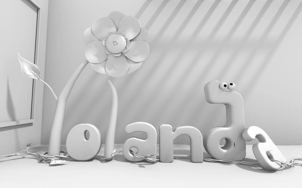
I’ve been married for a while now and thought I’d make my wife a pesonalised card with her name on it :eyebrowlift: …Not that she necessarily shares my enthusiasm about computers
After rendering with ambient occlusion I realised I like the greyscale more than color! I’m not that good at texturing yet anyway.
What do you think? Grey / color…
And what about modelling? Anything else I could add… It feels like it’s almost a bit… empty still…
Any comments / suggestions welcome. Thanks in advance
It’s a sweet idea! I’m sure she’d rather you spend time with her, but the thought is very nice.
I couldn’t read it at first, I think the twig with leaf needs to be thickened, and the A needs to be less tilted. Legibility above all. Also, girls really like colors, take this as an opportunity to learn textures. Just keep the spec low. Maybe the letters are the only thing that need color.
@3dementia… Your probably right about spending time :)… Now who says blender artists can’t give advice about romance ha ha!
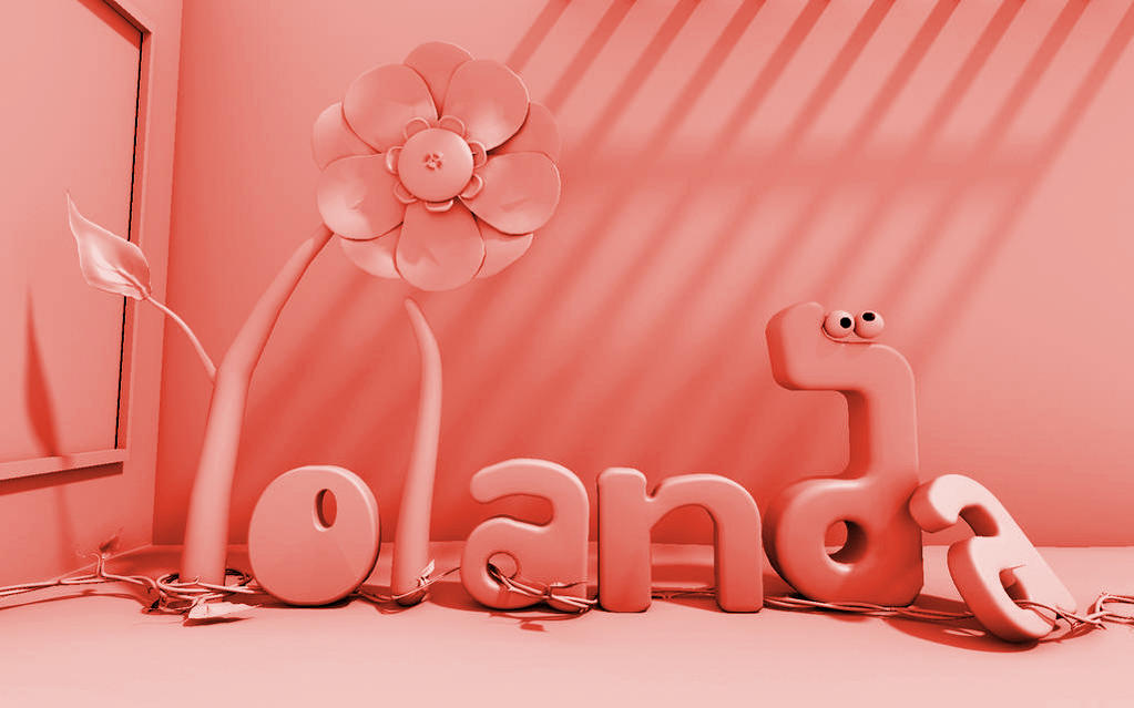
I get what you’re saying about the color. I’ll see what I can do.
@a5… okay your response made me think about a saying I’ve heard… “if someone has to ask what it is… is the art good?” the thread is actually a vine running between the letters. I suppose color would’ve made that more noticeable… I’ll see if i can put more detail into that to make it more obvious. I think the floor is too empty… too much open space… and yes… perhaps that’s the feeling that grayscales gives. perhaps color will solve this issue.
@Zeffi… No it’s just that… I thought this year I wanted to make her a … er… handmade… card :). The snail (or d) / flower combo is typical of her personality… So I thought I’d bring it into the picture.
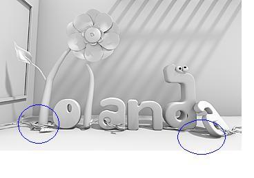
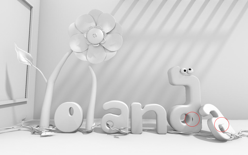
i marked two places on your image think you need to merge some verts and push em around
remember you don’t need to do the whole thing in colour, you can do a highlight of one object, like the name … or each letter… or the vine… or the petals… or the window,


 :)… Now who says blender artists can’t give advice about romance ha ha!