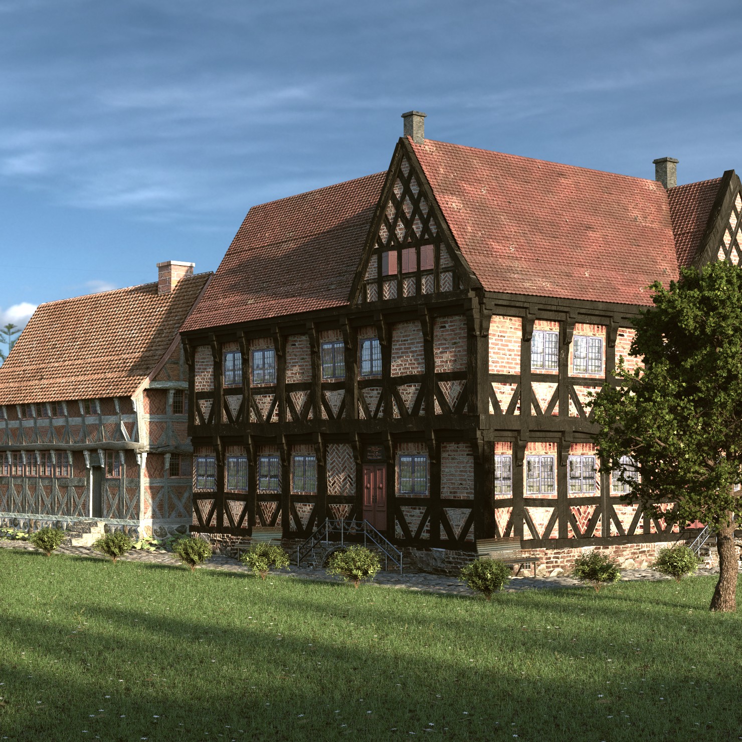
I uploaded it before, but I think it should be finished now. However, I do need constructive criticism on this one.
Why does it not look photoreal to me? I can’t really point it out what specifically makes it unrealistic. But it just doesn’t feel right compared to photoreal settings
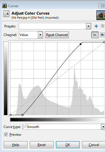
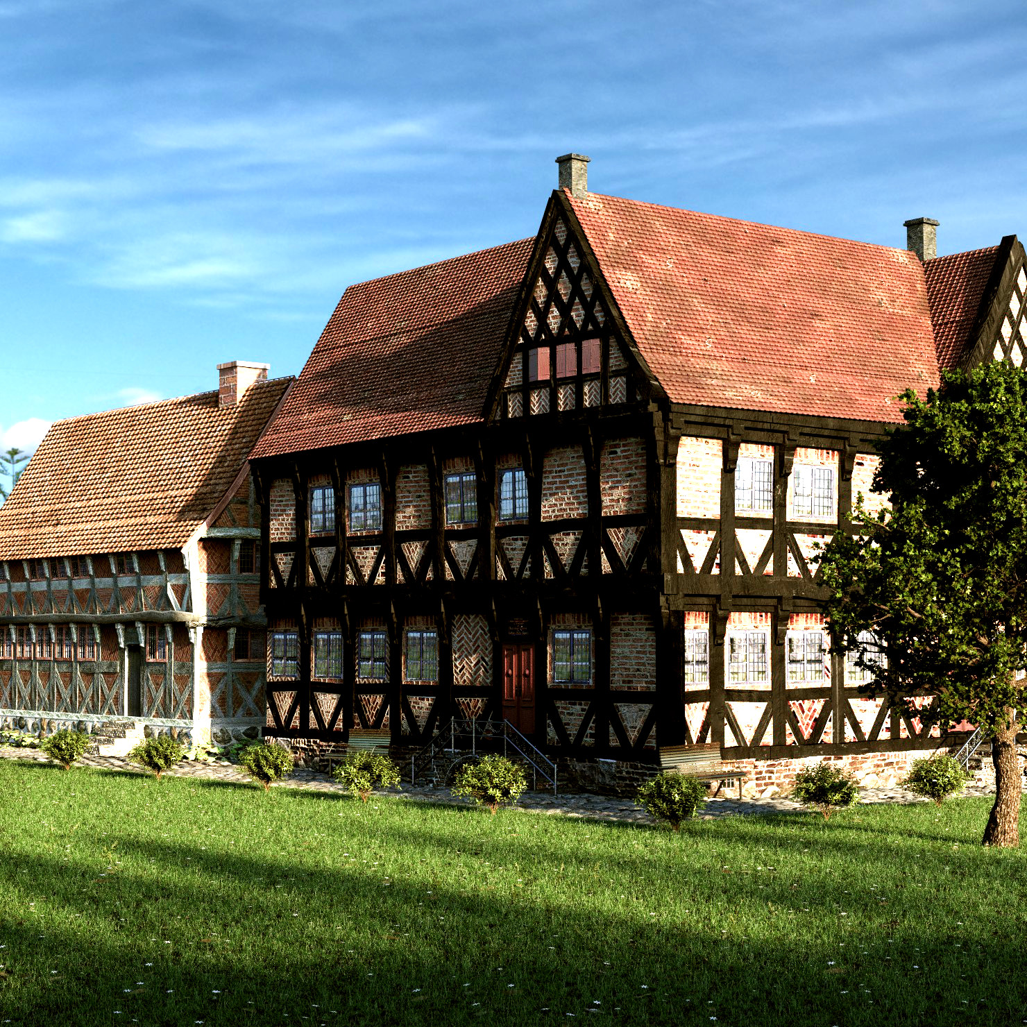
EDIT: Dit a little change to the compositor, not the render itself:
Well the one with the darkest wood must to have less saturation on the wood and the other must to have a darker color on the wood too, thats what I think. The tiles are too perfectly accommodated, You can make some changes on them.
What’s become of this? I thought it was sensational! I’d add some variation to the color of the grass - I know it’s supposed to be well kept but different tones still find their way in. This is a really well-earned good work!
Thanks. I didn’t think about that, that the grass needs different tones. Next time I make something with grass in, I will try and incorporate more different types of grass.
I really love this image, the detail and just feeling of it is fantastic. i took the liberty of just adusting the curves a tiny bit though just to give it a bit more kick, it’s more to my personal taste though, on a very non calibrated screen.
Only critique is perhaps it could use a person or to hidden sublity away in there, and maybe add a lattice modifier to the roof to give it a bit of sag etc so it’s not quite so perfect.
here’s curve edit and adjusted image.
I think it’s the sky/clouds. I don’t know, it’s like they’re painted on a single plane in the air at a skewed angle, if you know what I mean? They just don’t look right?