hey everyone.
Im currently doing a parody in blender of the MakePovertyHistory campaign called ‘click’ seen here - http://www.youtube.com/watch?v=3mJU58A9SNc and ive done a few test renders and put them in black and white:
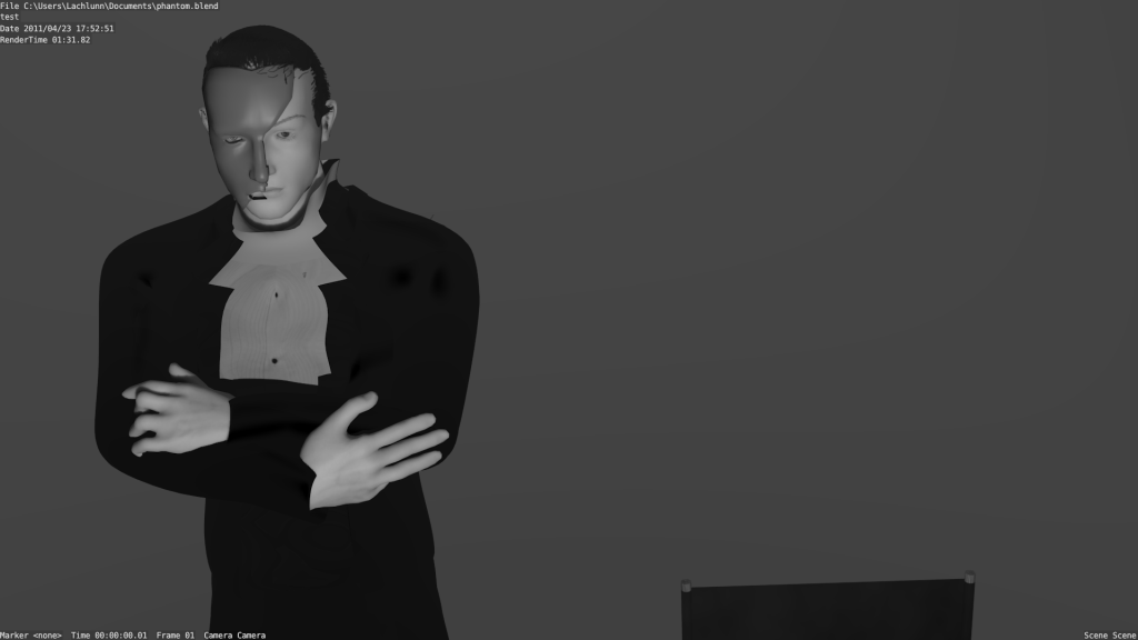
and
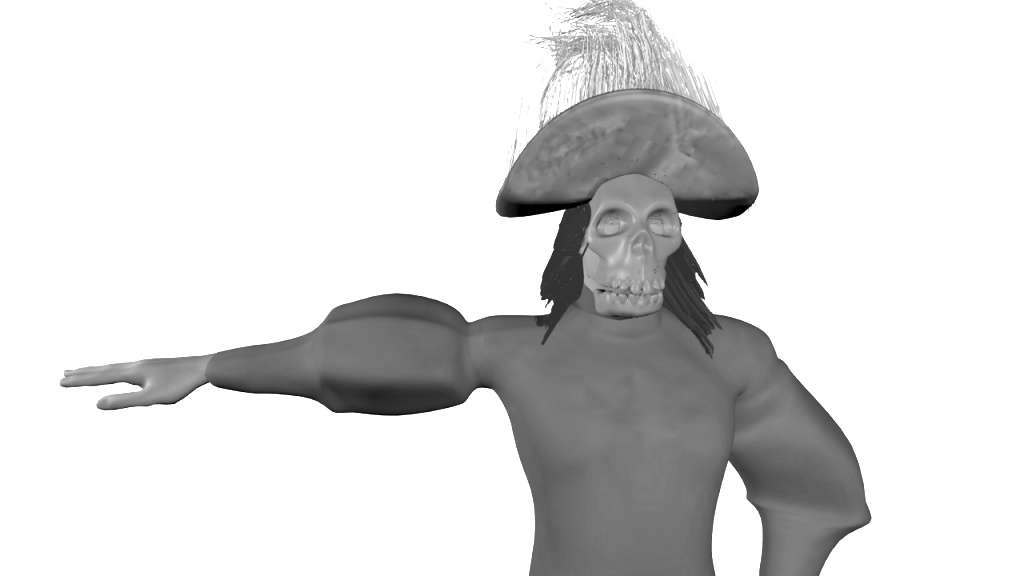
Now im currently tossing and turning between keeping it in colour and adding a little more detail and going for black and white and adding all the detail that it would require to stand out.
my question is, for the purpose of the video and the joke, is it better to go with the B&W or stay colour (bearing in mind that my ideal completion time is one month)?
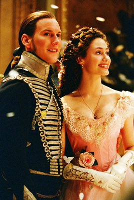
also here are some reference photographs for the characters i will be doing:

http://www.twotsi.com/pdata/APP-1281259412-phantom-of-the-opera.jpg