An interior. Thinking about interior design.
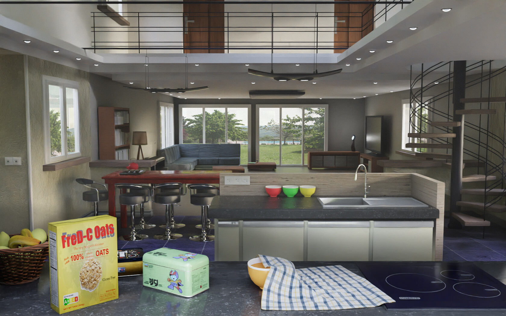
But there are many small modeling difficulties to overcome (the wicker basket, the staircase, the tea towel having to “fall” in a realistic way…). Lots of problems for the entry of light supposedly coming from the outside. We can also ask ourselves the question of the situation, for such a shot: because if it were a photograph, the camera would have to be located either behind a window, or behind/in front of a wall, for such a composition: weird? So I cheated a little.
The two large, long, flat fixtures are from Evermotion Archmodels, if I remember correctly.
The small green box is Korean: it is an existing metal box.
The third box hidden behind, between the two boxes, is a free model downloaded from the internet: I took the liberty of slipping it there, because it is almost hidden.
I rack my brain too often over details that will be invisible from afar : a beginner’s mistake.
Anyway, that’s what. Nothing special.
I would say this is a good start overall. The far objects seem decently realistic, though a real room would probably be a bit more cluttered.
The main issue I see is the camera placement. It gives a weird effect with the counter top in the foreground, like the room keeps going behind it. Also, the angle makes it look a bit like it’s part of the floor and the objects on it are huge objects that are placed on the floor.
Thanks.
-
“The main issue I see is the camera placement”: yes!
 It was a real problem. As usual, I left without preparation, then, having advanced too far, I no longer had the courage to start again: I had to tinker in the end. This image must be more or less part of my first 5 completed projects, so I still had a lot to learn while doing it. You are right.
 -
“The angle makes it look a bit like it’s part of the floor and the objects on it are huge objects that are placed on the floor”: I didn’t quite understand. Can you tell me this “angle”: is it the “shooting angle”? It’s related to the “counter” (logical link): my low level of English/American language is to blame. I can’t see in the image what I think I understand from your indication.
I was a little disturbed by the rendering of the chrome legs of the high chairs: it’s weird. A bit as if they were floating in the air without touching solid concrete ground (…)
However [pardon for the heaviness of the considerations which will follow], on this last point, I skimmed the comments of the section
- “Blender 4.x Cycles Photorealism Improvements…still not quite there for me”
Where I understand that certain rendering problems are questioned by the pros, on points of detail which can - also - come from the software technology specific to Blender.
~ ~ ~
I mean that the surface right in front of the camera is perfectly aligned with the floor behind it, has a similar color and brightness to the floor and the transition line is mostly hidden by the boxes, so it seems like it’s a continuous surface with the floor.
I think it’s because of a few things:
-
The soft lighting that doesn’t create visible shadows.
-
The floor has high roughness but the metal is very reflective, this creates a jarring effect. If the floor was even a bit reflective, it would look more connected to the metal.
-
The tiles seem very large. Have you measured them? Do they have a realistic size?
Yes, that is true.
Often, viewers will find a render more realistic if you imitate camera imperfections (color grading, lens distortion, glare, depth of field etc.). Or sometimes people will base their views of what’s realistic on movies and the way they do their esthetic.
Familiarity is as important as real world accuracy for an image to look pleasing.
Merci / Thanks.
I only measured the slabs based on intuition. Now that you’ve drawn my attention to them, I see that their joints themselves appear too wide, another sign that they are a little too big, indeed.
“If the floor was even a little reflective, it would look more connected to the metal.” : that’s an interesting reasoning, I wouldn’t have thought of it. However, I preferentially wanted a rough floor. It’s not that serious.
Right now I don’t have much motivation to make another modified render for this image. Time will do its work.
Thank you for your interest and good times to you.