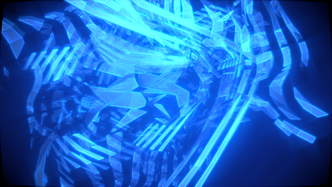
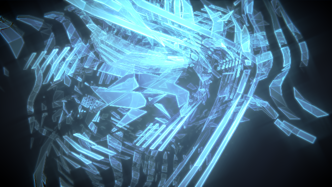
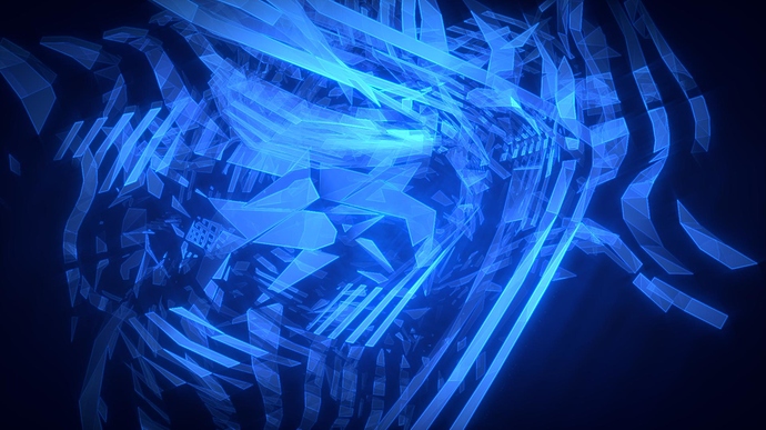
My results from a tutorial on how to make abstract art.
What do you think?
From which tutorial ?
I think it’s a very nice render but you should darken the corners of your image(a vignette effect) . And maybe it’s too blury… You should also increase a bit the emision value of your material.
Agree with the vignette comment.
Personally for me, it’s too busy. Too much overlaps, and while abstract art isn’t supposed to show a clear image usually, it helps if it is at least distinguishable enough for the viewer to pick out some kind of image. I consider looking at abstract something like looking at clouds, trying to find images where they don’t exist. Like an imaginative Rorschach test. This is just too much, your brain gives up after awhile.
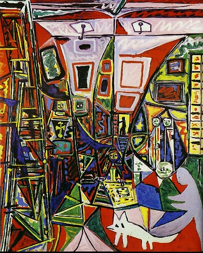
Ok thanks for the advice. But 1st of all you just cant turn up the emission, sure you can but that wont get the effect your thinking of. 2nd of all abstract art is really up to the eye of the beholder, different people have different perspectives and beliefs about it. I personally compare my work with some thing like this:
For me my picture doesn’t make my mind give up but this does. Sure there is an actual picture in there with a fox/dog/whatever. but for me this is even crazier than my thing. And technically if Picasso (a famous painter) can get away with painting stuff that makes your mind give up than I don’t know why I cant try also.
sorry thats just the way I see it right now.
Ok, you’re in right to do what you want, but if you “refuse” some help, why do you post your work?
I understand that you think it’s good enough for you. But for other people like me and mrmagician, your render is not perfect ! If you just make the vigneteeffect, that will already look a lot better. And you should also add a little lens distortion effect.
Hope this help:o
Okay, maybe I didn’t really convey what I was trying to say properly. Yes, the picasso is confusing to the eye, but it has a focal point to focus on. Larger objects on the edges, smaller in the middle. Yours has pretty much no such organization, making it hard to even focus on. Maybe if all the shapes were geometric, no curved sections. Or even if you just removed some layers, so that the brightness was more uniform.
Sorry about that not the best day in the world when I posted that:no:. What about this better/worse? 
It’s worse due to a wrong setting.You should make the value of the lens distorsion to an negative value and check “fit”. And also increase a little the dispersion value (not too much).
You can also increase (a lot more) the vignette effect.
Can you show us a sceenshot of your compositing node tree ?

Ok im hoping this ones better. iv been messing around with the color correction also. For some reason this 1 seams a bit more blurry. :Z
Can i see your nodes tree ?
It’s better but the vignete isn’t that good… Show me your compositing node tree and then i’ll give you more advices and i’ll guide you through.
You can also increase the lens distortion a bit… And you can also use the same lens distortion as a mask to mix the original render with the lens distortionned render. That will blur the corners of the image, and lens distort the corners too, but the middle part will not be blured. Because, you know, lens distortion is good but it blur also the center of the image. By adding this effect only to the corners(use mask), it will look like previously, but it’ll not be blured like in your 3rd render…
Hope you will understand what i mean…
The third one is a lot better than the first two. The outline on the shapes really helps with their definition. I like this quite a bit now, almost looks like broken glass in a Tron world. I’ll defer to heol on the camera effects, I haven’t worked with camera settings enough to be of much additional help in that respect.
No offense to heol, but I would scrap the vignette and lens distortion effects. They are way overplayed and abused, and here they really won’t do anything to enhance the picture. I have to agree with mrmagician when he said “Personally for me, it’s too busy. Too much overlaps, and while abstract art isn’t supposed to show a clear image usually, it helps if it is at least distinguishable enough for the viewer to pick out some kind of image”. Very true.
The first thing that I would fix is where the big blast of light is, right now it’s at the top of the frame. I’m not a big fan of art that grabs the viewer’s eye and throws it to a corner or top or bottom. Even though it’s abstract, it still needs some sort of focal point. Not sure why you are playing with color correction either, there’s not enough going on here for that to have an effect, especially with only one color.  One thing you could do is change the camera focal length to 20 or something, then zoom in, that will really wack out the perspective. I use that trick all the time when I have some abstract piece just floating in space like this one. But, get out of the nodes, they are not the answer here. Fix the picture first before adding effects.
I think that the subtle vignette in the 3rd image is pretty fitting for this, just not more than that. And I think the trick @VickyM72 mentioned with the focal length could do wonders.
Most successful abstract painters do very quaint, very subtle changes in their coloring while working. And it is abstract only in the fact it is not traditional [as in its not exactly what one would expect as a tree] but does follow a basic design, some of Picasso’s best works are abstract portraits or mockeries of still life.
I was painting long before I even considered digital artwork.
As for your work, what exactly are you trying to “abstract” paint?? If you can’t answer that, then I am sorry to say from a painter’s prospective you’re not painting. Most good painters have an idea, even the slightest, in their “mind’s eye” as to what they are wanting to achieve [my apple barrel demo for example, took me all day to get the lighting and shadows exactly to what I wanted while the modeling took 30 minutes]. As it is you’ve got a bunch of lines that in the brightened one really do hurt the eye as I had to squint against the glare.
Other than that, and no intention to be rude as I am looking at your work from an artist prospective, until you figure out what exactly you’re abstracting I don’t think altering the compositing is going to help you. It’s far too random.
Nice rendering!
wow im gone for 24 hours and I get 6 replies! ok 1 at a time:
-heol:[ATTACH=CONFIG]250602[/ATTACH] sorry but I kind of got lost in your explanation. I haven’t really played around with distort nodes/camera settings very much so you got me confused.
-mrmagician: Thanks
-ZickyM72: I dont know taking off the corners, at least from my perspective kind of helps. (Ill talk about randomness at the end.) A good amount of that light is on the line for rule of thirds and it seams almost parallel to the golden triangle. As for color correction I knew i wouldn’t be getting the look I wanted without it, here’s an example:
(without color correction.) With color correction it gives me a larger range of colors (technically there is more than 1 color but they are all blue) instead of only 1 color and many shades (lights and darks) of that color. Ill work with the camera that I totally agree with you on. But since I have a broader knowledge in the area of nodes naturally I started there.
-mrmagician: thanks once again 
-TheBlackCat: I wasn’t necessarily shooting for a painting look on this 1, after all it is digital art. The Picasso painting was to prove my point that abstract art could be very random. And I don’t think that I want to be painting with blender for this project if thats what your implying, so yes im not painting;).
As for my view of abstract art like I said earlier I believe its in the eye of the beholder. Its up to them to decide what your trying to depict in the art. You could name a piece of art “house” and you could put a house in the picture but maybe that’s not what others see in the picture, it might influence what they see but no body will get the exact same understanding of the art as anyone else. I could be totally off about what I think abstract art is, but that’s what iv always thought abstract art was about.
tahnk-thanks its appreciated.
Now about that randomness. It is so random because of the way its created. I’m pretty sure its obvious that I created it with meshes but its not that simple at this point to change it or get rid of stuff. The easiest way to get less randomness would be to start all over again and I dont really want to do that, I kind of like this 1.
I hope I covered all of the questions/critiques. Please let me know if I missed something or if you have a further explanation for me. especially about the nodes heol.
So, for the nodes … you can forget the lens distortion if you want, Because after reflection, I do not think That this effect perfectly fit the scene … So you can delete the lens distortion node and the last mix node as well … Actually, there is a better way to make the vignette effect …
1 - add an Elipse mask
2 - play with the values to make it a little smaller than the picture
3- add a blur node (you can blur a lot: fast gaussian,relative, X and Y, and a X and Y value at something like 20 or higher as you prefer … (I recommend you to blur a lot)
4-Add a mix node
5-Mix a blue-black color (darker) with the original picture
6 - Connect the factor imput of the mix node to the blured mask you done just before
7- if the effect is too much, you can decrease it by mixing the blured mask with a white color
8 - you’re done!
I hope you understand
Oh wow thats a lot easier than the way I originally had done it and a lot better result I think. Thanks!:yes:
You’re welcome!
If you need any other advice or help, don’t hesitate
PS : i definitevely like your render:)


