What is the house made of? If I may ask. It looks very grainy. I don’t understand if it is the cycles render sampling or the material of the walls are wheat-ish, but that would be my only question. Other than that, good job  especially the rendering. I thought it wasan external rendering program that you used that made it look so much better. Any compositing done to it or no ?
Very nice! For me the problem is illumination, my first advice would have been to remove the sun from the horizon as it seems too intense for how low it is, but I noticed you did that already. Personally what should be lighting the majority of the scene is the gas giant, just in the way our moon casts a blueish glow on the Earth at night, the gas giant in your render should be casting a purple glow on the field especially since it is such a large object in the sky. I prefer the image without colour correction, what I would try would be to change the colour of whatever lamp you are using to a purple tint so the light cast on the field matches the planet, that way you can blend all the elements together without having to rely too much on colour correction, but instead some simply compositing to finish it off without changing too many colours.
It is grainy because of the low amount samples. The image below is rendered at 1000 samples (the previous was 100). Also yes a lot of compositing.
[/QUOTE]
Great advice! I’ll look into it.
The house is really starting to take shape. Still no materials.

It seems to me that the purple highlights of colour ( second picture without colour correction) are clashing with the colours around the scene, making it look not quite right. perhaps altering the colours of the nebula in the background might help this to be easier on the eye, other than that i like this, it’s a very interesting scene.
That’s vertigo dude. lol
Seriously though, can you do a render of the horizon & house level just for me and ronin?
Fiiiine! I guess I can show my progress as well then.
Tilted version:
Level version:
I like the level version because it accents the slight hill in the background. And the main planet with the rings seems to close, the distortion of it makes it look like it is so close that gravity and all sorts of stuff would be messed up, so maybe make it larger and farther away? It might mess up the composition if it is moved though.
It is a pretty crucial part of the image. This image is not meant to be realistic it is meant to be abstract, so the laws of nature don’t necessarily apply. Also you can’t tell how close it is by the distortion, the only distortion is because of the wide angle camera.
I JUST HAD A REVELATION! Deafeater905 and roninzero are both completely right! The tilted version is stupid, and looks retarded (excuse my language) so I’m scrapping it. I’m also going to make the horizon completely level.
Interesting picture, I think there is a lot of potential here. I actually prefer the landscape version, I think it’s a better foundation upon which to design your image.
I think what would make this more coherent would be if you could sketch where you wanted the eye to move when someone looks at the picture. Think long sweeping lines, curves, focusing eventually on a certain feature. The wheat in the field is a great opportunity to comb in some patterns that lead the eye the way you want it to - it will almost be how master painters use particular brush strokes to create texture within the painting. Right now I look at the picture and my vision wanders off either to the left or to the right, it’s not really drawn to any of the major features. The rings on the planet actually lead my eye right off the picture past the house. Try and create a design with you components so that they are meaningfully interacting. Elements that are placed close together (but not touching), are still mentally grouped when we view the whole picture, so you can hide patterns and create unity among certain parts of your image. You may need to sacrifice one or more of your features if you are unable to make them work together.
Wow that’s great! I might have to a bit of research on that to get it right, but if I do it would be pretty cool.
I am referring to how the rings appear much larger on the close side than on the far side, this might be what you want but if you make the planet farther away and larger it would make it look bigger and more realistic.
Well it wouldn’t really look different if it was farther away but bigger to compensate.
one night i had a dream. i woke up ( into the dream) and the sky was completely full of floating planets, really close and really big. i love planets, so i love really much the scene! it has a very interesting lighting, and there’s a nice lonely feeling. my suggestion is that you could bring some motion to the tree also; i can see the direction the wheat takes is given by the wind right? it feels strange the tree isn’t affected by it. really great feeling on this scene! apologize my english, i’m italian!
Don’t worry about your English it’s fine. And good idea with the tree as well didn’t think about that actually ![]()

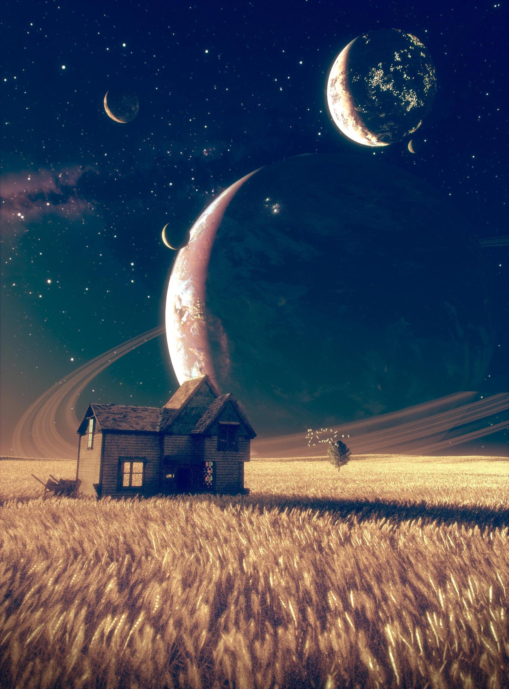
Looks good. I think the birds distract from the focus. However, I think you can minimize this by spreading the flock over a larger distance. I really like this.
even better you could add some other tree…maybe 2 or 3. looking good though!
In the latest picture I didn’t make the tree bend in the wind though, because this was rendered before your suggestion. It will be fixed in the next update ![]()
I don’t know man the planet with the lights just seems awkward and out of place no matter where I put it. Do I remove it, or is it salvageable? Matt I need you!