well i’ve recently tried my hand at acrylics… here are some that i’ve done so far… i’m still a noob, but would appreciate any criticism…


The lady is great! the other two are not bad. My advice would be to take time and work hard on detailing
It seems you like high contrast, good!
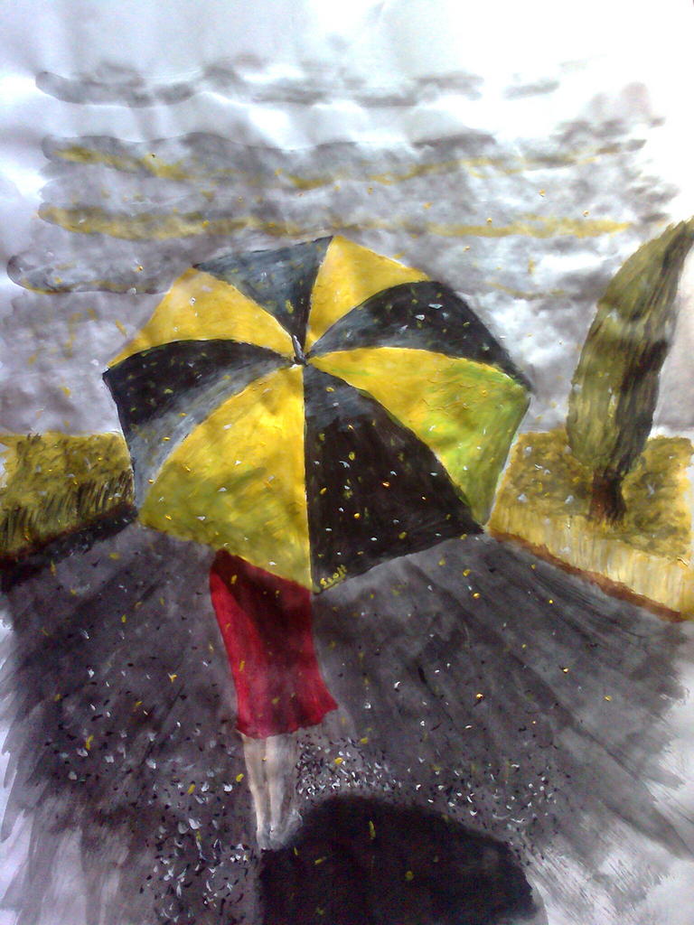
The lady has a good sense of balance of whites and blacks the eyes are very expressive I wonder what shes thinking or longing for, tells a whole story there,
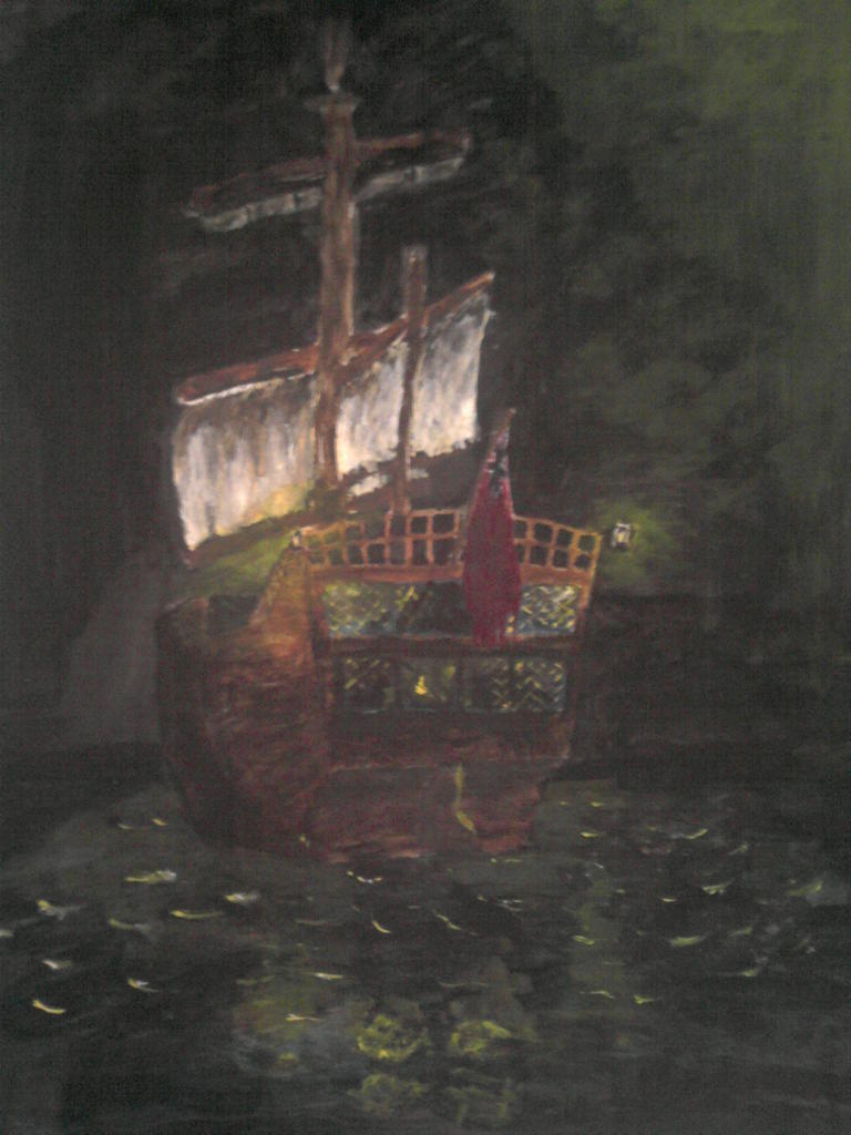
The vessel could use be a little more light on the lights so the contrast is better. But is also very well done.
The man, the eyes are also expressive, I really loved the reddish portion of them, It´s like he doesn´t want to see what he is seeing, my personal interpretation of course. A very subtle smile-grin makes me wonder what he is up to. 
Just work a little in more light to subdue the dark atmospheres, without taking away the dark themes. makes sense at all ? hope so.
Me likes!!!
Try to title them, it works for making observer´s imagination run wild!!!

thanks for the input. i do go for high contrast… it grabs your eye better… but ya, haha, you put a lot more meaning into them than i do… i’m not particularly right brained, unfortunately, so i can’t imagine such things… well i shall certainly work on the contrast of the ship picture… ya, names aren’t my strong point
 i have to admit, though, the man in the shadows was a rushed job… i just put down a coat of burnt umbar and then added black to the dark areas and then a tiny bit of red/yellow ochre to the eyes with a spot of white for the… shiny bits lol… well thanks again for the criticism. i’m starting on a street scene
Edit: all pictures are A2
A great resource is http://gurneyjourney.blogspot.com/ I have the Color and Light book, and if you want to paint, it’s pretty comprehensive, yet accessible. For crits, pay attention to the light source more, your noses aren’t catching much, but considering they protrude the most can add the most depth.
With acrylics, a technical aspect to really pay attention to is to keep the paint wet as much as possible short of turning it into watercolor, I keep a spray bottle of water next to me, two 20 oz cups of water for washing and wetting, and a few rags for quick wipes and brush cleaning. Using a soft sable-style brush helps with blending two tones together. Also, a very good thing to do is to premix your tones before you put down the large areas side by side to blend them, as acrylic tends to muddy up once you begin blending a lot. Sometimes I put a base color down, and then water down the other color to overlay it on top of the other.
If you like to paint stuff with a lot of black, consider mixing some reds.yellows and browns with black for foreground, and blues and greens with black for background/receding zones. It helps distinguish the black even though it doesn’t have to be completely another color.
Good work so far, every piece is an opportunity to learn for the next. Keep up the work!
Thanks for the thesis i must say, the mixing of the black is something which, i would imagine, would add a lot to a painting and i’ll definitely take your advice on that one… i do use my acrylics rather thin (apart from anything else, because i’m cheap(: ) but in some of my paintings (such as the ship) i added quite a number of layers, so it does look rather thick… the light and reflections and small details i used rather thickly, though… i saw someone with spray bottles next to their paint and had no idea what it was for, lol… i thought perhaps it was paint… yup… i’m a noob
well this is one i did yesterday and today… i didn’t continue with the street scene as i messed it up rather badly… and wasn’t really amped to fix it…
looking good, I like the contrasting values in the second one on the top. It looks like your paper is distorting from the moisture on the lower one. I would reccomend using a piece of masonite and painting it with gesso as a base. You can also use thick watercolor paper, but even that will warp.
thanks Modron. unfortunately finances are a bit of an issue, so i use whatever i can get my hands on… i found an A2 sketchbook in the store cupboard and i’ve been using that but, as you say, it does warp somewhat…
well i’ve started on a ‘painting within a painting within a painting’… atm it looks more like two mirrors facing each other, but i’ll fix that… well i’ve attached the initial sketch and my progress by last night… i won’t be able to work on it any further until this evening, though, as i’m working at a film studio during the day…
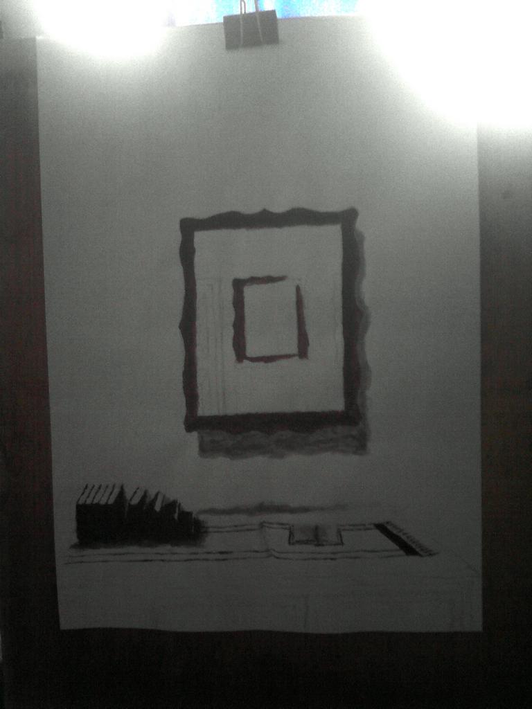
edit: apologise for the poor quality phone camera…
Perhaps you can use some plastic sheeting, something more rigid but cheap to get ahold of. I used a 4’ x 8’ piece of paneling from the hardware store that I coated with a layer of Kilz stain blocker, then used spray paint to block in my base colors. For studies you are right, it is just about using what you can get your hands on, but Modron is right - you need something that can handle the moisture and not throw you off track with warping. Even using a cold press illustration board would probably be better with the water amount to some extent.
well firstly, the result of the painting i started on monday:

but ya, thanks for the advice regarding materials. i’ve managed to make a fairly sturdy canvas out of calico and some wood with some relatively stiff plastic and drawing pins to fasten everything… it cost a total of about R2.50 (about 25 pence) so i’m quite happy with it… it’s slightly larger than an A3, but not much… when i have the time i’ll make a larger one, though.


well here’s what i’ve done on my home made canvas thus far… i must say, you guys are so right about painting on paper… i don’t believe i shall ever do so again…

Well, once you break into watercolor, then you can go back to using a kind of paper Looking good so far!
i used water colours a while back… not particularly successfully, though… it was my first use of colour. up until that point i had only done pencil drawings… this is one that i did


I’m trying to do a kind of ‘sequel’ to my last painting… i still need to do the lower window and the cvines/creepers

Very good tree. I’ve only once ever been able to draw a tree and it was only sort of good.