Loop Cut (Active Tool version) received some improvements. It works in a click->slide->release gesture. Since it’s effectively a single button press it makes it graphic tablet friendly (gif was done with graphic tablet for example).
Loopcut is working in a single click.
I was wondering how the left click would be efficient with multicuts already slided.
Campbell added multicut setting today.
Unfortunately, preview is not working, yet. And there is no improvement of the tool in that area.
I would like to be able to slide 2 cuts in opposite directions.
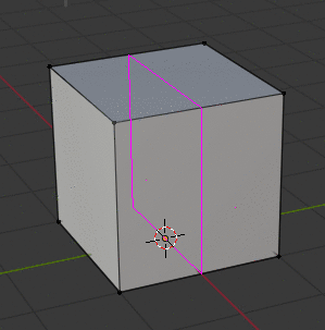
Imagine that you want to double edges at the caps of a cylinder. For this kind of cases, it would be fast to just do one multicut loopcut with cuts at both tips of edges.
There is a need for icons for future toolbars of other editors.
They will have to produce a lot of them.
Previous ones were nicer with shadowing but it took time to fix readability of most of them.
I think that they want to avoid to take too much time making future icons of other toolbars.
So, they move them to a simpler look.
I can live with that, they are not so bad… But the rest looks cheap/flat/mobile like… They are trading uniqueness in favour of this trendy generic look, which is bad.
Could you show me how this looks on a light theme?
@zeauro
If there are technical limitation reasons for those changes, then it’s ok, otherwise we are doomed… (look at what is happening with the workspaces )
But yeah… i’m not liking it either. I’m too used to old program buttons that were more descriptive of the action and less flat. the whole mono/material/“f*ck depth shading and contours” doesn’t sit well with me.
Might be a generation thing. I grew with the windows XP/Iphone 3/4 style icons, that were very detailed and full of nuances.
Do this specific area (user interface) has a document with all the guidelines, objectives and design philosophy?