Thanks, I know. But it is by practicing with defaults that we can detect lacks.
If right-click menu is the default way to expose it for headers ; a new user should discover the same way that he can move toolbar, too.
So what’s preventing you from doing so?
Basically everyone wants that.
1 Like
the bug tracker is not open yet for these kind of “bugs” or missing options only for crashes i think…personally i thought these little missing ones will be added later since the devs are focusing more on completing the big features especially the UI…etc, and if in the beta and were forgotten then i think either me or someone else will mention them if the devs didn’t port them and we are way far from official release yet 
Brushes now categorized as tools. Basis of this design task. Not really much to show yet, though.
https://developer.blender.org/rBac8d7873278c47e8e282b7f83888108e2720a451
Without quick acess, that sucks. That is not 1 brush = 1 button.
It is probably simpler for developers to have one brush active per tool.
But for users, it means 2 clicks per brush switch.
It is stupidly lowering UI speed for the most basic step of painting workflow.
3 Likes
Maybe we could have an option to pin the brush, so it keeps the same brush for everything. But I think it can be useful sometimes to have one brush per tool.
No, there is no benefit. You don’t want to call a tool. You want to call a brush.
Now, if you press I to use Inflate brush, you have a Blob brush.
If you press P to call Pinch brush, you have a Crease brush.
If you create a new brush and use it as active, shortcut is no more working because it was specific to brush, not to tool.
Of course, that is a first step commit. But following steps to bypass that are needed in 2.80, or else painting/sculpting would be stupid in 2.80.
1 Like
Agreed, that sucks. I need top-level access to custom brushes.
3 Likes
are they trying to do it like Photoshop for example, you select the Tool then you choose the brushes but the hotkey is bound to the tool not the brush!! is that right?
It looks like that.
And with the low amount of brushes by default, that looks ridiculous.
In Grease pencil draw mode, you have just 3 buttons in toolbar.
2D Shapes will probably stop to be a popover and becomes buttons.
But, by default, that means 3 buttons to access 6 draw brushes, 1 fill brush and 3 erasers.
So, 3 clicks to access one of 7 hidden tools against 1 click to access one of exposed 10 tools before commit.
A situation with no extra click becomes a situtation with extra clicks in 70% of cases.
2 Likes
Discussed before here Another workflow proposal from Willam; overhauling the brush system
And yes, this is a terrible, terrible mistake and regression to the brushes workflow in blender. Those who used other 3d sculpting/painting apps know what I’m talking about. BLENDER IS NOT PHOTOSHOP.
3 Likes
that’s counter intuitive they should at least do it like zbrush let you move you most used brushes to the tray(aka Active Tools) you can have at least 10-20 at one click no nesting and with quick menu it adds even more maybe the only useful thing from photoshop and likes is switch between your Active brush and the secondary one.
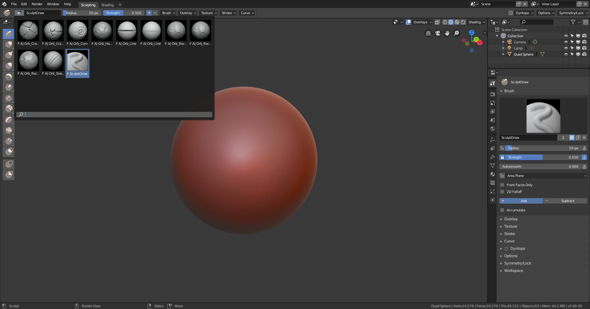
Brush preset selectors on topbar (I loaded in the extra presets just for the screenie). Also moved Smooth out of the group with Scrape/Flatten.
1 Like
The grouping in toolbar is inevitable for active tools in edit mode. But that is completely useless for painting/sculpting tools.
There are not as many sculpting/painting tools as modeling tools in edit mode.
To demo this making just one group with 2 brushes of similar use like Fill/Deepen and Flatten/Contrast would be sufficient. But grouping for grouping in toolbar just makes no sense.
The group of tools, we have in toolbar is completely different of group of brushes in Topbar.
Grouping of tools is managed by UI python scripts. There is an hope for a newbie to be able to remove or change this unsatisfying grouping by simple editing.
Grouping of brushes by tool is forced. Today, we have no idea if it would be simple to workaround that.
How many days we will have to wait to have an add-on that proposed a satisfying UI that let user control of brushes grouping ? Or if it will be free or not ?
I really don’t understand how people can validate that choice to choose to force a grouping based on software internal categorization instead of freedom of grouping according to workflows.
1 Like
Obviously there has been a lack of consulting on this particular matter. For most of the stuff they changed they had artists around to test and give general direction, however I doubt there were artists actively using sculpt mode to consult at the time of design.
They are totally destroying the sculpting and painting workflows in blender, it’s a shame they can’t see it.
Why not ask the sculptors for suggestions before doing this?
And where is the sculptors community? They should be screaming against those “make more difficult and slow to use” changes.
Now I can’t see a reason for people to switch from apps like zbrush etc, to use a system like this.
I’m very disappointed. 
1 Like
i think they should take a look in how other successful apps like zbrush…etc do it and get inspiration from it because what might work for 2d app definitely won’t work for sculpting one maybe you’ll even need two different systems instead of trying to make one that fits all…and like you said, where are the veteran Artists?
1 Like
Clearly there’s a tremendous effort on trying to make Blender look and behave like Photoshop, and this is a huge, huge and huge mistake…
Though I’ve seen comments elsewhere such as YouTube as to how some artists actually prefer to sculpt in 2.8 compared to 2.79. In this case, I don’t know if we can definitively prove that those complaining here are truly speaking for all artists across the entire community.
As for the commits that the devs. should only concentrate on making the workflow faster instead of slower. Faster workflows are great for those who have the skills needed to handle it, and I mention that because it could cause you to work faster than your ability to plan ahead and lead to errors and other messes (which then slows you down a bit by way of aggressive undoing and cleaning up errant data).
Likewise, I would understand if some people appreciate a slower and more methodical approach because of the heightened ability to avoid errors or worse (which would be totally screwed up data from free-wheeling content creation practices and even PC lockups). The best way forward in this case is figuring out how to accommodate both approaches when possible.
People made videos about what was there. They could not have made videos about yesterday’s UI changes.
Of course, every sculptor is excited by improvements of display ( better and custom matcaps, cavity, wireframe overlays, fast shadow) and UI changes of workspace with brushes accessible through a toolbar, Topbar for settings.
A cleaner UI that gives more space for 3D View.
That is what positive feedback was about.
But they could not have really test other thing than dynamic topology because multiresolution modifier was not working.
And I sincerely don’t think that people who was happy about brushes in toolbar and critical about 2.79 brush selector would be really enthusiast by the the fact to be forced to use it.
So instead of making conclusion from nothing, try to make point.
An UI confusing yourself and making you think that something is not what it is, that’s the kind of error that software should prevent.
But software should not prevent user to make wrong choices of values for brushes settings or tools.
Choosing the good tool for good task is something that sculptor have to learn by himself.
Being prevented to make an error is not a good way to learn and improve yourself.
Slowing the UI for everybody because software have to be available to newbies or hobbyists is stupid.
Newbies are supposed to evolve and don’t stay at a slow speed for ever.
A paint/sculpt tool is a large group of settings adopted around a main behavior/principle/concept.
But it is a little bit like object types.
You can model similar shapes in many ways by starting from different object types and different modeling tools and modifiers.
You can make a similar basemesh from metaballs or by using a skin modifier on a mesh.
User is free to experiment.
If you use a Crease Brush as an additive brush, play with its curve and change other settings, it can become close to default Draw brush.
So, there is no pertinence to make a grouping based on tool. That will be misleading about tool abilities.
And from a workflow perspective, you have brushes arranged in categories.
But if you have found a way to obtain a specific effect that require to alternate use of 2 or 3 brushes.
You will need to make a fast switch. Because effect will be based on repetition or should be applied on a big area by repeating strokes of a little size.
(Blender is not Zbrush. We cannot make a brush from what we had sculpted.)
If both brushes are inside same category, user is forced to use selector for a newly created brush that don’t have a shortcut.
Toolbar should be built by user to drag and drop the brushes that he need at a precise moment.
It should not be the place of classification like menus are.
1 Like