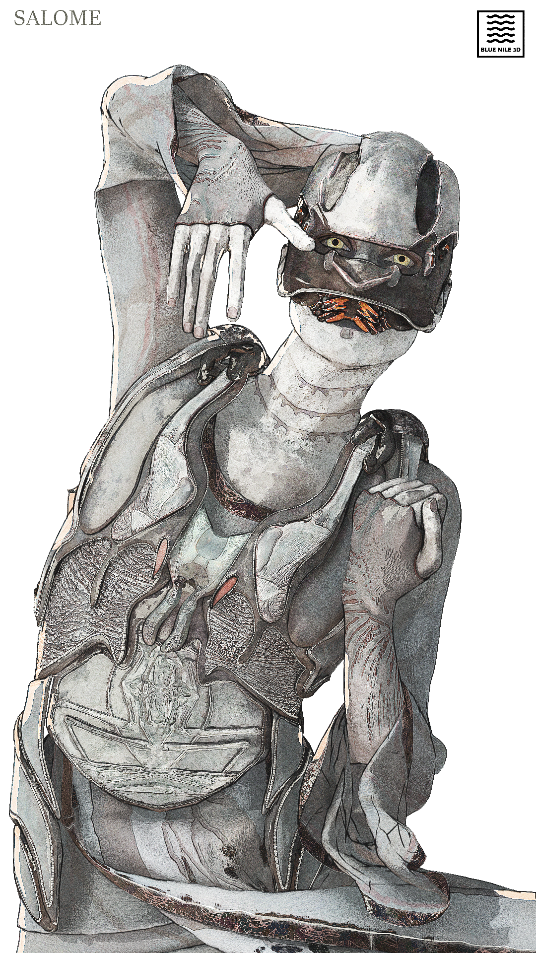
I’m trying to get an NPR, illustrative look. Not like cell shading/anime but rather like comic book artists Bilal or Gimenez.
Among textures, shaders, compositing etc I’ve tried to reduce perspective by flattening all the geo along the camera axis (rather than using an orthographic cam since I want to preserve background framing later when I animate.
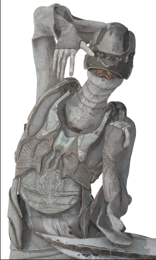
But, I’m not sure if I like this flattened effect or the original. Flat definitely has a 2d look but reduces some lighting info.
Yeah interestingly the flattened version isn’t fully flat - but almost - and so it sharpens all the shadows making the lighting more pronounced/3d. It also means the matcap I’m using for a rim is much stronger/wider.
Thanks! - the eyelashes were actually a mistake since they’re on a separate layer for the left image but the flattened object is a whole collection joined into one and I couldn’t/didn’t bother separate them in compositing.
Hand drawn is what I’m going for but I’ve got classic ‘looked-at-this-too-long-itis’ and don’t know which one my gut prefers - maybe tomorrow I’ll know.
Which one appeals to you most regardless of my objectives?
So I had a really hard time answering your question. I looked at both your options, then went online to look at the work of Bilal and Gimenez. Ultimately, I believe the most appealing to me is the left option, the one which is 3d.
Ironically, reads to me as having more depth because the blacks are crunched. This is an interesting style, but I find the contrast in the neck and in the helmet of your subject to be too intense and busy, whereas the neck/helmet of the first image looks more hand drawn because of the slope of the shadows.
Without reading enough to know what you were looking for, I preferred the aesthetics of the image on the left (by far). However, based on what you are looking for I think the image on the right is more suitable (unless you change your mind, of course).
I prefer the one on the left, mostly because the hard shadows on the right are a bit distracting and a strong hint that this is CG.
However, the stronger rim light and the higher contrast in the textures on the right make it more readable.
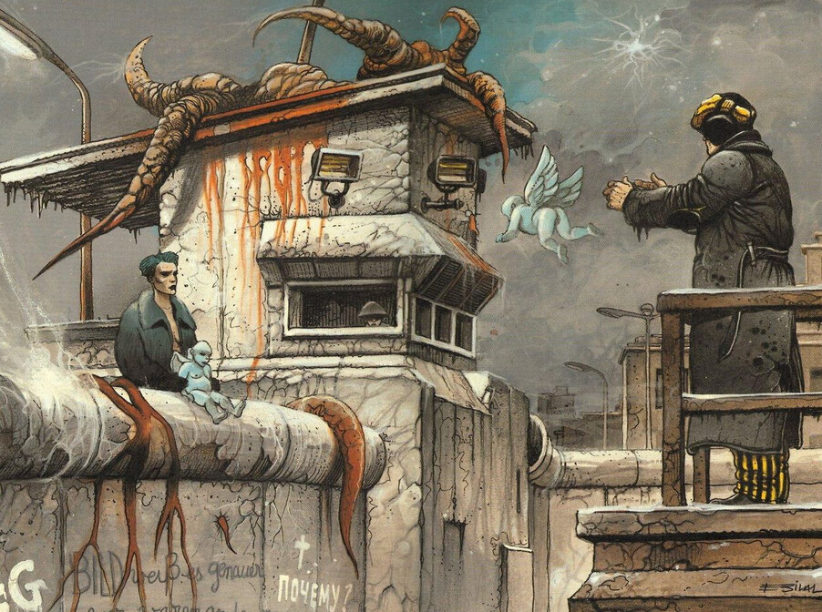
On the technical side, I don’t understand what are you trying to achieve by reducing perspective. Aren’t the coolest hand-drawn scenes the ones which go completely crazy with perspective? Even on the example given by bhibb, perspective seems to play an important role.
(and on a side note, your character looks really cool )
Thanks man! Honestly right now I’m very much ‘exploring’ without a definitive goal in mind - hence looking for immediate gut opinions from you guys.
Even the two artists I references are somewhat different in style but If I had to clarify it would be their smoother-gradient lighting (as opposed to binary cell shading) and textural watercolor-like quality to the colors I’m after.
I find the right version quite busy - not too mention more unpredictable with lighting.
The 3d/flattening effect is just something to break the perfection of 3d. I’m testing with lower flatness values now.
Thank you! Yeah dude I agree with the busyness bothering me also - I think I just had/have the classic worked-too-long-on-a-solution-itis where I figured out the perspective flattening and wanted to justify using it.
Yeah ditto dude, thank you! Right now left definitely wins.
As for perspective, I don’t necessarily want to remove it entirely - I just want to ‘break’ the perfection of the 3d camera.
For moments where I really want to warp/mess with perspective I actually planned on using a lattice/variable flattening rather than a single axis for everything. But the single axis is my first test.
I may try the 3d version with the rim now though!
edit - Oh and thank you so much for the character complement
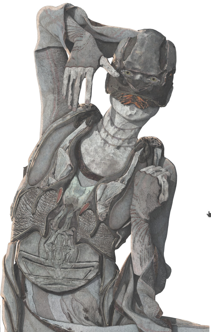
That’s a winner. Although I would be mindful of how this looks blended into a background.
It’s very sharp on top of the white background and looks great… but if everything in the scene is as sharp and striking (high contrast) as this, and especially if you have a busy scene, it could be a bit overwhelming to the viewer.
Of course, it might be no big deal. And without seeing an example, it’s hard to judge. So it’s just something to be mindful of.
I suspect there is a happy medium between this look and the look of the first image (left side). But it’s really all about what you’re looking for.
Thanks man! And absolutely yes you’re right I’ll have to be careful with the backgrounds. I’m currently building a scene to test exactly that.
But of course that means testing whether I use the same texturing methods, composite tree, lineart or no…etc so it may take a few days before I have some concrete comparisons and tests. Especially since I’m comping in Blender rather than AE or Davinci for the first time.
Once I have some results I’ll be back for more help since everyone here is so amazingly helpful and constructive.