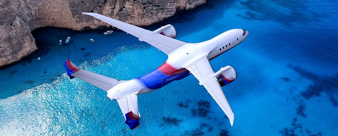
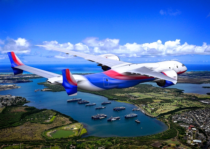
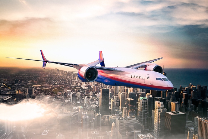
Recent render’s for a luxury jet concept I started working on sporadically over the last year. Test renders. The original article is published here:
Of the three renders presented, I like the third one (marginally …) best, because it comes closest to following the cardinal rule of this sort of "advertising(!) photography:
“It’s All About The <Girl | Product>” Nothing more. Nothing less.
(And: “it’s a 100% visual medium.”)
So, in making my assessment (IMHO …) I am literally measuring pixels – “how clearly is The Almighty Product™ visually separated from its environment?” When the human eye wanders across the frame, whatever it is, does it always return to The Product?
-
In the first frame, the water is definitely “visually more interesting.”
-
In the second, there is no “dodging” around the perimeter of The Product to ever-so-subtly separate it from the situation.
-
The third is passable, because (except for the two wings and maybe the tail fin) there is visual separation.
-
The fourth “mashes-up” against the entire background.
“Does it really matter?” Yes, it does. (Go buy the current edition of Vanity Fair and study every single page in advance of the table of contents as though your professional life depended on it …)
this look really cool !!!
I featured you on BlenderNation, enjoy!
 Awesome! Thanks Bart!


