This is the base image for a CD cover, for a rock band. I did it using MyPaint ( and blender to set up my shot with correct perspective ), which seems to be a pretty good program, and is free.
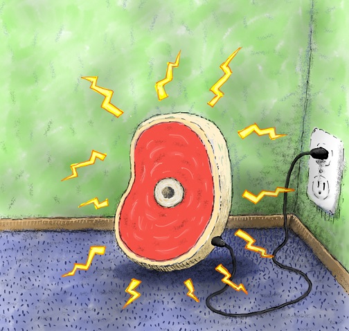
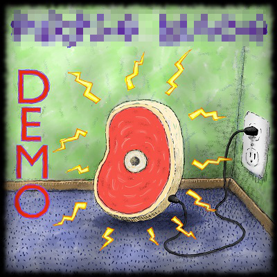
I finished it up, but I had to pixelize the band logo, which is too bad because it’s a cool logo. Added the text in blender using freestyle, and added the vignette in GIMP. Anyone have any good recommendations for programs that will format a CD cover?
My attention goes to the hole in the center of the piece of meat. Why is there a hole there? Am I too hole obsessed? Me –> O
Hole. Hoooooole. H-O-L-E.
I like the style. Not too sure about the vignette, it doesn’t quite match the style.
Anyone have any good recommendations for programs that will format a CD cover?
Hole
The hole is supposed to be a bone. :ba: 
Nice! I’m a pretty big MyPaint fan myself, and have made some stuff on it in the past.
It seems I made it at too low of a resolution, so I had to re-do it, and this time I used just Blender and GIMP, and used my original as a background reference. I kind of like the clean look of it.
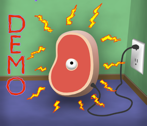
I honestly prefer the first one more. Now it just looks a bit like a beginner’s vector illustration. The earlier one seemed to have more personality and reminded me of Ren & Stimpy and the Rugrats with its detail.
maybe I’ll run over it in the paint program and see if I can give it some more of the ren and stimpy look.
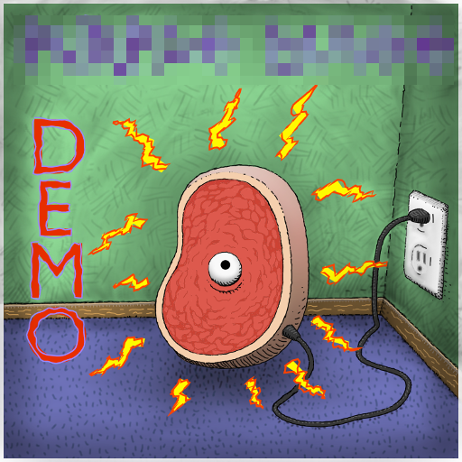
…is cool…I’d say rather R. Crumb-ish…tho Ren + Stimpy ain’t bad…like the final the best…so far…
why is there a eye in the center of the vector version? O_O
why is there a eye in the center of the vector version? O_O
I like the first one best, looks like a classic nickleodeon cartoon.
Heh, love the progression! You definitely got the character back into the picture, has that Ren and Stimpy or Beavis and Butthead look 
Good job on the marbling of the meat.
The bone should be more to a top corner unless its a slice of a arm or legg