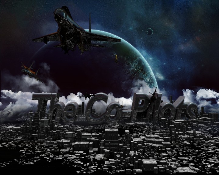
I’m making an album cover for a band I am managing, (I’ll post a link to the site later if your interested), called, The Co-Pilots. Here is what I have so far, please tell me what you think, and how it can be improved. Thanks.
(Specs: Vectors-215,288, Faces-311,594, Memory-60.76M(36.75M) Time to Render- 1:29.25)
It’s begging to be rendered with motion blur 
Lighting needs improvement. Right now it’s almost backlit, kinda un-appealing
What lighting do you suggest? How much should I blur it, and should I use nodes?
Something with the text, I’m not sure if it’s the typefont or the shader on it… but as it is the band’s name, it should call the most attention to itself (and not because it seems out of place). Besides that, it’s pretty sweet, I like the composition.
So should I adjust the font, or color, or what are you trying to say? Like make it glow or something?
Glowing was kind of where my mind went, but not as in making the whole thing glow (emit)… more like from the Creature Factory http://www.blender3d.org/e-shop/product_info.php?products_id=105 and kind of complimentary to the jets.
And yes, I would change the typefont. It says something about your bands uniqueness in my opinion, so make a unique font, but also ensure it’s easily read (squint your eyes and walk across the room, can you still read it?). My favorite font site to help out http://www.abstractfonts.com/
Thanks, I’ll post as soon as I get a new font! I’ll post back in about ten minutes.
I went and redid the lighting, and this is what I came up with. Do you think its better or worse?
Attachments
My opinion is better. It’s more vibrant and the text feels “more at home”. However, now my focus shifts to the reflection on the plane, it feels more like artifacts then a nice reflection. Are you using ray-traced reflections? If so maybe tweak the gloss just a touch (0.980?).
Also, realize this is merely my opinion. Before re-working too much might be good to hear some other opinions too.
I do like the color much better, so I think it’s a definite improvement so far.
Thought I’d chip in with my 2 cents. I think you need to go further with the title text. The whole scene is very crowded and busy, and the title does not stand out the way it should. I would use a thicker typeface, and not use italics for sure. Also the grey colour does not help. Perhaps do an outline around the text and use the glow effect just on the outline, but I would definitely try to use a little bit more colour on the text to make it pop. Don’t rely on the chrome material to make it stand out.
Some positive items. I really like the composition of the scene. The background sky with the planets, The clouds/smoke in the mid-ground, and the city in the foreground are good elements. Perhaps the city needs a little more detail and colour variation, the jet could maybe use a little rocket flare on the back, and some “wind lines” if you know what I mean (that’s more a 2D effect, but might help here).
Hope this helps, good luck!
P.S. - you might want to check out Andrew Price’s text tutorials on blenderguru.com
Also you may want to warp the text or just tip it back so that there’s a little perspective to the text so that the bottom of the text is a little wider than the top of the text. Will give the title a stronger impression…
Ok, thanks, but I have a problem. I want the title to run dominant, but its supposed to be a building in the city. So that means I probably don’t want to tilt it. And I dont know how to make it glow. Any help? Thanks.
BTW how would you suggest to use the wind lines and rocket flares?
I think it looks better without italics
Also think the old one is better unless you are still adding to the 2nd one
@RobMonty1987 - Thanks for the feedback. This 2nd one is for another album cover, and yes, i posted it to get help on what to add. The words are in italics essentially because they are supposed to be being swept by the speed of the jet. Sorry if they look sorta strange. Any critisicm is accepted. Thanks
Should I keep workin on the 1st one or is it read for me to post onto the complete forum?
I kindda like the 1st design. The 2nd looks too simple…
Did you make the background image in the 1st or did you get it of the internet ?
I think if you want the “words being swept away by the jet” it would be cool to have dust and maybe small chunks being whipped off the top/sides of the words and the jet at the far end of the last letter in the word. Also might wanna think about throwing a few shadows of the Jets onto the ground somewhere below, and all jets leave a smoke trail. Maybe if you get into it you can even add the heat distortion to the back of the jet engine. Just a few thoughts.
Just a thought. Looks good regardless.


