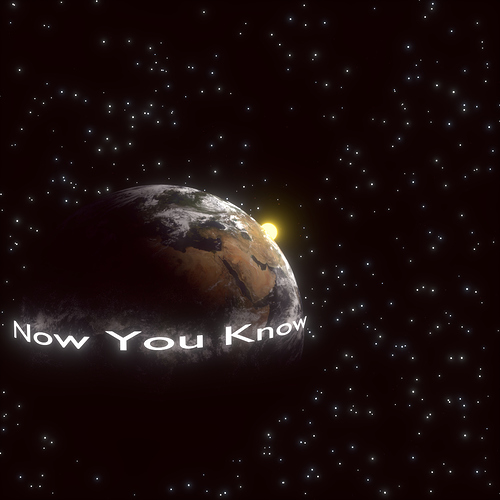
i made an album cover for my friend i just want to know what you guys thing its all done blender renders with cycles :eyebrowlift2: the square one is for the cd case and the rectangle one is for his website i like the one where the letters are not wrapped around the world but thats the one he wanted
It looks good, only few details:
The ones wrapped around the earth have wrong aspect ratio (too wide, or too low)
If I look on the lightning it’s clear that it’s lit from other angle than from the sun, but i would not think about that if I saw it somewhere else (and i suppose it’s meant by that way
The glow around the letters - I would myself use smaller glow (just few pixels to blur the edges of text), but stronger (or instead of editing this one just add one more) - like this the edges are sharp and clear, not like edges of strongly glowing objects, and It may also help the stars (if adjusted their size /E made smaller, so glowing them would not make them too big/…)… but that’s only an idea, it might also look too “unrealistic” then
it may also seem good to add the moon (but in right proportions and distances)
i have the random size on the stars all the way up it didnt make much difference… i will work on some other tweaks that you mentioned thanks


