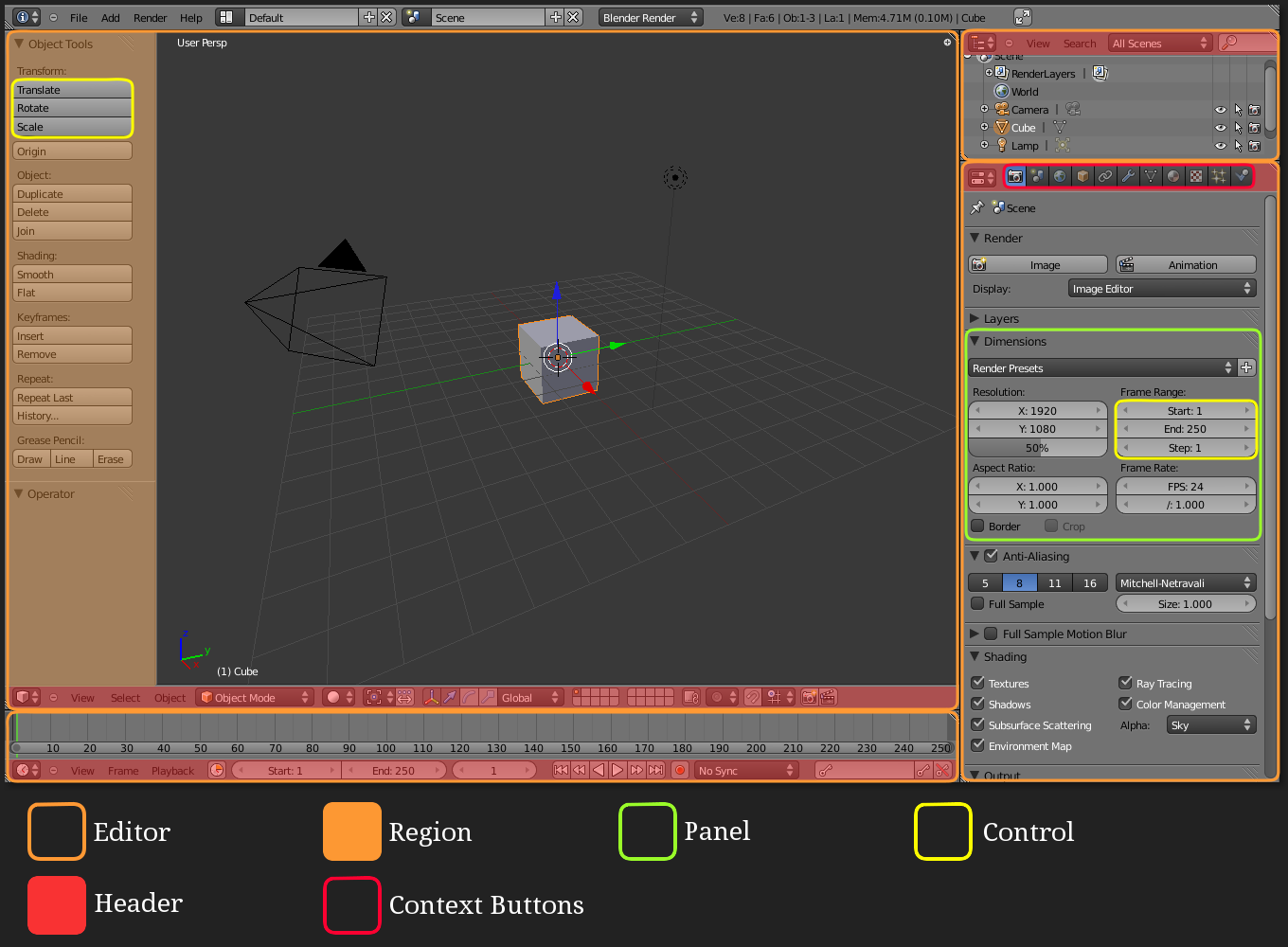
For the sake of writing clear instructions in tutorials, what are the best names to give the panels and tab regions?
For example, I frequently reference the “properties panel” as being the side panel which toggles when you hit the N-key over a main window, whereas the “properties toolshelf” is the that “properties” window type which contains the tabbed view for render, render layers, scene, object, constraints, modifiers, etc.
“Properties panel” versus “properties toolshelf” is already somewhat ambiguous, but now with Blender 2.7x we have a new set of tabs down the side of the T-key toolshelf. The trouble is, I am used to directing people with instructions like “LMB-click on the Render tab”, meaning those tabs usually along the top header of the properties toolshelf. Now with a new set of tabs, any instruction of “click the xxxx tab” is getting confusing.
Do how do we break the ambiguity when writing step by step instructions? Are there short (two word) definitions which won’t be confusing to new users? I want to be able to say “click the object tab” and have no confusion about where the user should be.
The Blender Wiki calls the “panel” the “Properties Shelf” and the “properties window” is “The Properties Editor”. I think that’s probably a pretty decent definition for now until the shelf can be renamed.
You don’t want to start an UI discussion but you just want to use terms for tutorials : just use same terms that the ones used in Blender UI.
N/T regions are called Properties and Tool Shelf in View menu of each editor. Use View Properties/View Tool Shelf or be more specific 3D View Properties/ UVEditor Tool Shelf.
If you want to avoid confusion, it is better to be precise.
But you can do what you already did in this thread, you can call them N column /T column.
Thanks - I think I can use the following terms:
Tool shelf panel: the side panel which opens when the user hits “T”
Properties panel: the side panel which opens when the user hits "N"Pr
Properties Editor or Properties Window: The window type “Properties” with the tabs for Render etc…
Tabs: These refer to the icons along the header of of the Properties Editor.
Side tabs: These are the new tabs which were introduced to Blender 2.7x Not sure if they have an official name other than “tabs” which is already taken.
I’ve tried pushing this issue with the devs a few times, but in the end no one really sees the gain in giving these regions useful and unique name, and showing these names in the UI rather than hiding them in the wiki or code.
Please don’t use “panel” to refer to the T/N regions, panels are the little boxes inside those regions that you can collapse and reorder.
Here are the official names for the UI elements, from the wiki.
Moved from “General Forums > Blender and CG Discussions” to “Support > Basics & Interface”
gregzaal has it right. The Toolshelf and “N sidebar” are regions. By name, the most accurate ones would refer to the Toolshelf as the Toolshelf and the N region as the “Properties region of the 3D View” (because different editors can also have Properties regions)
Yes, the use of “Panel” within Blender itself is why I have used that term for my writing. What gregzaal (or, should we say, the wiki) has called “Panel” I have referred to as “Area” because Panel has already been used too many times. I don’t personally like the term “Context Button” because it’s long winded (“select the Object Data context button, that is, the cube icon” - typical “Beginning Blender” style instruction) but I’m thinking the new top left options are better named as “tabs” (what I was calling the Context Buttons throughout first edition).
Instructional material is an obvious reason for the devs to give consideration to some consistency. It’s mind blowing that the wiki page definitions should contradict the labels / context help (the mouse-hover pop up bubbles) within Blender itself.
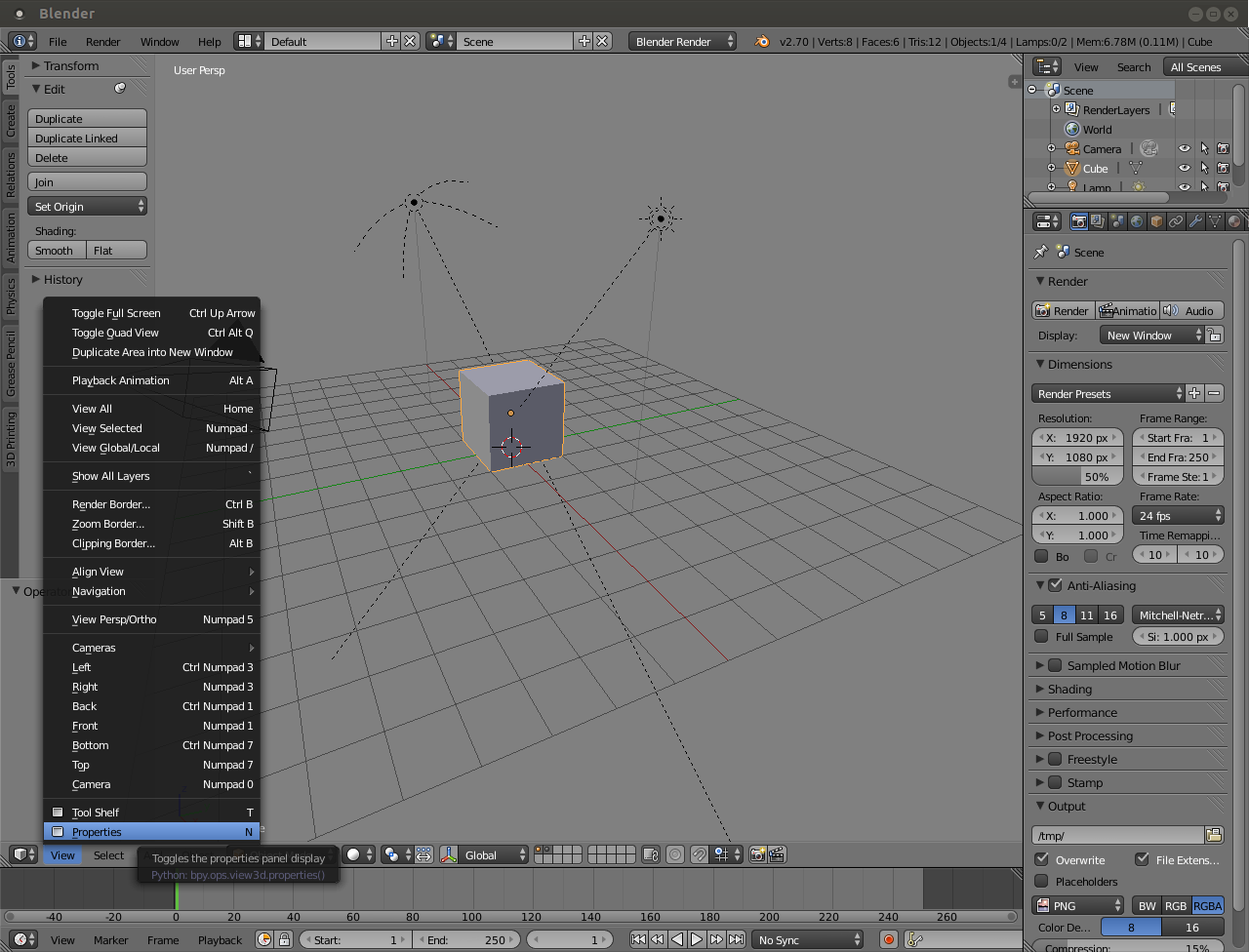
JA12’s screenshot shows an incorrect and inconsistent tooltip which should be fixed. The reason it managed to be written incorrectly is the same reason this thread was created. (Editor) Region is a bit vague/ambiguous/unhelpful… but it is at least its intended title.
Don’t base documentation/tutorials on one of the many incorrect or unhelpful tooltips in Blender.
I like the way Fweeb’s put it, 3D View Properties Region, 3d View Tools Region, UV Editor Properties Region, etc. But it is still very poorly used, I mean view settings are not really properties.
If you go to theme the N/T panels you need to theme the “region”.
Right click on a panel header and it will call itself a panel, that’s correct.
I call the panel that opens up when you press the N-KEY the ‘Numeric Entry’ panel. That is what the N stood for in 2.4 series. In 2.5+, however, you can do more than just type in numbers. I call the context buttons along the top of the properties panel ‘TABs’ in my video tutorials because that is what they are called in 3DSMax. It is funny that we don’t have official names for all these ‘areas’ of the screen.
Maybe we need to come up with silly words for everything? That way when we are talking about Blender it sounds like this…:eyebrowlift:
Press the N-Key to bobomatize the wigdometer then activate the swizzle stitch for access to the memodam.
That’s the problem Atom; until we do have some kind of agreed convention, verbal instructions are either going to be ambiguous or simply too long winded (overly descriptive) for the “plain English” student. Single word names preferred (definitely not three words for a location). When someone’s trying to learn a new concept they don’t want to have to handle complex instructions beyond “you can make your renders less grainy by bumping up the Render Samples, found in the Sampling area of the Render tab. Bear in mind that this will make the final render take much longer.” Of course, now there are two “tab” regions in the UI, and notice that I’ve avoided the word “panel” because just about everything turns out to be a “panel” or some kind of “properties” section, yeah, I could imagine people reporting that the instructions might be hard to follow.
This is absolutely incorrect because Area is already something. An Area is the container where an Editor lives. Most people might not need to know that, but it’s a useful tool for explaining how an Area can contain any Editor… it’s also useful if you’re giving documentation for Python scripters.
What I’ve had: “…you can make your renders less grainy by bumping up the Render Samples, found in the Sampling area of the Render tab.”
The more terminologically-correct version: “…you can make your renders less grainy by bumping up the Render Samples, found in the Sampling panel under the Render context button.”
I dunno, to me there is a more ability to misread the more “correct” version, particularly “Render Context Button” which could have readers scanning the UI in search of a single button with “Render Context” written on it. Those context buttons behave (and to me look) more like tabs than buttons, and single-word terms are less confusing (which is why Tabs makes more intuitive sense to me). Using the word “under” (because if it’s a button not a tab, then things items are below and no longer “within”) could also imply “immediately below” as opposed to much further down. Being text-book perfect seems to make things harder to read.
Is there a proper name for the newer left-side tabs in the T-key region?
“Context button” is wrong. You’re not in a button. You’re in a context. You can click a button to get in the Render context of the Properties Editor, but saying you’re in a button is confusing and incorrect.
That said, I slightly break convention here in my own writing. Instead of saying the “Render context of the Properties Editor” every time, I shorten it to simply “Render Properties”. It works reasonably well and only gets mildly confusing when referring to the Properties region of the 3D View, but if you maintain the convention of only referring to “______ Properties” as a context in the Properties Editor, there’s very little confusion for the reader.
However, I am intrigued by the notion of calling the 3D View’s Properties region the Numerics region… I just don’t know if that holds up well enough to work in editors other than the 3D View.
…thanks Fweeb. How would you give a single (and short) instruction to click what I have been calling the Render tab? I feel that directing a newbie reader as “… in the Render properties/context…” is making an assumed knowledge jump that they automatically know this means to click the camera-looking icon. Until now I’d been fine calling them “tabs” because there weren’t other tabs to confuse the issue, but with those new left-side ones this is no longer the case.
How about…? “…you can make your renders less grainy by bumping up the Render Samples, found in the Sampling panel within the Render context of the Properties Editor (e.g. The camera icon)”
I really don’t like that. “Render tab” is way easier to digest than “render context of the properties editor” which could lose dyslexic readers like myself. I prefer simple instructions to stay as one line (not long enough to wrap).
“Context Button” was going strictly by the wiki-page terms which gregzaal posted earlier (it can’t be wrong can it?) Being two words and also with “button” meaning just about every other item in front of the reader which could be pushed, I don’t like the term either.
Since I normally write to a longer format, I typically go into more detail on first introduction and include the shortened form in parentheses (e.g. “Click the button with the camera icon in the Properties Editor to see options related to the Render context (also called Render Properties)”). After that, I opt for the shortened form in most cases (unless I need to provide a longer explanation or emphasis).
And to keep things simple, I try to keep consistent use of title case and reduce the use of “the” in the naming of things. The latter is particularly important, otherwise, you get sentences littered with that particular article. So rather than “the Render properties”, I tell the render to go to “Render Properties”. It’s in title case, so that gives the hint that it’s a place. It includes the name of the editor as an additional hint. And it’s short to write (and therefore read/remember).
In the future, these may end up becoming proper tabs and I may need to re-evaluate. However, if that day comes, it’s likely that tabs will be all over the interface, so it may be best to stick with what I’ve been using. We’ll have to see.
ail this is ssso confusing . and who gives a %^$ . who calls what this or that.the interface is just as good as any other program out there, it has it’s +'s and it’s -'s . so dig it and move on. and can we pppplllleeeaaasss get ride of these @#$#'in tabs, they may be good for newbies but i would like to have an option to get rid of them altogether or at least make them optional.heeeey mabye if i make a video about it and i have some FANS on the internet i can creat a ground swell of support for my idea , oh wait thay’s already been done yeeeeaaaa, that’s not gonna work out lol