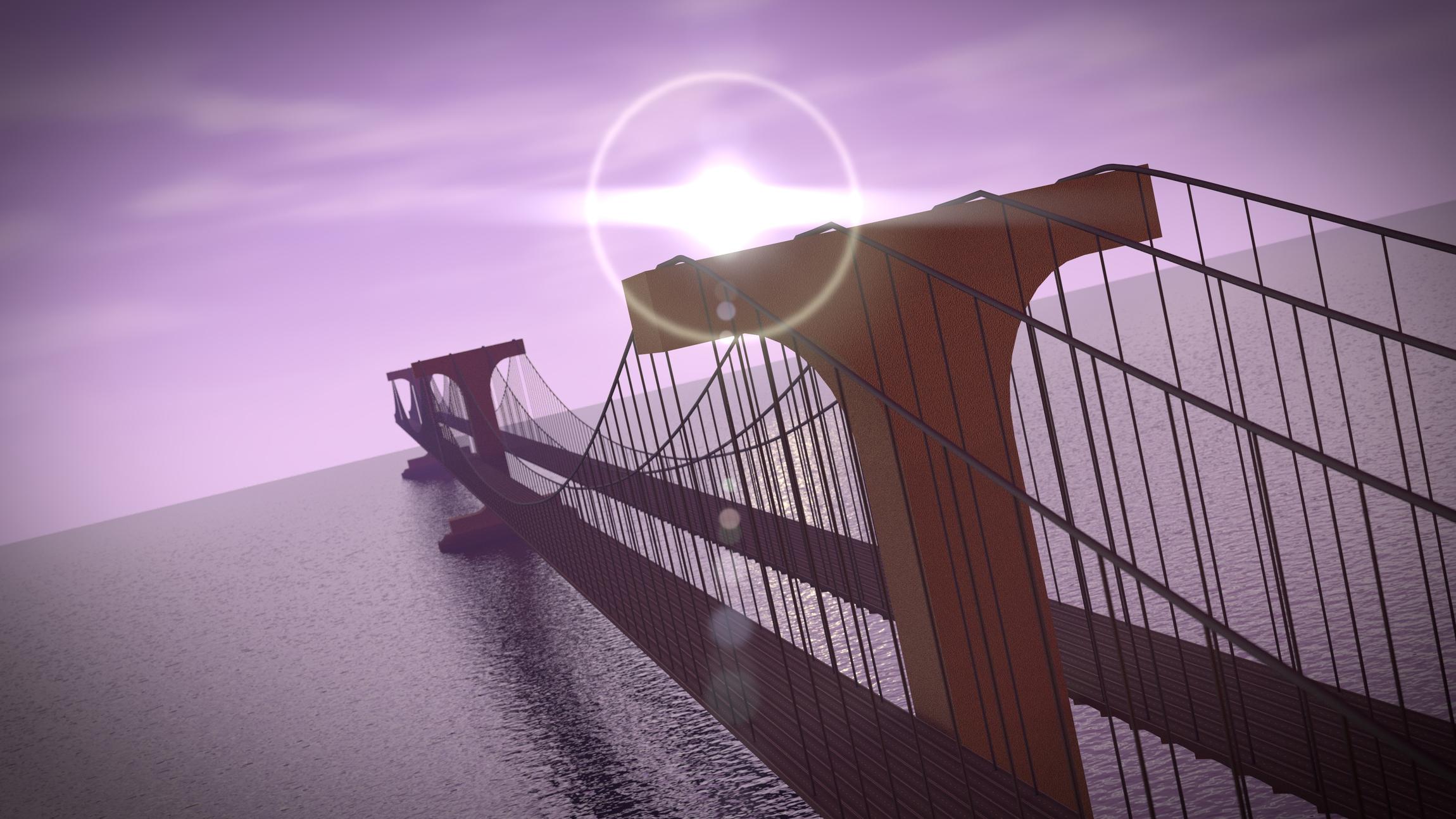
Hellooooo everyone, here’s my latest side project: a suspension bridge. It’s another Cycles exercise, but I’m also learning advanced compositing, so tell me if you have any tips. =)

Not bad so far. Some people say its important to keep the horizon level. You might find you get the effect I think you’re going for if you lower the focal length on the camera to something like 35 or 25. But first I think you should try making the bridge pylons higher. They seem a bit low to me. Also adding a sidewall to the road decks would make it look more finished. You could also add some fog in the distance or and island so it looks like the bridge is going somewhere. My suggestion is to work on your foundation more before you start in on compositing, lens flares and such.
Okay happy holidays first of all 
So i will not be commenting on the structure of bridge (althoutgh it needs to be improved.)
So composition, i have just finished a scene with a sea horizon, and two things you absoluteley need to have are depth of field and atmospheric faloff. Fortunately there is a lovely tutorial on that : http://www.youtube.com/watch?v=7FsLG4egf6k
secondly, the color of the water is way too blue and dark, don’t hesitate to give it a red/orangy color, and make it more bright.
Finally i suggest you add some texture to the pylons . I believe this image can go really far , keep up the good work
I think this image would improve if you had a vignette 
For where the sun is situated the back and left side of the upright (can’t remember the name) bits should be black, or nearly black; the same holds true of the cables; they appear to be lit from the left and the ones closest to bottom right of the picutre are darker on top than the left side of them; its back to front.
The shadows cast by the uprights don’t line up with the reflected sun streak on the water.
Physically its ok, except it seems to end with no where to go for cars except into the sea as it doesn’t hit land on the other side. I would have put the vanishing point lower and perhaps added a 4th tower very close to infinity to give an impression of a very long, if structurally impossible, bridge.
Thank you everyone for your replies! @deltaray, the pylons only look low relative to the roads. Having corrected the lane size it’s merely the road’s height that looks out of place. The towers (or pylons) are nearly 1000 feet high. One key factor about this bridge is it’s enormity.
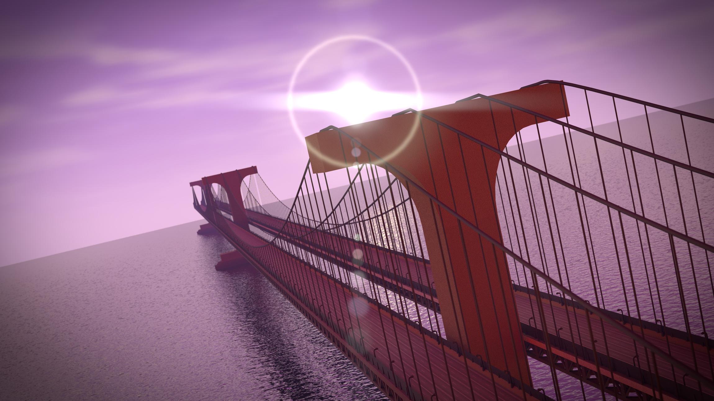
@andiyo, I fixed just about everything you mentioned there. =) The same goes to you, BjarkeDuDe.
@JonathanWilson, I’m aware of the darkness problem and have been trying to fix it, thank you for reminding me. =) It’s weird how messed up the shadows were, I should have noticed that before. Well I fixed it, and now there are hardly any shadows at all…? Oh well. Here’s the latest render:
4 Ideas:
- try to change the z-rotation of the sun for now it’s nearly directly behind the bridge (in a photo this would giv you either a overblown white sky or a pitchblack bridge) - so a bit of realism comes from how you gonna use your light
- consider to stretch the bridge farther out (or make the other side, now it looks like the bridge ends in midair (there is also a chance that you intended this)
- Consider using distancefog (you may do this in Post - just use a mixnode on your image and mix it with your sky color - use your z map (with a map value node infront) as depthmap so fog starts at certain distances and then increases to blend things more nicely
- you could make more details to the front roads (like e.g. handrails), atm. it looks very unicolored, maybe a bit variation could be good?
Thanks for the tips forelle. I have atmospheric falloff (distance fog) already, you just have to look closely. I’ll add the landscape soon, and some lowpoly cars as well. In the meantime I have a big update on the roads/trusses here:
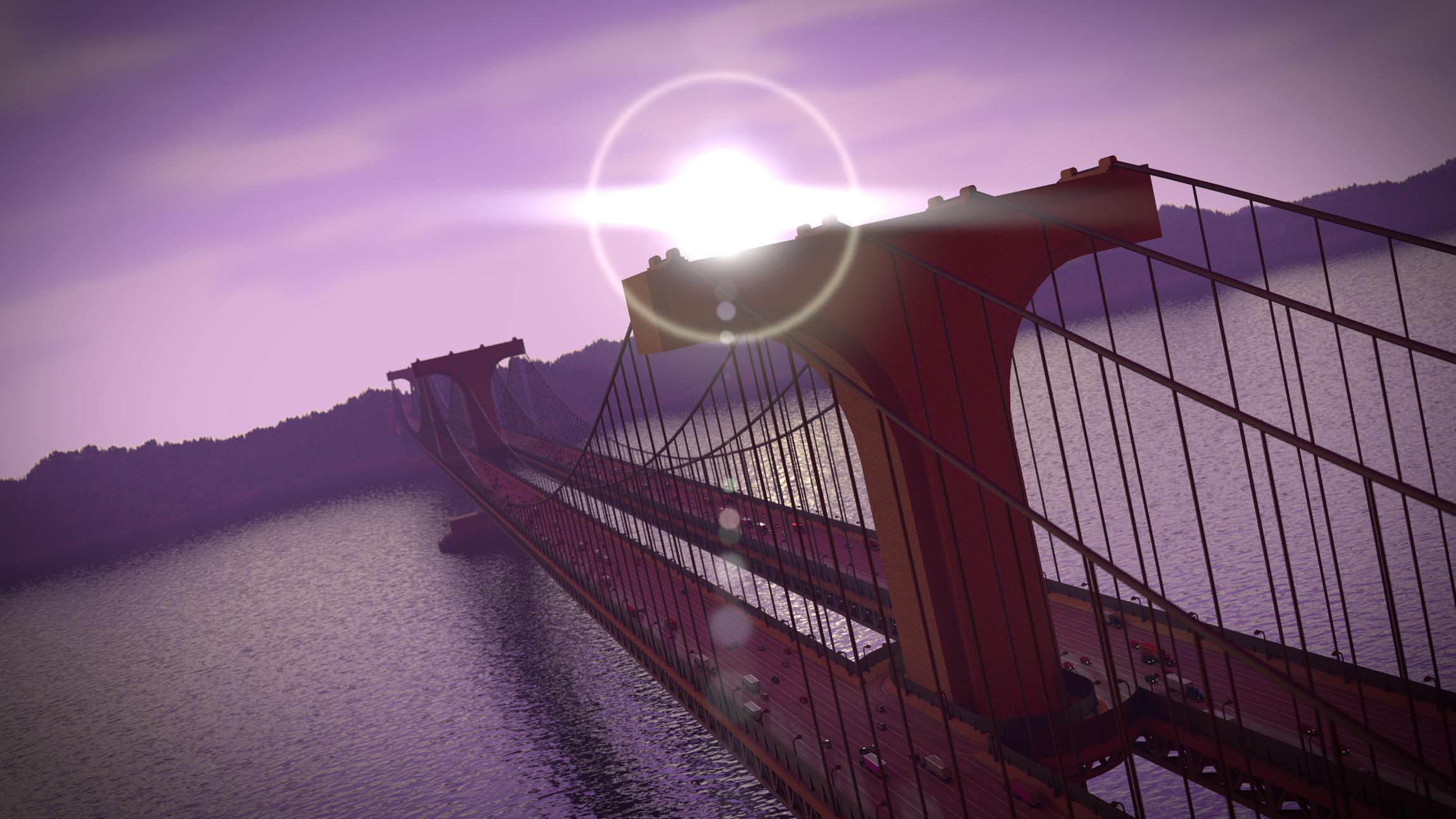
Added the cars, a tower update and the landscape! I will make a few more car models to add some variety, but here’s where it’s at right now:

It is progressing well, but i think what you are suffering from is a lack of reference.
What are you using to create this image? The best images are created with some amount of reference. If you had reference for a scene with the sun in the back ground you would understand the lighting and could adjust your image accordingly. Include scenes where the light is reflecting off the water. If you are wanting to work with the modelling then you could find images of the bridge. Even if yours is not the exact same, then you could create shapes that would make yours believable. Remember the largest amount of weight is placed on the point where the wires meet the pillar. The top of your ‘T’. This is the engineer in me, but if you want believablilty you would want to create a structure that is supported. If you want this stylized for a project then ignore my opinion.
The other comment that i will make about compositing is that you need to know what you want to do. If you don’t know what you are trying to achieve at the outset, then you will get lost and add all sorts of effects that you don’t need. The idea for the final image has to be in your head, or at least a vision that you can work towards.
Hope this helps.
Thanks for the tips Jfaurbo. I don’t have a reference for the compositing, and I’ll start looking for one, but the model details I get from this image of the Golden Gate bridge:

I realize what you are saying about the structure of the towers, and I’m going for a fairly stylized result in the overall model.
You can also take a clue from your reference image about composition and lighting. In your render the light is directly opposing the camera and also behind the bridge, which in reality would only leave a silhouette of the bridge because all details would be in the shadows. You used some sort of fill light which for a structure of this size is totally unrealistic. The reference image has the sun on the same side of the bridge as the camera allowing illumination of large portions of the bridge. At the same time this light to camera angle allows the shadows to further define the shape of the bridge. This is the photographer in me speaking
How’s the lighting on this one:

I know it’s still a little bright, but I don’t want this detailed model to turn into a big black silhouette. It kind of defeats the purpose.
Another update. =) This time I added semi-trucks:

(amazing detail!!!)
…and I also spent far too much time modeling transitions between the two bridges for those unfortunate people talking on their phones who end up going the wrong way and don’t want to drive five miles to get on the right track. Ahem…the render:
Hope you like it, and if not, fill me in. =)
By the way, I’m thinking about putting a ship of some sort in this scene, but that’s the problem: I have no idea what kind. Sailboats and motorboats are invisibly small, but supertankers and cruise ships would eat up the scene with their vastness. Fishing ships and the like seem out of place. So, any ideas?
well done untill now, can’t wait for more