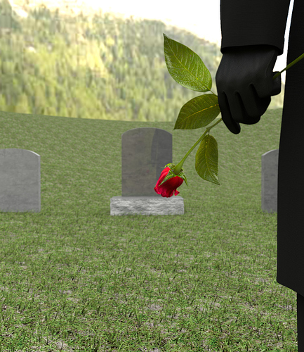
Here is an update…I got the computer back up and running:) Still working on the fog, rain and the tree. Changed the camera angle a bit to show the grave stone more. Let me know what you think!

If anything, I would suggest maybe taking the headstones and sculpting some wear and tear on them if possible. They just look too pretty for my tastes. They had a great tutorial on how to do this on BlenderCookie. Possibly some water droplets on the man and rose since they’re in the rain.
Overall though I love the image. Great work so far.
In addition to wear and tear, I would add some green moss/mold at the bottom of the headstone’s texture , its indeed too clean for a cemetery left out in the open like that!
Here is a screen capture after 2000 samples. I’ve been having issues with the water dropplets still but I think I found a work around to make the dropplets illuminate as they should by way of caustics. As I figured out before only light emitting planes create caustics with the glass shader but it overlights the rest of my scene so I used the emitter plane ray visibility settings to only use transmission:) I’m pretty happy and can now move on, I’ve been working on the rest of the scene like the tree, overall textures, mist/fog and the head stones.
However I would like to note that this is intended to be a millitary cemetary which all the head stones are very uniform and well kept…so I dont want to make the head stones appear to aged and worn as they are a smooth finished marble and stand up to weather very well. I actually started off with head stones that were far too worn and aged and didnt fit to objective after further research.
Thanks for the comments though please keep them comming:)

Here is another screen shot at 1000 samples without the full amount of leaf and grass particles. Its starting to come together…I’m liking this version of the rain better than my other attempts. Still need to add the fog but I’ll do that with the final render pass. I also need to create some grave stone texture variations…names and such…just making the names up…hopefully none of them will be readable:) Let me know what ya think!

The fact that it’s a military graveyard makes it all come together nicely. The water on the rose looks fantastic, and I agree that the rain is much improved. Can’t wait til it’s finished.
hi there,
Really nice work!
My observations:
- a bit more irregularity in the graves positions (rotation on the ‘large’ axis, taking more wind)
- some irregularities too in the chamfer (hard edges) of the graves to show ‘time’
- I think that those kind of stones are more white, that could also increase the contrast of this rainy day
- the rose, imho, is 10-15% too big (but it is really good looking, even if the green is a bit saturated)
- maybe a difference of color between the coat and the glove, ‘beige’ for the glove i.e.; the coat could also take a bit more wind showing interior lining i.e. Scottish fabric.
- maybe add some seams to the gloves would give it more consistence.
keep it up!
PS: the composition is really good, the eye goes from the arm to the rose, from the tree to the grave, and I think that it it is possible to add a bit of hope, far in the grass between the graves, maybe suggest children playing (or cow with a calf to say that life goes on), it can even be done in compositing, and be very blurry…
–
tmaes
Coming along really nice! Though maybe you want to have some variation in the inscriptions on the tombstones  Unless Jessica is a relative of Kenny from Southpark
JoshMaule-Thanks again I appreciate it:)
tmaes-I think you are right on with everything pretty much.
I think the thing that really to me says the rose it too big is the leaves, which I’m going to try to work on and avoid messing with the rose and the stem:)
Your probably right on the grave stone color it could be a little whiter but I’m going off pretty good refence images and it seems there is a little variation between cemetaries…some are darker than others.
I’ll also work on the variation and of course the names hehe:) I’ll try to work on the coat more if I have time I’m thinking its a thicker coat which should be effected less by the wind.
As far as the colors of the coat and glove, I tried to lighten the coat a bit and kept the pants black and I was hoping to keep the glove black. I played with beige and wasnt sure about it…it seemed to make the coat stand out too much:( But I’ll play with it more.
On the P.S. you must be in my head because I was just thinking about that on the way to work this morning…I’ll try to come up with something clever:)
LiMuBei-She could be haha…I know I’ll get some variation in the names. Thanks for the laugh and comment:)
Well as far as the progress went later last night I found that the scene has exceeded my 2GB video card so no CUDA:) I have to render a test full size with all particles on CPU which took 7 hours to complete 2000 samples:( But at least it rendered! I’ll post an update later today.
Thanks all and Happy Blending!
What do you guys think about a white dove taking flight from one of the headstones in the distance (flying to the left)? It would be subtle but I think effective, the DOF would help me out with the lack of time I have, but I think I can do it.

I think this is looking fantastic, but I’ve got to say this perspective was the best:
Perhaps just set up the camera comp guides and put the rose in the direct center, or somewhere in the rule of thirds.It seemed to convey more emotion, the current scene the guy looks all stiff and not quite natural.
For the rain, I think you should mix the two types because the first was too small, and the last was too big.
The rose is astounding. I can’t critique that at all.
Rain + Doves = no no They don’t fly in rain they seek shelter.
I know Jonathan that was my first visual angle thought but I didnt feel right putting another persons name of a grave even if I’m making it up. A straight on angle is hard to hide the name unless I put heavy DOF on it which I could try still. The other thing I was struggling with on that angle was the reflection but now I know the grave stones have very little reflection so that wouldnt be an issue. I figure I’d do multipule camera angles in the end:)
@Artistic- haha you got me, I know but I thought maybe supernaturally it could happen;) I’ll try to think of something else…since its millitary I could do a small flag on another grave in the distance…would that represent hope though? My thoughts were butterfly, rainbow, birds… but none of these happen in rain without sunshine which I dont have:(
oooh what about a locket hanging from his hand (with the rose in it) open with a picture of children in it…is that more sad or hope for the children to cary on the family memories still?
Locket sounds good to me… although think of how it would look since it would be too small to attract detail?
Also a flower wreath, or a medal resting on one of the tombstones… how about a subtle crack on another stone on its side?
Hope could come from an opening in the clouds that shows blue skies through it and maybe a hint of sun rays breaking through in the distance, something like this
In 3d gfx and composition… imagination is your only limit! :eyebrowlift:
hi,
the flag or the bird is for me a bit too ‘patriotic’. I typed ‘lambs playing’ in google images and I think that with only 1 model (very LPM) you can make the adult one and little ones that could be really expressive by their funny positions although they are very far and small (I mean near the last green horizon line in the background)… as I said, it can also be done in compositing too if the contest permits it. But I don’t know if they play inthe rain in real life… or children very small too with yellow rain jackets running in the same place… the most important for those is the position, not the modeling, it’s so far
edit (my wife) there is no lamb in the fall…
Well, personally as there is not a whole lot of time left, I would not spend a ton of time modeling anything else that is complicated. A locket would be great if it is not too distracting.
I am glad you respect enough as to want to cover the name, seems like a lot of people wouldn’t care. As for the camera angle, how bout if you still had the first pose, but put a leaf or something just barely obscuring the name so you can only make out like part of some letters. I would not add too much DOF cause it just wouldn’t look good.
Good luck, I expect this to be some real competition
Here is the locket…I think it will do:) Its gonna be farther away and subtle. I found the kid pic on line they are not mine at least I dont think so haha 


Well I think this is about it, the only things I can change at this point is color correction and minor minor gimp edits. I’m pretty happy with the final scene, it all cam together pretty nicely. I did finally hit the big wall even with CPU when I tried to do higher resolution headstones:( anyway I got the locket in there and I am very pleased with it:) the chain just work out awesome and it incorperated nicely…at least I think. Tell me what you guys think…and thanks for all the input. I would have loved to put more into this one but you know…wife…kid…house…work…but I always try to make time to Blend:)
P.S. I’m calling it “GOODBYE LOVE”

3000 samples…took forever:(