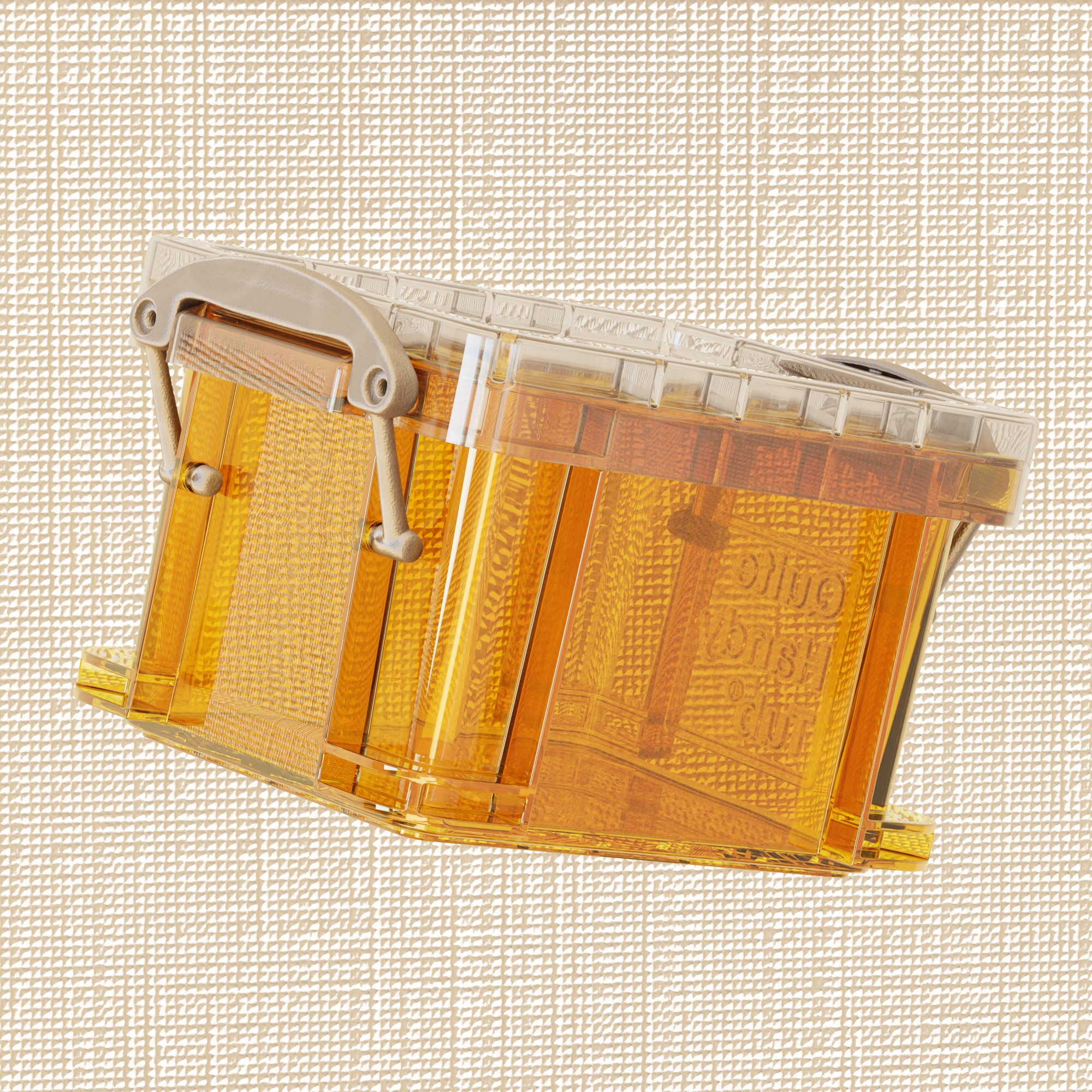
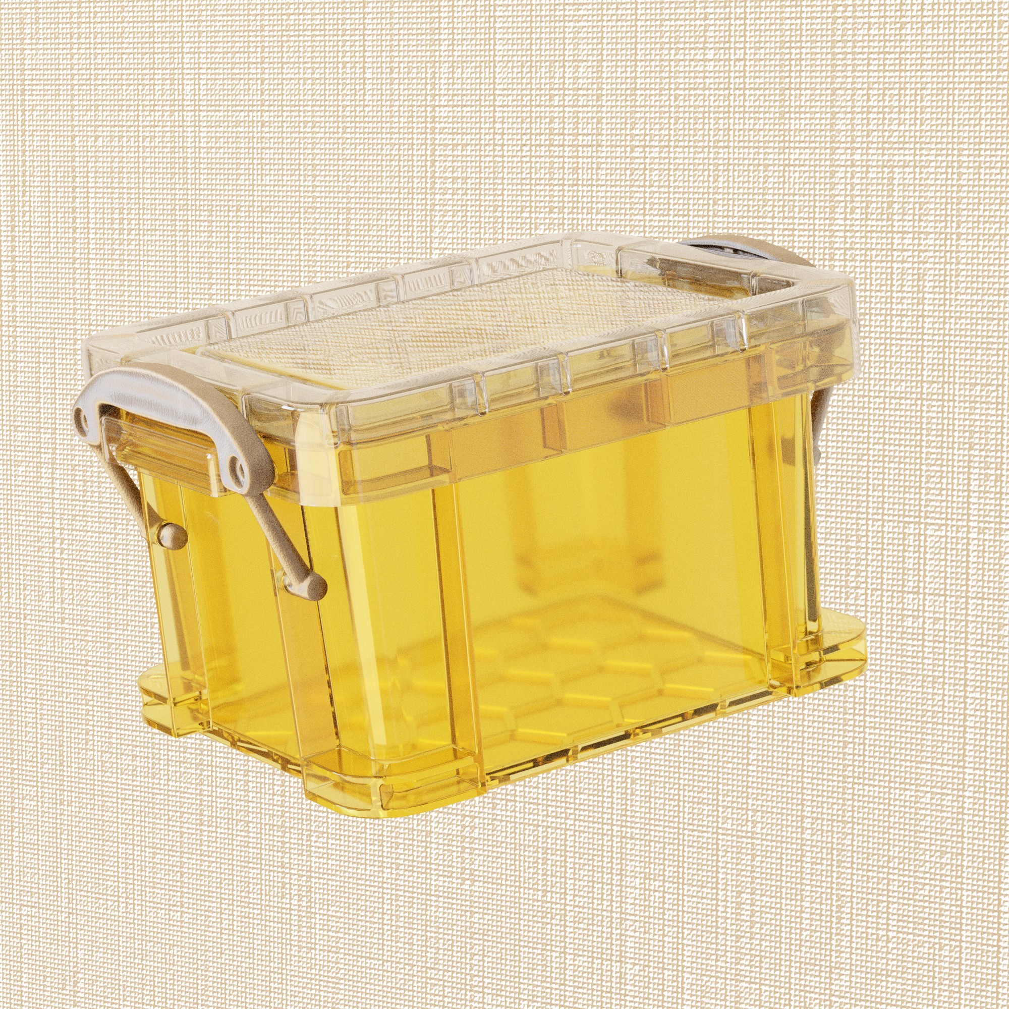
…and it is proving quite difficult to get right. I’ve tried a few transparent plastic shaders but the real difficulty seems to be the reflections and glossiness of this material.
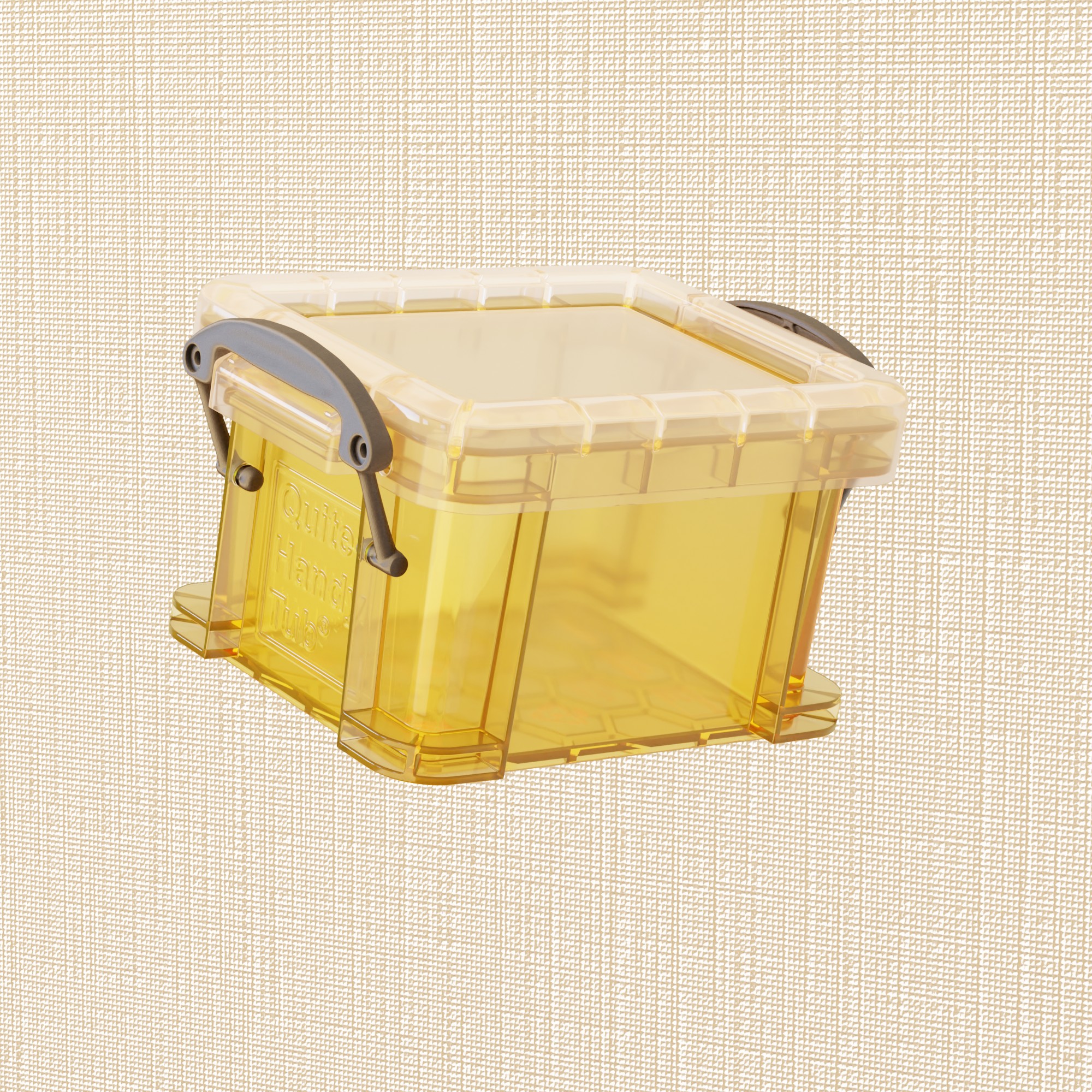
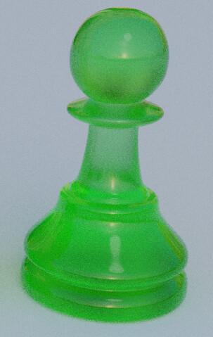
E.g. here is a test render with what I have so far:
I think what is difficult is that the real life material is quite smooth, quite transparent, yet also not that reflective - it is that soft polypropylene material, whereas my texture looks more like polystyrene hard plastic. There is also a sort of “opaqueness” to the material with thickness, but it’s not something that uniform values of transmission/roughness seem to capture (I suppose there is a way to add “thickness maps”?). Matching the colour is also quite difficult because of this.
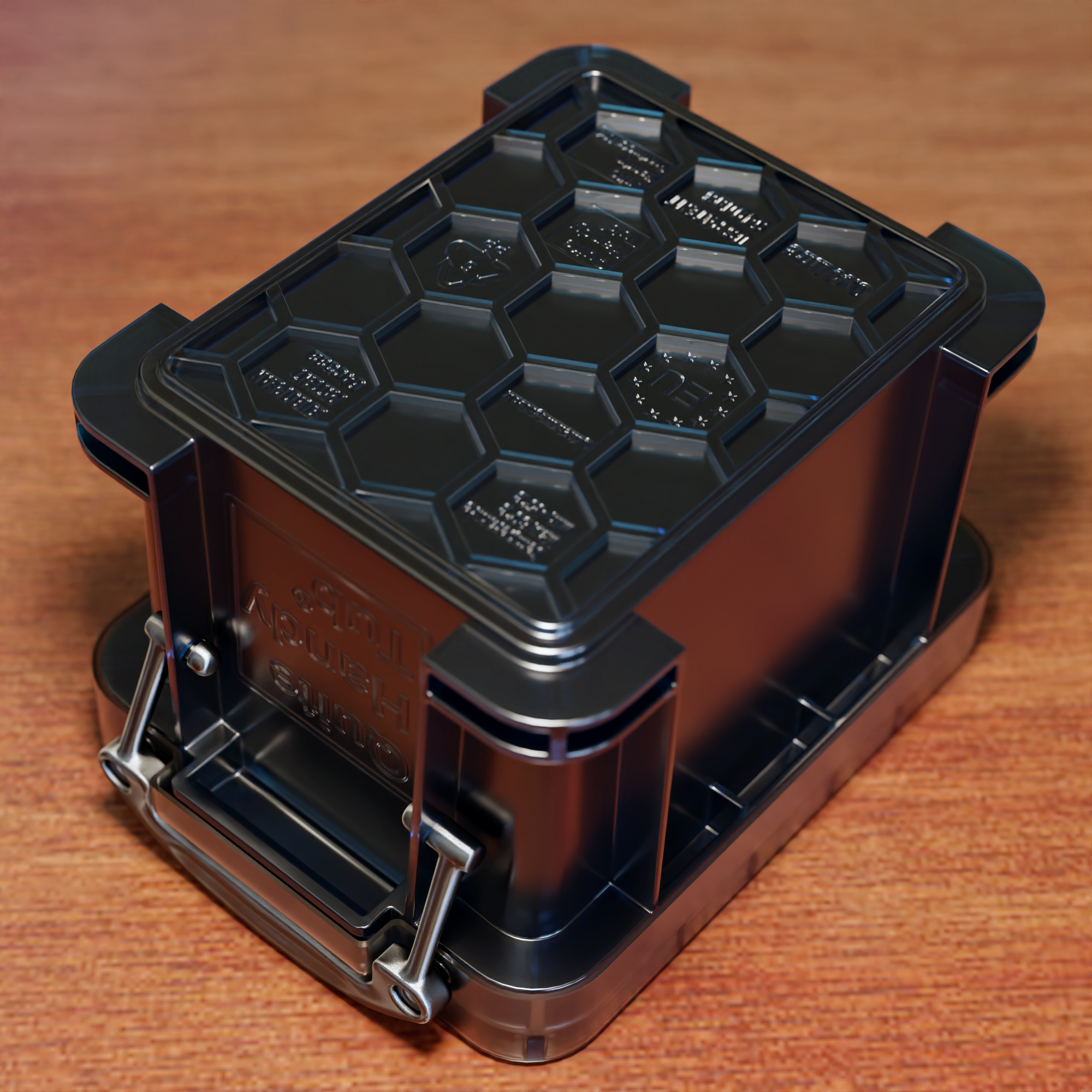
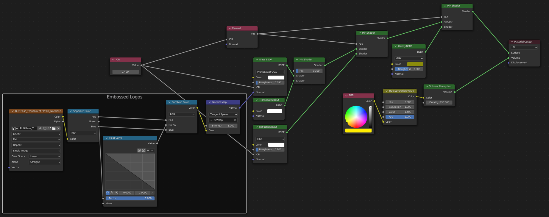
I can’t take any credit for this material, as it’s basically just a minimally tweaked one from Blenderkit (see below). The problem with this material for me, is that it is so complicated I really don’t know what parts of it are doing (- only in a broad sense, and also, annoying because everything is in nested groups). There are problems with this material too - such as the transparency and reflections changing depending on camera angle (same material in both shots):
So I tried this old setup and the results are reasonable but I still find myself with the trade-off between making it transparent enough, smooth enough, but not too shiny.
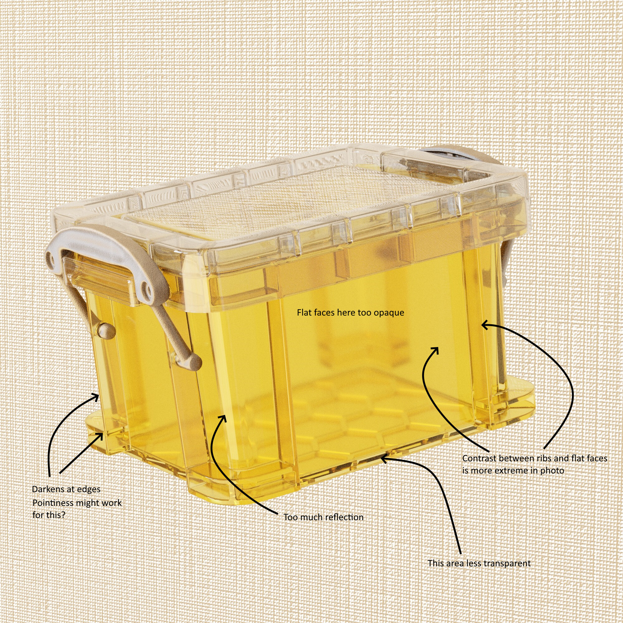
Here are my thoughts on the problems compared to the original image. I’m not sure how to tackle some of these however. It’s quite a slow process when you only have a vague idea of what everything does.
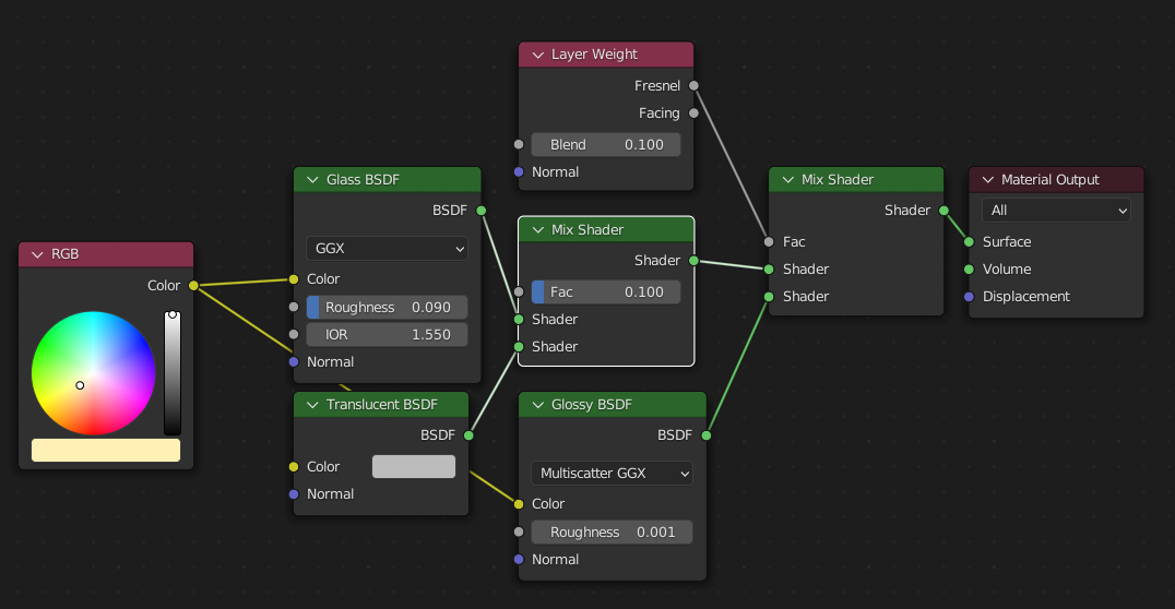
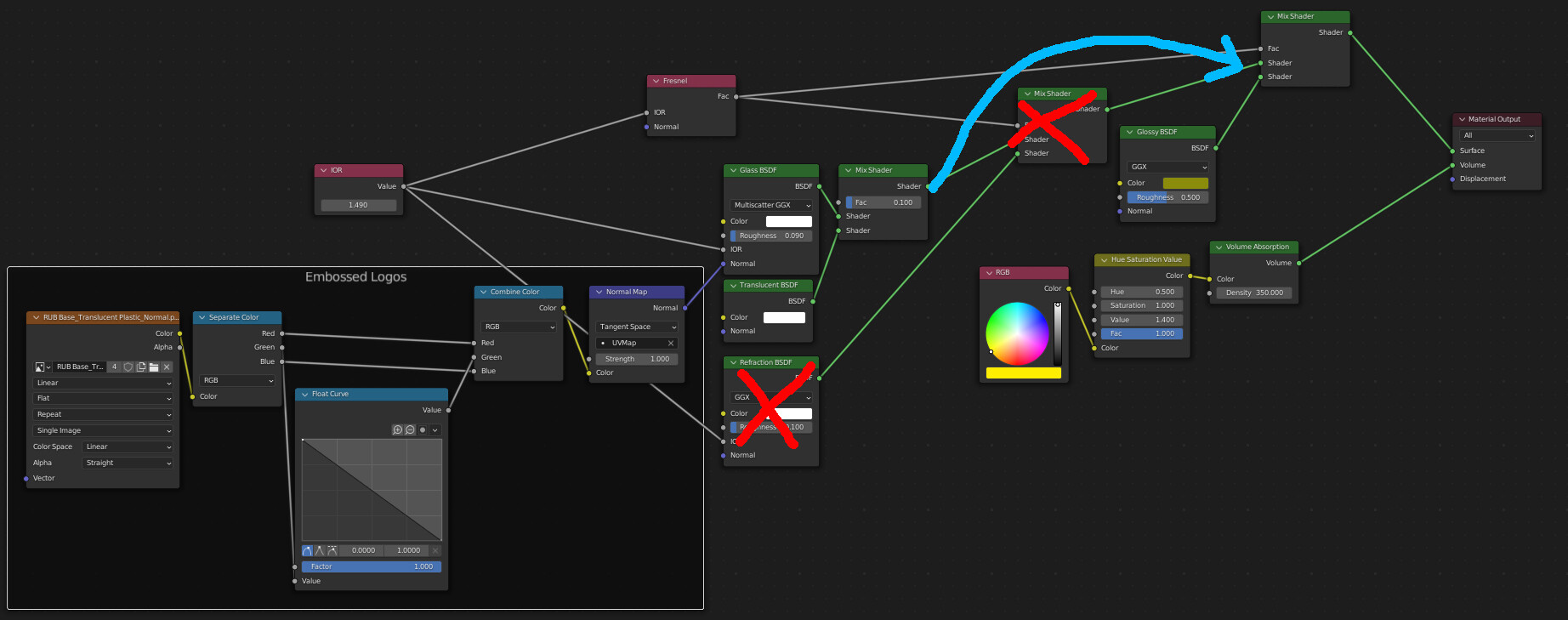
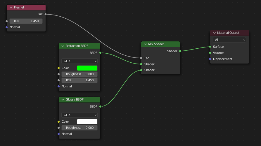
You have your glossy node at full intensity and the same colour as the glass shader. This is pointless, since the glass shader already includes a glossy component. It could be part of the reason your reflections are too strong.
You should only mix glass and glossy if you want to give the glass glossy highlights of a different colour to the glass. Otherwise i’d mix refraction with glossy - using a Fresnel node as the mix (not the layer weight node). Just make sure your fresnel node and refraction node have the same IOR - otherwise you’ll get weird resultys.
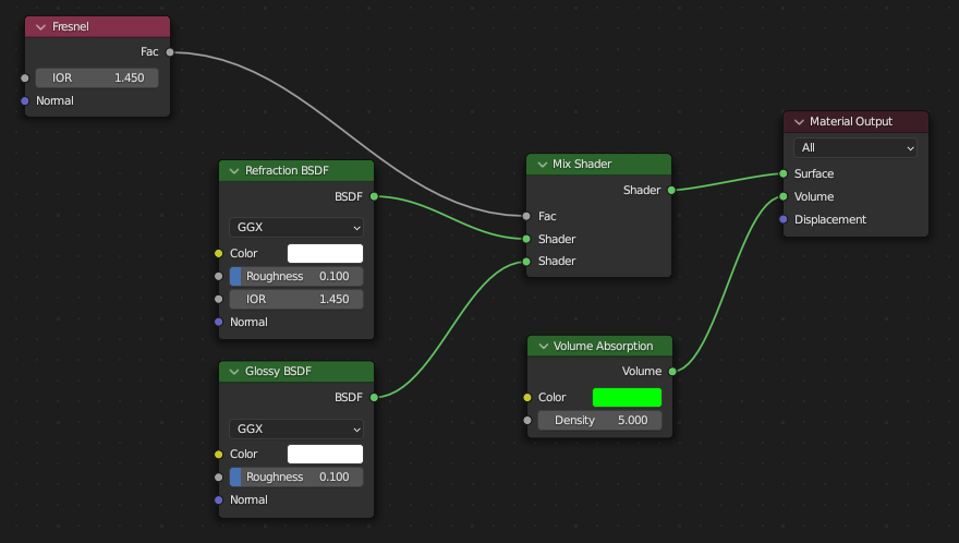
In terms of the plastic colour - instead of colouring the glass shader directly - try using a volume absorption shader instead - that way, the thicker the geometry, the stronger the colour will be and vice versa. You can then change the density of the absorption shader to tweak the contrast between the ribs and flat bits.
Transparent materials are usually colored using volumes. If you color the surface, it’s going to act like glass with transparent paint on its surface, which can be correct in some situations, but most transparent materials instead have their color spread through their volume.
The amount of reflection might actually be just fine, the reason yours is stronger could just be because your lighting is different from what it is in the photo.
For the material darkening at edges, make sure you have lots of glossy bounces in the render settings. I mean like 32 bounces or more, and make sure the “total” bounces are at least as high. Glass materials actually need those kinds of numbers to look right.
One thing I will say - be careful overanalysing your reference photo. The lighting conditions for it are very different to your scene - and the sharp highlights you are seeing in your scene compared to the reference photo may be more to do with the diffuse lighting and environment the plastic in the reference photo is subject to - rather than a fundamental difference compared to your material setup.
You seem to have a very strong light behind the camera that is causing the sharp edge highlight on your boxes. That lighting condition isn’t present in your reference photo.
That does look better - and I didn’t know about the glass/glossy thing. I kept seeing it in setups but without understanding exactly why.
When I first read this I was like “why would Blender be like this” but I guess it makes sense if you want to model painted glass/stained glass, versus tinted glass.
True. Although it did help me realise the shader was, as it turns out, suffering technical errors.
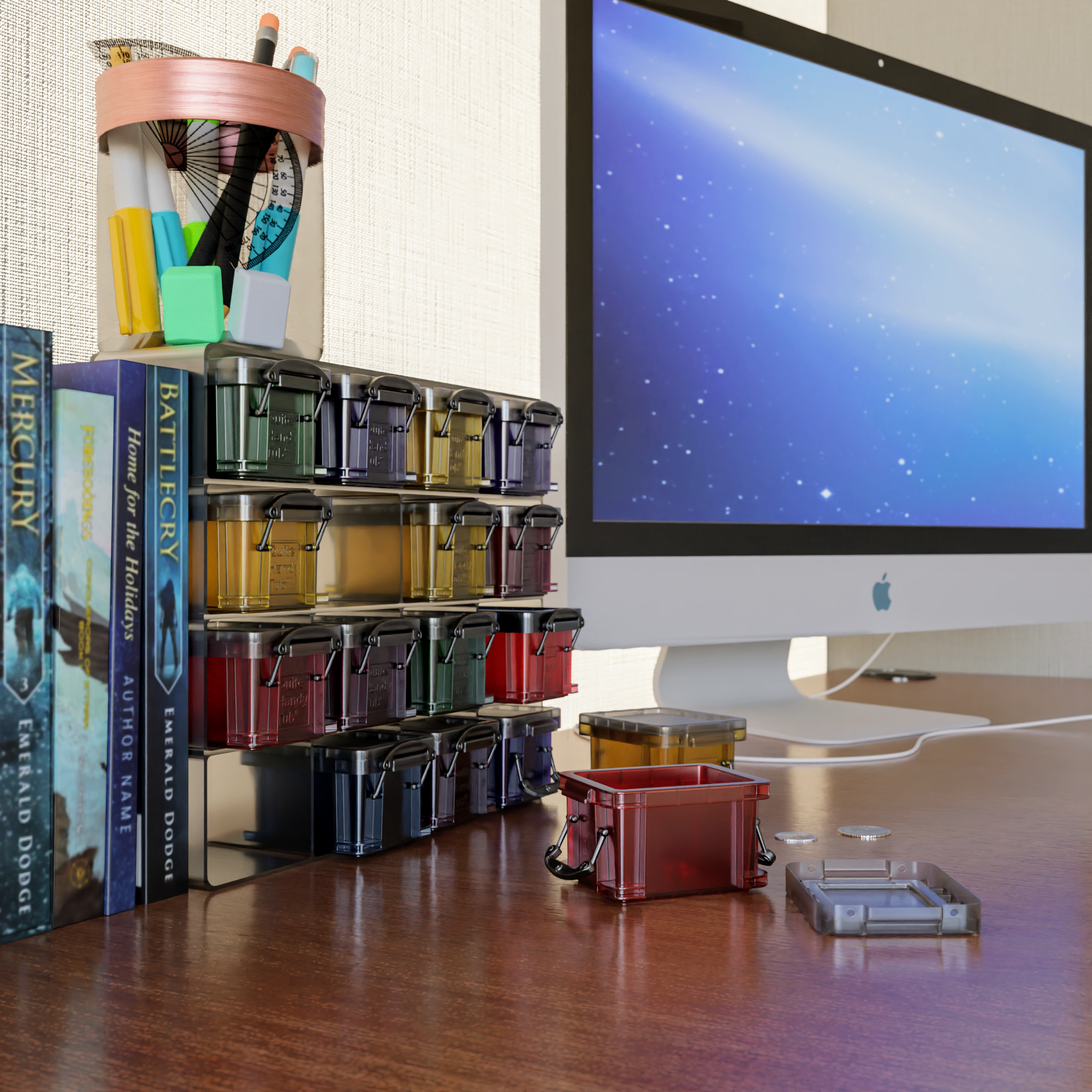
I did a couple of renders with different setups, and I think using glossy with glass is closer to the image. Without refraction you don’t get the nice edge darkening, but with just refraction/fresnel the edge darkening is too clear and the colour not quite right. Adding the glossy node, to my eye, looks better although I don’t fully understand why (it’s very subtle though).
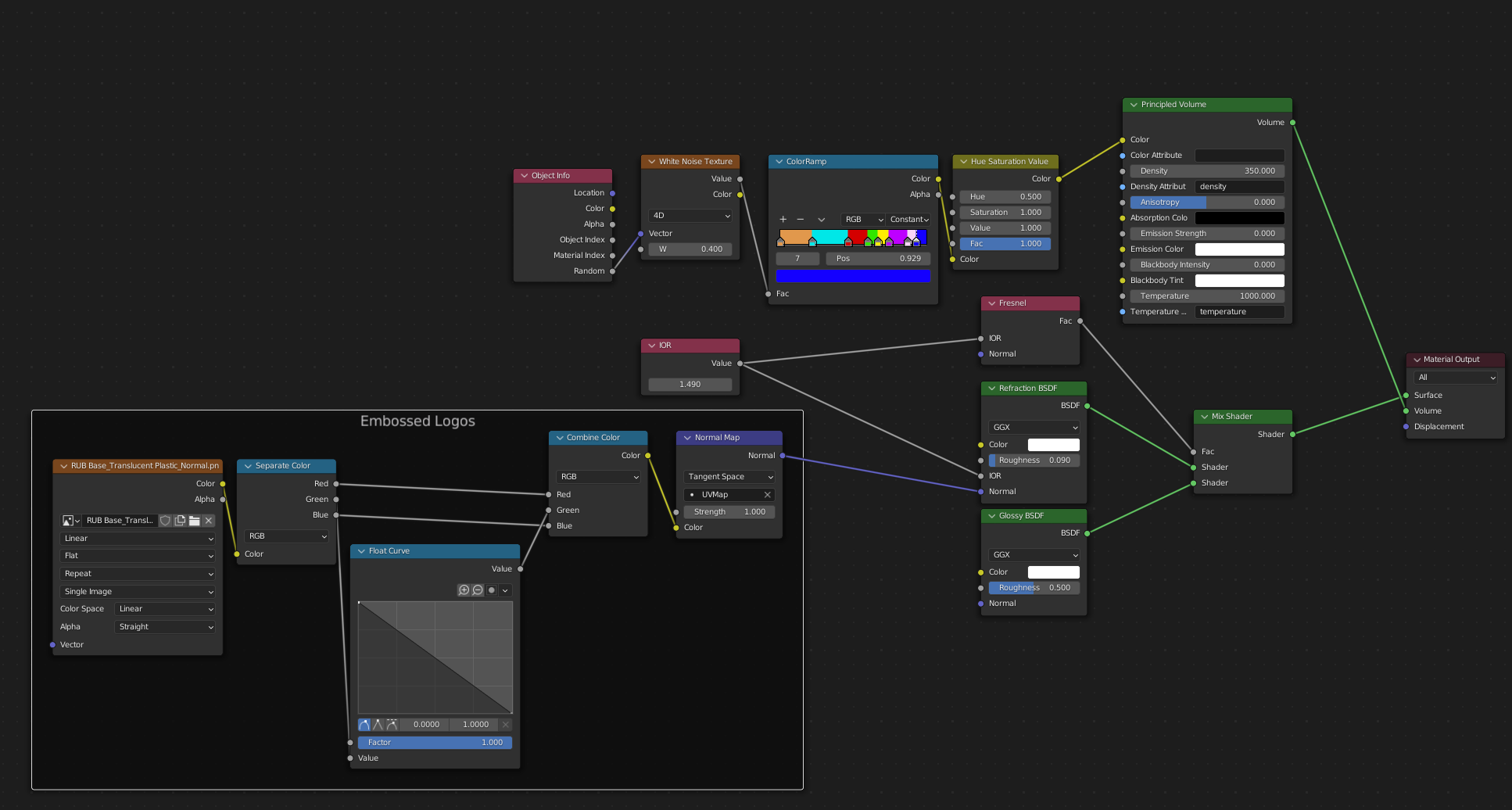
They are slightly different as I did make some changes to the mesh (lid bevels) in between. But this is the current node tree if anyone is interested or perhaps has ideas to improve it. I can’t share the mesh unfortunately.
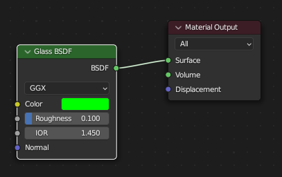
You don’t need the refraction and glass shader mix - one or the other - but not both (unless you are looking at a birefringent material).
If you mix a refraction and glossy shader using the fresnel as the mixing factor with the same IOR as the refraction - the output is identical to using the straight glass shader (except that you have independent control over the glossy reflection colour - which you don’t have with the glass shader). In your setup however you aren’t doing this.
Ah I see. That image is helpful, I was initially like “how is it transparent if I get rid of the glass”
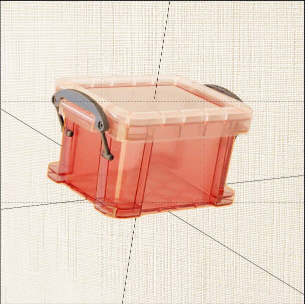
It seems each colour will need to be dialed in separately - e.g. here is red (at full saturation) with the same settings as yellow. Compared to life it is not saturated enough.
Up your volume absorption density - or give your glass/translucent some colour to help boost the colour saturation
Also - your glossy node should be white (or light grey). Plastic is a dielectric and as such will generally display un-tinted reflections (it’s also why you can’t use the glass shader right out of the box to handle coloured glass or plastic - because the glass shaders highlights inherit the glass colour - which is metallic behaviour - not dielectric).
This image shows three ways to do glass (or other refractive transparent materials)
Left = pure glass shader (notice the tinted reflections - this is wrong for most glass/plastic materials which are dielectric and thus don’t have strongly tinted reflections)
Middle = refraction/glossy mix (notice the white reflections - this is physically correct for reflections, but the colour is uniform regardless of how thick the glass is, which is incorrect)
Right = same as middle, but using volume absorption to drive colour instead of refraction colour (colour now changes with thickness).
The right hand side one is the most physically accurate
The other advantage of the last setup is that you can affect the roughness of the transparent part of the material, whilst maintaining glossy reflections (or vice versa).
Instead of using volume absorption, try using principled volume. Then, go to the render settings and increase the volume bounces.
Volume absorption is a shader that does only the darkening effect of a volume, it doesn’t scatter (bounce) light. It’s not a complete volume shader and is in fact meant to be used together with volume scatter. The principled volume avoids all this trouble by doing it for you, it’s a complete volume shader with both absorption and scattering.
Very helpful, thanks once again. I wish this sort of info was in the blender manual. At the moment I find the manual a bit like a cook book that tells you like, what a carrot is, but offers no advice on how to use it in anything. It seems there are established methods for certain materials regards photorealism, but the examples/text in the blender manual is largely absent or rather cryptic.
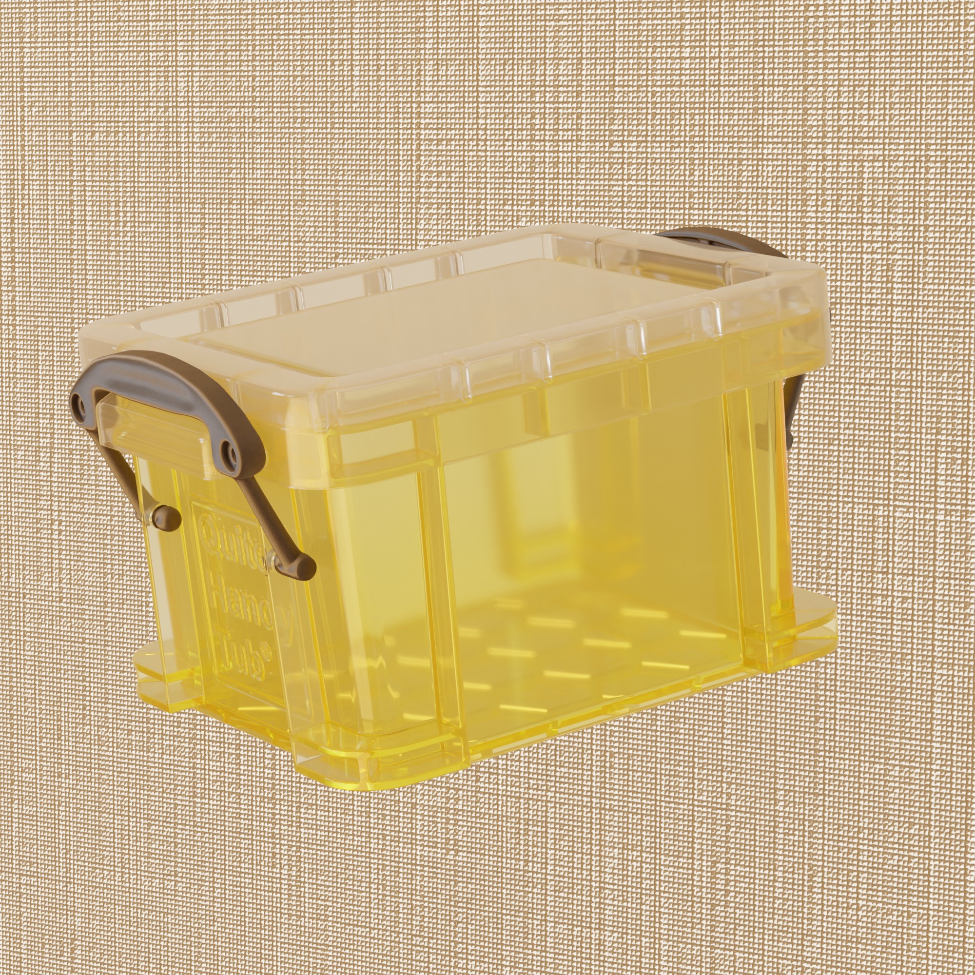
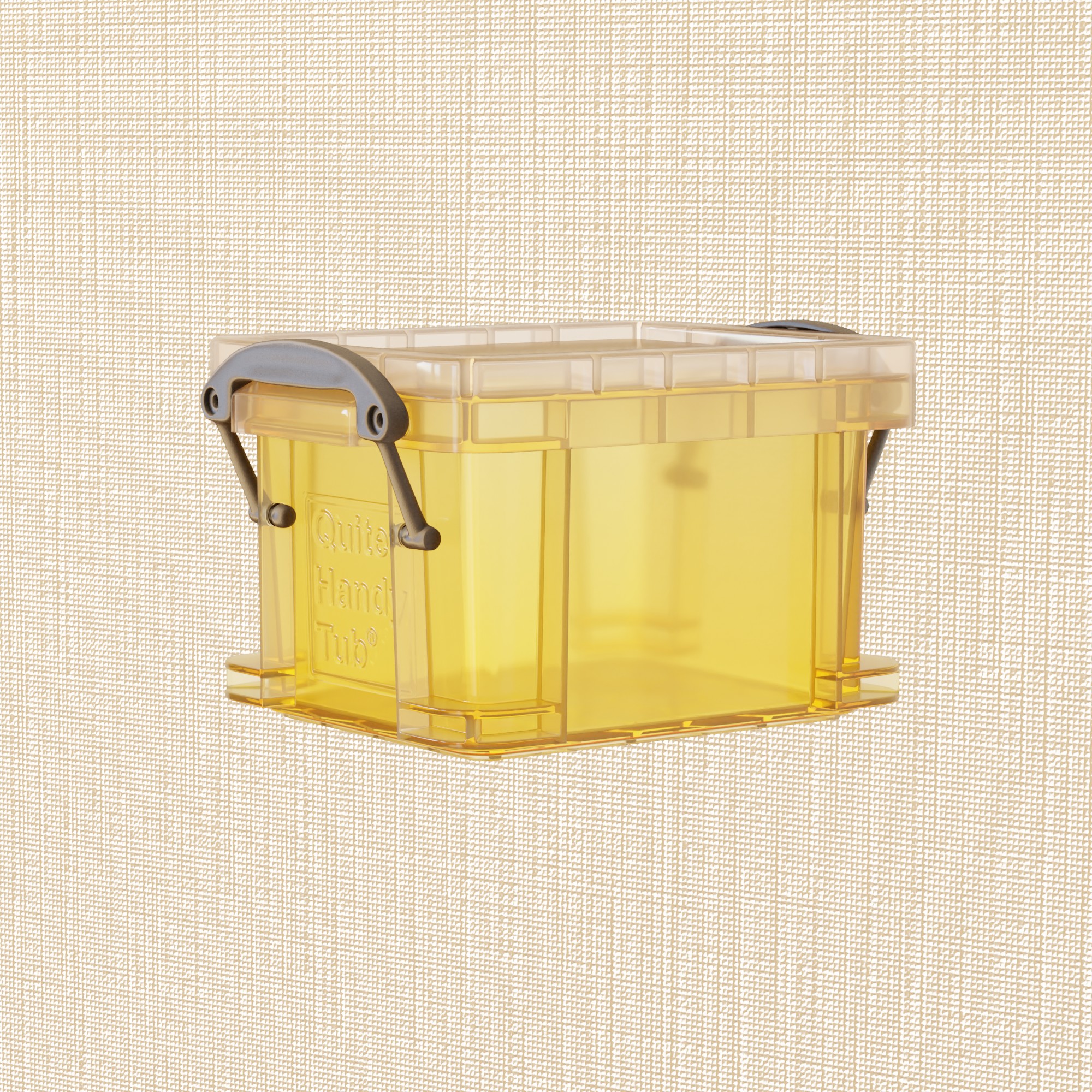
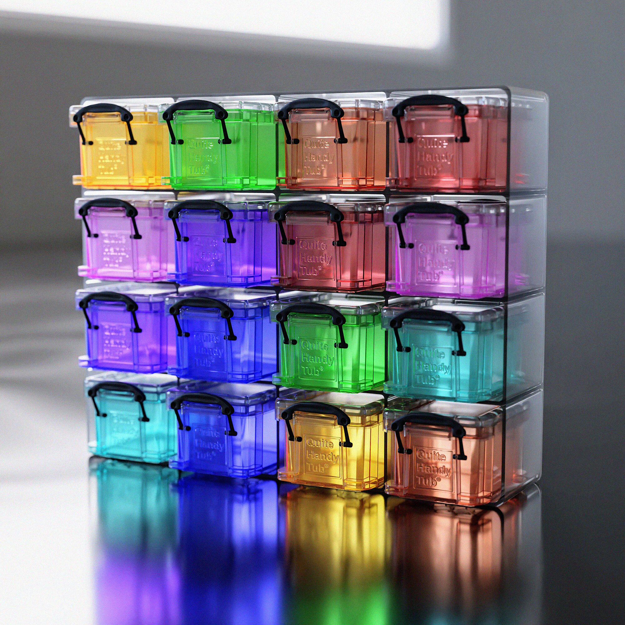
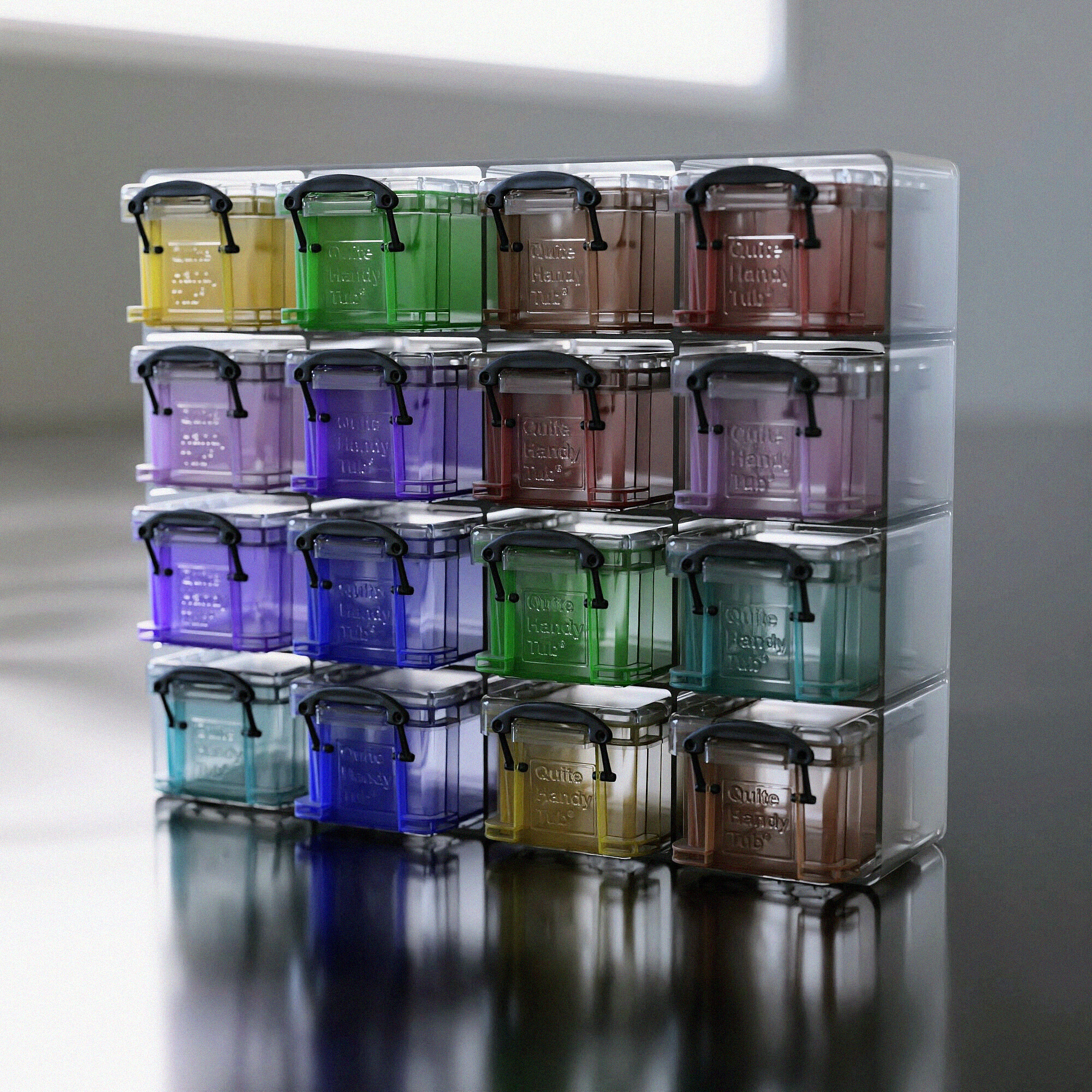
Also very helpful, thanks once again! I did a new render to compare - my old setup, and the new one suggested here (with principled volume, refraction/glossy/fresnel). The original setup is clearly less realistic (the reflections are crazy) but it does look quite good still - more like an advert style with bolder colours.
The latter looks more realistic I think but I’ll need to tweak the post processing etc (and volume density needs to be upped - hard to tell in preview). Both were sampled at 3000 samples (min=256) with 32 light bounces for everything, and a sky texture providing illumination through the windows.
I think it looks a bit darker than it should. Cycles struggles with sending enough light through glass materials or similar.
There are some things that can help.
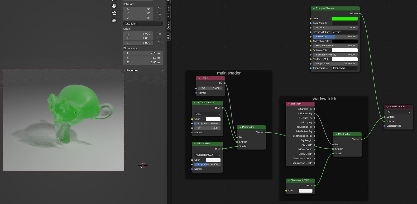
Try using multiscatter ggx. Glass materials with many bounces are one of the cases where it can actually make a difference and make the end result brighter.
If that’s not enough, I would try the shadow light path trick. It’s a bit of a hack, but Cycles doesn’t really have a physically correct option that sends enough light through transmissive materials.