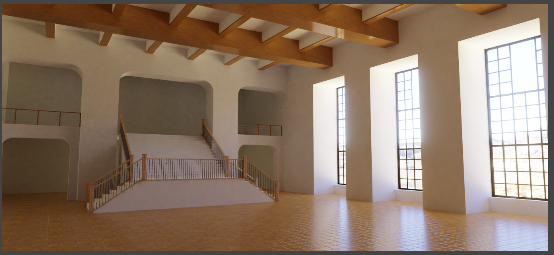
Any tips on how to make this scene more photorealistic?

Any tips on how to make this scene more photorealistic?
Hi, you can make the scene more realistic with more textures in the walls and the top, some grunges textures make more realistic, the stair need better textures too. There are a box without textures. You can configure the glass shader with grunges and colors too, the windows looks too empty.
I’m not sure if you use the bevel modifier with the models, some irregularities will look good.
When you populate the scene with some props its will look better, and probably you need to change the camera lenses. I think its a must a more natural HDR environment texture.
you need more imperfections for more realism.
I hope its was of help.
Floor texture is looking pretty good. I think it could be scaled up a little though, as planks seem slightly small…there is also noticeable tiling.
I agree with above comment that everything else needs some texturing etc…aswell, but you probably already have that planned.
biggest thing for me is the lighting. With a nice bright sun lamp coming through those windows, you’ll get some really interesting shadows and lighting hitting the floor. A HDR will also give more variation to the color of the lighting coming in aswell.
But you’re off to a good start! 
Supporting structures (i.e. a concrete column) usually have a chamfered edge, so I would definitely throw a bevel modifier on that. Perhaps a secondary bevel to round the edges of the chamfer, especially if you plan to go any closer. In CG, you might want to have them larger than realistic to “catch more highlights”, generally improving the visual quality of the image.
Sun is nice (this one looks like daylight only), true, but keep in mind that indirect light bounces from sun will cause significant noise. Maybe a fake tree in front of it to break up the pattern and make shadow more interesting.
Utilize the color scheme more deliberately. Perhaps have the “inside” part of the rear wall same red as the ceiling parts, perhaps a floorboard with color to match the black railings etc. Maybe light up the inside coves - which makes them more interesting. Good idea to render out those passes individually (daytime only, interior lights only) and add them together in post for maximum control and less noise.
There is really no focal point in the image. What is it you want me to look at first? Guide the eye towards that using lines in the composition, framing, weighting and so on. A good trick is to use a mask/frame in the foreground that is out of focus. If there was a focal point, maybe a filled dinner table with some couple dancing or something, you can get away with less detail in the background.
The floor looks total CG with its repeats. and total flatness; a topcoat would have scratches where the floor is used, would possibly have to microroughness going on, and the layer would not be completely flat (reflections of windows would be more sharp but also more curvy). You could also break up the floor into sections, patterns with dark or other colored wood, tile sections, heck even some rugs would break it up
It’s an empty big room with nothing in it. Make it interesting, make it pretty, screw realism 
That’s about my answer to 80% of all questions asked here.
It should be Rule #1 of 3D modelling. When in doubt, grunge it out. Wear those edges! Stuff those cavities! Real life is straight up dag nasty, yall.
Here are photos of the real-life room.
The walls are very clean and there doesn’t appear to be any grunge texture.
It doesn’t necessarily have to be grungy as hell. In a more pristine environment like that, think of it more as tiny imperfections that keep things from looking too flat, too clean. The diffuse might have slight discoloration in places, the roughness a good bit of variation, the normalmap slight undulations. You don’t want to throw in so much it becomes immediately noticeable. You want only enough so that it breaks up the light bouncing off of it by just so much.
In real life, nothing is ever perfectly uniform. There’s always some wear and tear.
What building is it? I mean, the fireplace alone is bigger than my apartment
If you bump up the exposure and possibly use filmic, I’m sure you can get closer to the external lighting. There seems to be floorboards and rugs as I mentioned. You have s very sharp circular highlight on your handrail. If caused by a topcoat, there seems to be more reflections going on in the wood itself.
I wouldn’t worry too much about lighting and materials at this point. There seems to be a lot missing wrt modelling. Crap in = crap out; there is no way to “increase realism”, nor make it look good, with the little you have. It’s a start.
Not recognized ? 
Overlook Hotel - The Shining 
Jens
The Shining was not shot on location (except establishing shots). Acc. to wiki interior was shot on set based on Ahwahnee Hotel. Still, it’s a hotel, I thought it was some kind of government administrative building given the flags and ornaments/arts, which also appeared weird to me. That’s why I asked. There should be no shortage of fottage on how to go about populating your scene.
I might have recognized it if the image was high enough resolution I could see better the guy with the typewriter. I’ve seen The Shining a few times (I love the music), but the layout of the lounge isn’t what I remember from it.

I made the Indian wall painting just above the fire place last night. It’s not an image texture, but a mesh I made from scratch.
No perfectly flat image textures of this art exist online, to my knowledge.
Do some reading on Ansel Adams’ “Zone System.” Then, consider the image in post #1. The windows are almost but not quite “blown-out white,” while the ceiling and especially the upper balcony almost disappear into the gloom. Use the Histogram tool to quickly check the distribution of light-levels within the scene – you usually want a “bell-shaped” curve while what you see here would be a “U.”
Photographic film had a very limited ability to capture light – only a four or five f-stops – and video is in many ways very similar. Printing processes are also limited. So, that’s one reason why this is such an important consideration.
The outside is white-out blizzard conditions, which is why the windows are so white.
my 2 cents would be this:
Don’t try to fill it with things yet (objects/tapestry/ paintings).
This indeed is a space that could exist as you have it now and indeed it doesn’t yet look realistic.
Objects will make it look more realistic but you will bypass your main objective which is lighting it well.
I am new to blender (but not in 3D) so I cannot give you advice on the engine settings but as far as lighting is concerned your image is still weak.
I see you have very dark chambers in the back and a filler light in the center. Why don’t you try making it as realistic as possible with only the exterior light?
(btw: an ‘honest way to cheat’ would be to remove any glass you have on the windows so that it will be lighter computationally)
P.S. good renderings without in-depth understanding of the engine you use is just not possible…
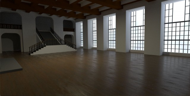
EDIT:
I gave it a try myself:
while I’m not proud of this rendering (as I said: I’m new to blender myself) I did this to show that lighting is key: with more or less the same amount of modeling detail -and with worse materials- you have to admit it looks far more convincing (with all it’s imperfections)
there is only one light outside the windows, but what I found that makes the difference is the hdri environment.
I really hope someone better than me will take this scene and show a really good way to light/render it!
RENDERING.blend (3.4 MB)
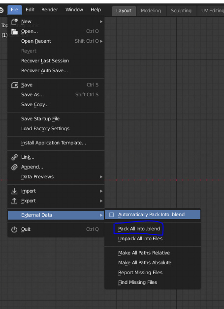
Pack the textures and I will give it a try!
how do you do that? Can you save a scene with all its dependencies? (textures/hdri/etc)???
thanks!
hdri is too big to upload but it’s this one:
and the scene with textures is here:
RENDERING.blend (4.2 MB)
Here it is now.
One quick question though, how do I make the light sconces on the walls have a glow to them? Like the real-life photos of the same place in this thread?