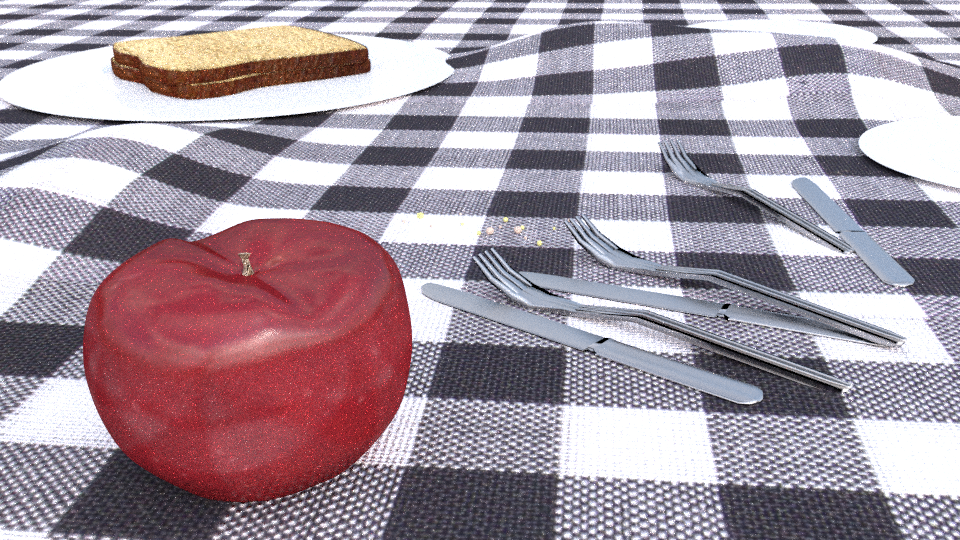
You may have seen one of the two posts in the finished projects category, well needless to say I kinda jumped the gun, I have now spent 4 days playing with this, and have learned a lot! I’ve been using Blender for a month now and I have 0 previous experience with 3D modeling, but now, thanks to Blender, plan to learn, and someday make money from this incredible art form! Please critique this image and give me helpful advice.
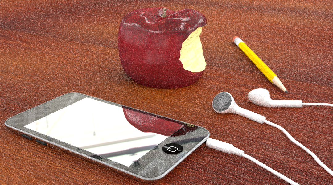
Thanks for the recommendation, it is incredibly hard (in my opinion) to find an apple texture, so I made my own, it doesn’t look the best, but hopefully it works.
I think the texture needs a little bit of work, but it’s hard to say, because the modeling doesn’t look right. It’s deformed in weird places, and just doesn’t look right.
The apple itself looks a little dull. A more vivid green would really help things. The bite looks like a Boolean was applied with a cylinder. It needs to look more like teeth took a bite out of it. (Google Image Search has some great references) Also, the shading has not been set smooth where you used the Boolean, so that section looks really faceted.
The speaker mesh on the earbuds looks nonexistent, which could be fixed with either a mesh or a simple texture.
The iPod touch’s button square seems oddly too large. I suggest you open a reference image of the device, directly into Blender, to compare proportions.
Overall, this is great work for someone so new to 3D modeling. I particularly like the bump mapping on the countertop.
I do like the idea of adding the apple in the composition… In some ways the bite mark has such smooth and uniform lines that it may benefit for roughing things up, both on the edges of bite and the inside of the apple where it was bit.
Yeah, the bite is messed up, I thought it would look better being smoother so that it more closely resembled the apple logo. I personally think the apple’s general shape is pretty good. I added speaker mesh after posting the photo. Is the apple too fat? Should I pull the bottom downwards a little? I will work on the iPod’s home button, I’ve already played with 2-3 different images for it, the real problem is getting the black screen color to match the home button of the image texture.
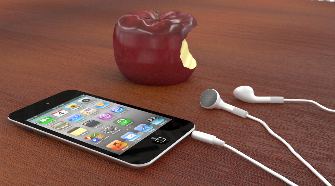
I think the changes you made to the apple in the iphone project are definitely improvements. The other scene you posted, I think your bread needs to be thicker and maybe find a way of changing the lighting on the plate (or the color) It seems very washed out at the moment.
Yeah I gave up on that scene for now, I just had that to show the apple texture. What else could I do to the ipod scene? I added a pencil on the table.
Well for grins I thought of this… Rotate the apple so the bite faces the camera more, than it is doing now. Now take the earbuds and position them on the apple… like the apple is listening to the music and has ears.
You may also want to fix that sliver of transparency in the upper right hand corner.
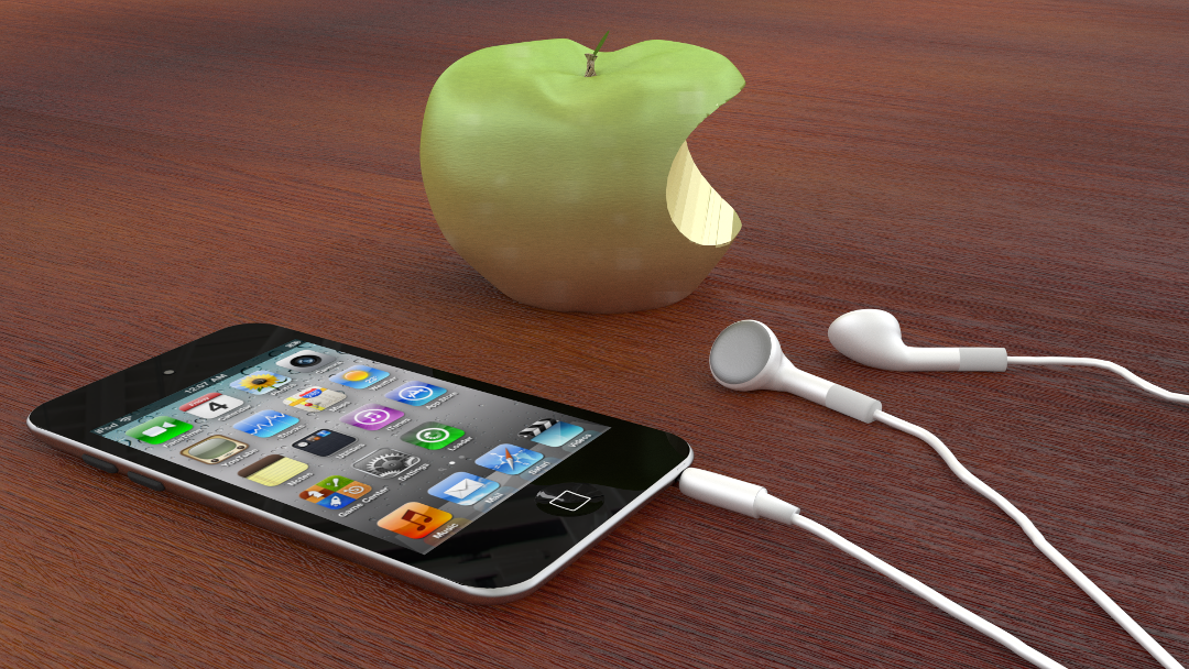
Then proceed to split the profits with me when Apple changes that boring old iconic logo, to this new cool hip one
Looks like pacman took a bite out of that apple. Add some more geometry and some teeth marks. Also right toward the center it should rise up a bit as most ppl don’t have perfectly straight teeth and that leaves a “crease” of food left behind when they bite into things. Little detail that will go a long way to selling a render.
That was Tips By B. Tune in next week for more great tips on how to crash blender by sliding the subsurf count too quickly.
Alright, I’ve figured out that is will look better with a glass (might use the IOR of a crystal to make it more polished) screen like the real thing has. Only problem is glass at any IOR and any roughness is too reflective. Is there any way make it show what is behind it and not as reflective/glossy?
 I get what you’re saying, thanks.