Hey everyone!
So this is my first Thread in this forum. I’ve always been a diligent reader, but I’ve never posted.
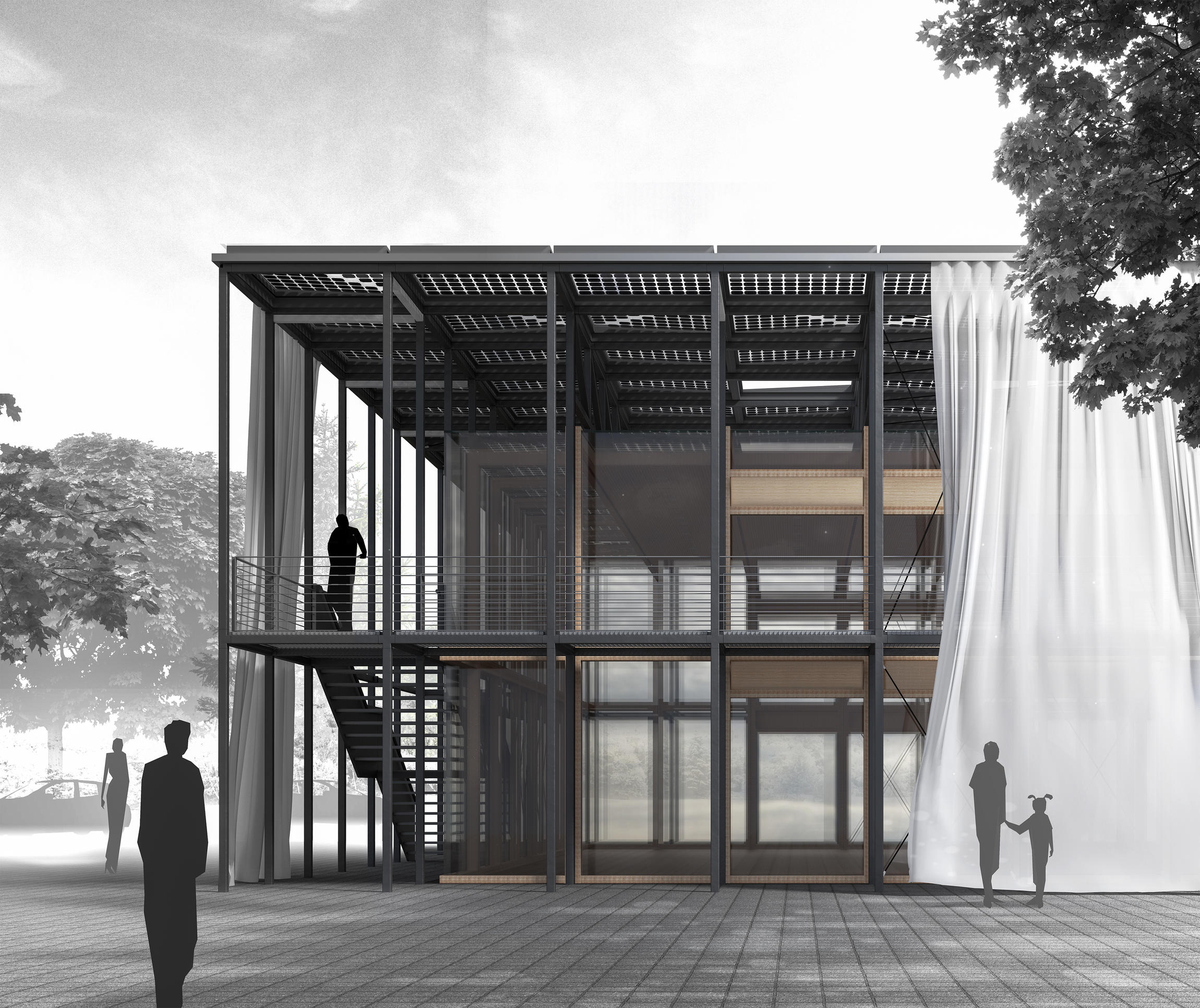
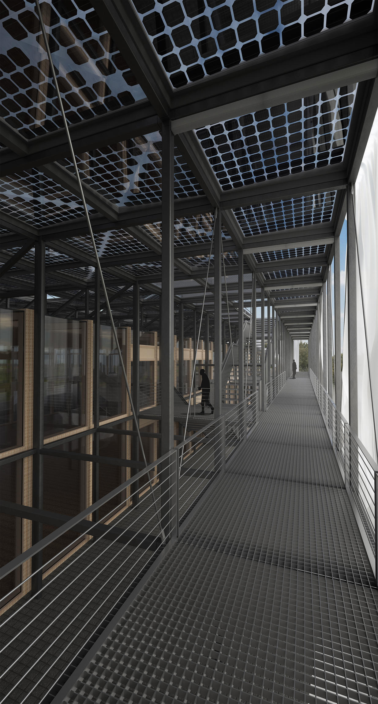
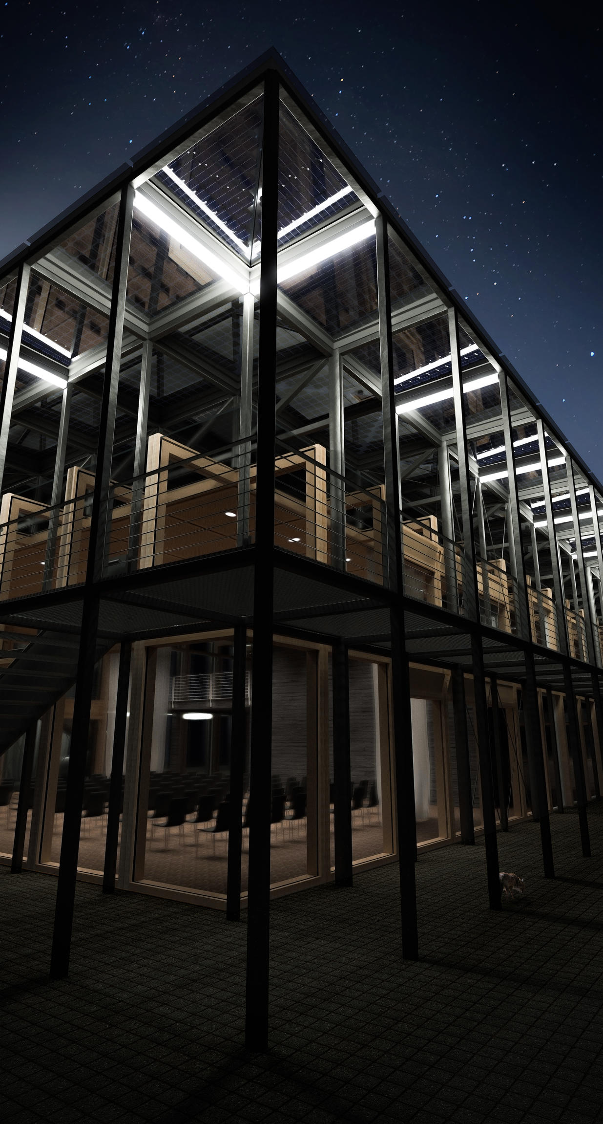
I wanted to present you something I made for university. It’s not really extraordinary work, but some of the pictures/plans may be a use of blender some of you haven’t seen before or at least I haven’t seen it exactly this way in this forum.
These are all visualisations of a project made by a group of 5 people over 4 months.

Section I (originally rendered in 16148 x 8181 for Scale 1:20)

Section II (originally rendered in 16148 x 5485 for Scale 1:50)
The draft itself was created in collaboration of all 5 people.
For the nicely hand-drawn sillouts of people and some photoshop work with the black and white trees and skies in the background, so some of the post-processing, the credit belongs to one of my fellow students.
Most of the rendered content seen here was created by me, as well as the 3d Model.
I know that the model and the scenes lacks of detail, some of the materials could be improved and that they have multiple minor mistakes, but you have to know that these “drawings” are always made while under serious deadline pressure and I didn’t want to redo some stuff instead on focusing on new projects.
Mostly I didn’t even had the time to do test renders and just tried to judge by live view if it would look alright.
Still I would really like to hear your opinion and also improvement suggestions!