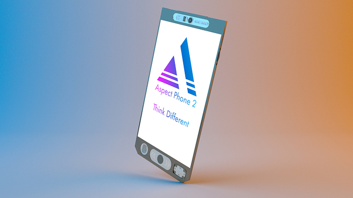
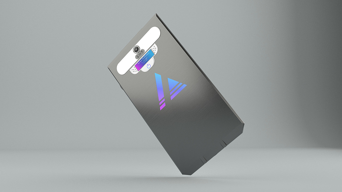
What do you think? This is my concept phone, the Aspect Phone 2. It solves all the gripes I have with modern phones, and I want to know how to improve, especially with regards to the lighting. Thanks!
Hiya there!
I think the phone looks a little too sharp and flat for a real model. Throw on a couple of subdivisions and bevel out the edges. The screen should have some edge around it, in order to separate it from the rest of the chassis. In terms of lighting, use a HDRI of studio lighting to get a more photorealistic look. Alternatively, add softer lighting by increasing the lamp size. The backdrop of the model should be more curved (you shouldn’t see an edge or crease). I love the look of logo and the colours you choose for it. I don’t think a silver model should be your base. Maybe put the text and logo on a deep blue or purple screen and use a black or dark colour for the actual chassis. Hope to see your improvements!
~ Para


