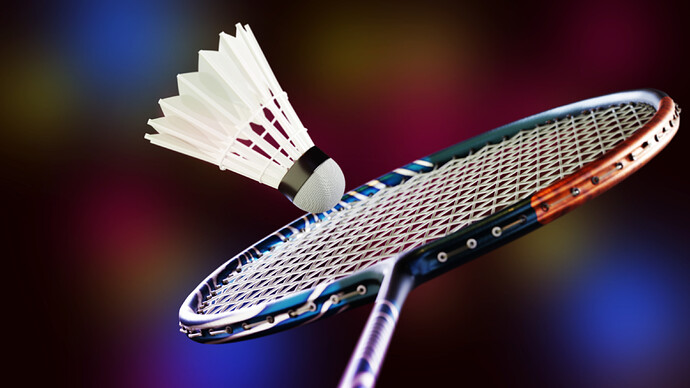
Here there is my last render. Rendered with Cycles and some adjustments in Photoshop. I am open to any kind of feedbacks and suggestions. Have fun!
2 Likes
Definitely like this … a few tweak-suggestions:
-
Right now, the edge of the birdie exactly intersects the boundaries of the racket. How about therefore moving the birdie – very slightly – so that it is clearly “in contact with” the racket … or at least, no longer directly intersecting it.
-
Either “motion blur” or maybe “a bit of artistic license” might help to convey the now-missing sense of motion. Perhaps even composite (or Photoshop) one-or-more “series of ghosts” (I hope you understand what I mean …) to convey rapid motion.
The components – the racket, the birdie, the lighting, the background – are all very fine already.
1 Like
Thank you for your suggestions! I will definitely try those and see what I can do.
