Hello. I am working on a mesh that I hope to use as a basis for character projects going forward. Because I intend on reusing it, it’s important to me that it doesn’t have any issues and is as good as I can make it.
I plan on using this for animation, so the topology and vertex distribution is important to me. I am particularly concerned about the strategy I used for giving definition to the back, and whether the loops around the buttocks are problematic.
I can easily make adjustments to the body shape, which I intend to do while I polish it further, but I’m worried about the hands- they have a boxy and unnatural appearance when smoothed, and I really want them to look good.
Additionally, I’m concerned about how extreme the shadow transitions are when the model is smooth shaded with subdivision turned off. Is this an issue or a sign of poor vertex distribution?
Any feedback is appreciated! If you would like to view the blend file, please PM me.
Base Mesh WIP
Imgur isn’t loading the image for me. Any chance you could try uploading it on Blender Artists? It’s really easy to do, you can just copy the image and paste it directly into the post.
As I said, I can’t see the image, but I will say if your unsubdivided mesh is fairly low-poly, that’s pretty normal. Of course, poor vertex distribution will also do that, and subdivision sometimes hides those kinds of flaws. I’ve experienced both situations. ; D
If you repost the image and I can see it, I would be happy to give some proper critique.
Oops, sorry about that!
I reuploaded to imgur because the forum prevents me from uploading more than one image per post, I’m afraid.
Here’s the images combined into one very big image.
That looks really good. Nice work! Good proportions, even vertex distribution, topology is mostly quads and mostly follows established norms for good animation.
I see what you’re talking about with the shadows though.
That is not a distribution issue. Distribution is excellent. This is a normals issue. I would guess it’s either
- You don’t have smooth shading on these edges. Smooth shading doesn’t have to be applied to the whole mesh, so you may have missed a spot. Try applying the the smooth shading to the whole mesh in object mode.
- You have smooth shading but auto smooth enabled and set with an angle that doesn’t work well for this area. Could also be a weighted normals issue. Reset your normals.
- If not either of those, double check you didn’t set these edges to sharp or something.
- Being fairly low poly, this may simply be an area where the normals can’t be properly smoothed by regular smooth shading because of the angle. That’s highly unlikely though, most likely it’s one of the others.
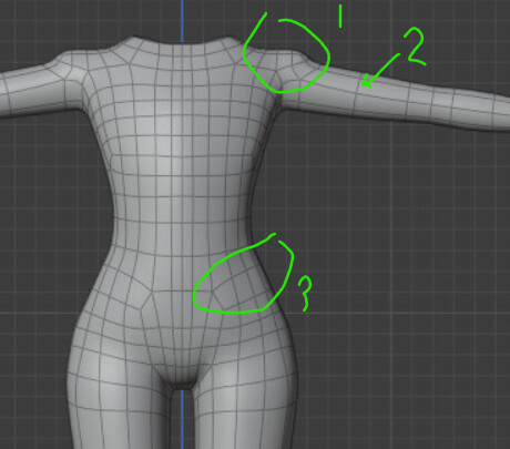
- Is the shoulder meant to be especially defined? I would soften it unless you are going for an angular style here.
- You’re being pretty conservative with the spans here. You may genuinely not need more but I would divide the upper arm into two spans of edges to have more control over the shape. If you ever want to use this as a base for a muscular character, you’ll need it. If you want to do pore level sculpting on this character, you’ll need more than that, and your legs need more too.
- I’m familiar with this pattern and know it’s supposed to be good for rigging, but this looks like the change in direction is a little high? It’s probably fine, but I wonder if that pattern wouldn’t work better a row or two lower? I could be wrong though.
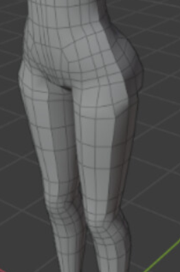
Good back topology and leg topology. I would add a little more shape to the calves, but there’s nothing wrong with them as is.
- Unless these edges serve a purpose, I’d dissolve them to have all quad geometry.
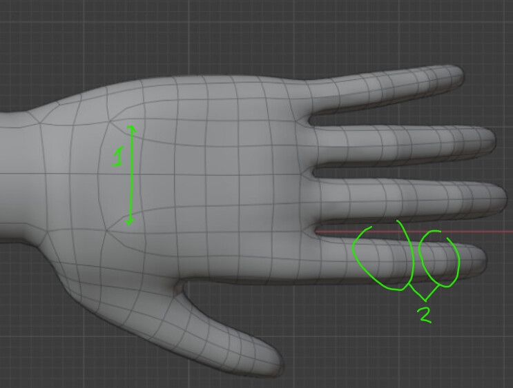
- Not everyone bothers, but you know that pattern you put in the geometry for the joints at the knees and elbows? You can use that same topological pattern at the finger joints to improve bending.
Otherwise the hand topology looks good, and the hand doesn’t look boxy when subdivided. Shape actually looks pretty good to me, but normally fingers aren’t the same length. If you pull in some photo refs, you might see ways to tweak the shape to look better.
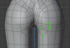
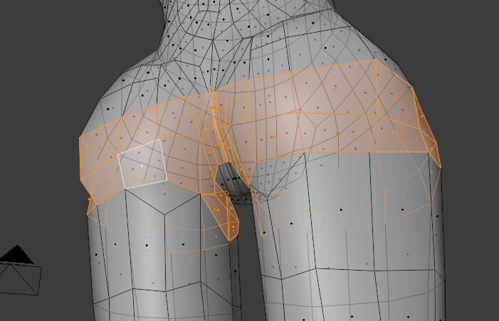
I would merge the highlighted points, unless they serve a purpose. I don’t see how they’ll improve the deformations in the butt.
Feet look pretty good, just remember toes aren’t flat, they have a little bit of curl even when relaxed.
The head and the neck are still missing. So I am not sure if the proportions are right. The arms might be a bit too short because the span of the outstretched arms is approximately equal to the height of the body, including the head.
A realistic adult human character is about 7.5 heads tall. But this varies for the different styles (heroic, ideal, stylized, cartoony, anime, etc), and the age of the character.
And add some extra geometry for the breasts?
Thank you both for the detailed critique! I’m relieved to hear it’s a solid foundation.
Most of the tweaks suggested are things I can iron out pretty easily.
I will keep the proportions information from JoeBlunder in mind. I am going for a stylized semi-realistic character pattern, and have a tendency to make legs a bit long, so I’ll keep an eye on the arms possibly being a bit short. Presently, the breasts are omitted on purpose to keep the mesh flexible.
Resetting the normals vectors fixed the smooth shading issue. Thanks for the tip!
As for that singular plane in the buttock area, especially in combination with the loop over the hips… this is the part of the mesh that has given me the most trouble. I spent two days rebuilding that topology over and over and this was the most cleanly I could iron things out. If you have any ideas for a better way to redirect the topology PLEASE let me know.
I think you can just merge the verts in green without messing up the quads.
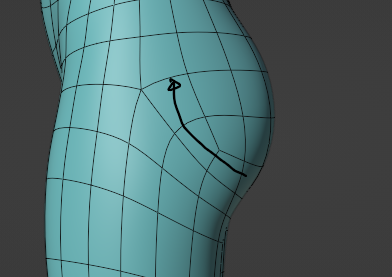
If that makes it require more rework, maybe you could try redirection like this:
1 Like