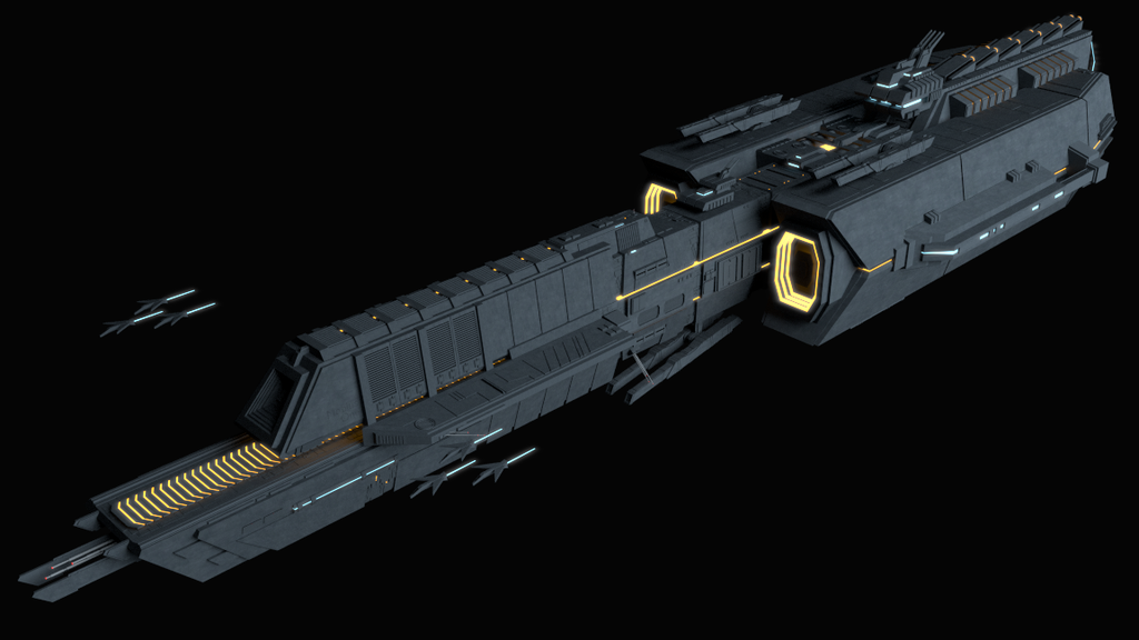
Haven’t been posted here for a long time. Here is another carrier concept design, the small space crafts were created really quickly just to give it a feel of a carrier with the space crafts protecting it. Love the orange light effects as well but still a lot of room for improvement!
I’m still trying to improve the lighting to make it more realistic, and perhaps a real background. If you guys have any suggestions please feel free to spam me
Nice concept
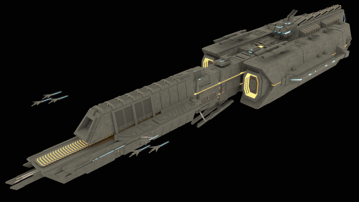
More detail would definitely help. Space background, afterburner flames, more little lights all over the place…and a fleet of frigates and cruisers. Battle Carriers IMO must be much bigger in proportion to frigates…its a mother ship… A LOOOOT of stuff goes inside that thing
Not quite sure that flames might be the thing here. In the starship models I’ve been working on (not happy with them yet) I’ve been trying to perfect for lack of better words “drive grid glow”. In my humble opinion flaming rocket engines are so Buck Rogers…
If I were to criticize (and I feel like I’m throwing rocks from inside a glass house here…) the lighting is what really needs to be worked on. You can’t see enough of the ship to know what’s going on.
Thanks guys, for the little lights I tried using fast gaussian blur but since they are so small they dont’ really blur/glow. How can I make those little lights come up glowing? Do I need to use AO + world? I will try something later tonight.
The one space scene I got to light correctly I cheated and put a plane with emission just off camera to illuminate the scene. Another trick I used was the planet on the edge of the scene also had a slight emission to it adding some indirect light.
I have a collection of Hubble images that I’ve squirreled away in my textures library. I use images as planes to add them to the picture, placing them as far back as “makes sense” but not too far back.
For the bottom of the image I use another image as plane and here is where the tricky part comes in. If you aren’t careful you’ll see a hard line where the two intersect spoiling the effect.
Then I jump into compositing view and assign an emission to each of the planes, turn on rendered view and adjust the emission level so the stars, nebulas, whatever glow brilliantly but not to brilliantly.
I experimented a while back using a sphere encapsulating the whole model but gave up when I couldn’t get the image to appear on the inside surface of the sphere. I know now that all I have to do is flip the normals but that was my third or so model that I was trying to create with blender. (I just started with Blender in July 13)
There is something for you to keep in mind. I’m quoting a friend of mine who models science fiction themed art continuously within the context of an RPG called “Traveller.” He told me in an email “Lighting in space sucks. There are extremes of light/shadow you don’t get on earth.”
So if you try to hard to use a single light source emulating the local star it ain’t gonna come out pretty.
I have a model that I did a month ago as a proof of concept. I’m not happy with the detail in either the ship or the shuttle that is leaving the ship and I’ve never returned to it. Thankfully it hasn’t become another “crumpled sheet of paper on the floor” and I still have the model. I meant to render it out last night, hand you the blend file and let you play with it. It is an example of what I just explained above.
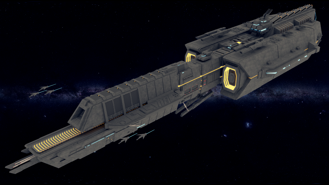
Thanks for the explanation, yea its tough to light from just one source, I’ve been playing around, I ended up with just using AO with no more emission planes and it actually came out better than before, at least to me. Lighting with a space background was a pain, the model just didn’t blend with the background.
Very nice model. Reminded me of Homeworld game at first glance. Very nice detail.
For lighting tips/hints you might check out JDaniel’s Giant Spaceship Thread. He posted a tutorial there that gives some very good info on how to set up a space scene, specifically using a world background image and other surrounding objects as a light source.
There is a lot in this model that I am not happy with but I share it to illustrate the point I made earlier about lighting. Off camera is a “sun” light source that I’ve added for the main source of light. There are two “images as plane” also providing light in a much more subdued fashion and I’d like to think the planet to the right is also providing reflected light but I won’t swear to that.
This image is one of the images I’m considering as cover art for a book that I’m currently writing.
The planet texture is supplied from a program called “fracplanet” and in my opinion does not have enough detail to suit me so I’ll be considering other options. My starship and shuttle are not detailed enough for my liking but at least I got the lighting I was after…
The starfields are from Hubble imagery easily found on line.
Awesome model Gundamf91! As far as integrating it with a spacey background I think you’re first bet is to locate a background with colors that mesh well with the overall lighting in your scene, conversely you could consider creating your own space background. I find that a few different cloud procedural textures and some particles work well. Other than that you might try making good use of the Color Balance node in the compositor, while it’s not going to save you from fundamentally flawed lighting issues, it’s a great way to tie colors together in a scene.
I opened your render as an image in the compositor and ran a quick color balance on it. Being in space you’ve got a lot of options as far as coloring goes, but I went with a more standard daylight type, slight blue lift and mid yellow gain. I’ve also included a screen cap of the node view.
I think what would help immensly would be to put it into relatio with something. Either put a star/planet in the background or some asteroids. If you decide to do that, don’t let the ship take up the entire frame.
And maybe a different perspective would help. Your perspective looks a lot like the typical shot somebody takes of a car on earth. I think you can get through with quite some “odd” angles and perspectives, since in space up, down and every direction is relative and nobody tries to keep the “normal” directions. :spin:
Just my 2 cents. I’m probably skipping the lighting part and going straight to the compositing. So if you haven’t tried to composite in the the frame yet I’m sorry.
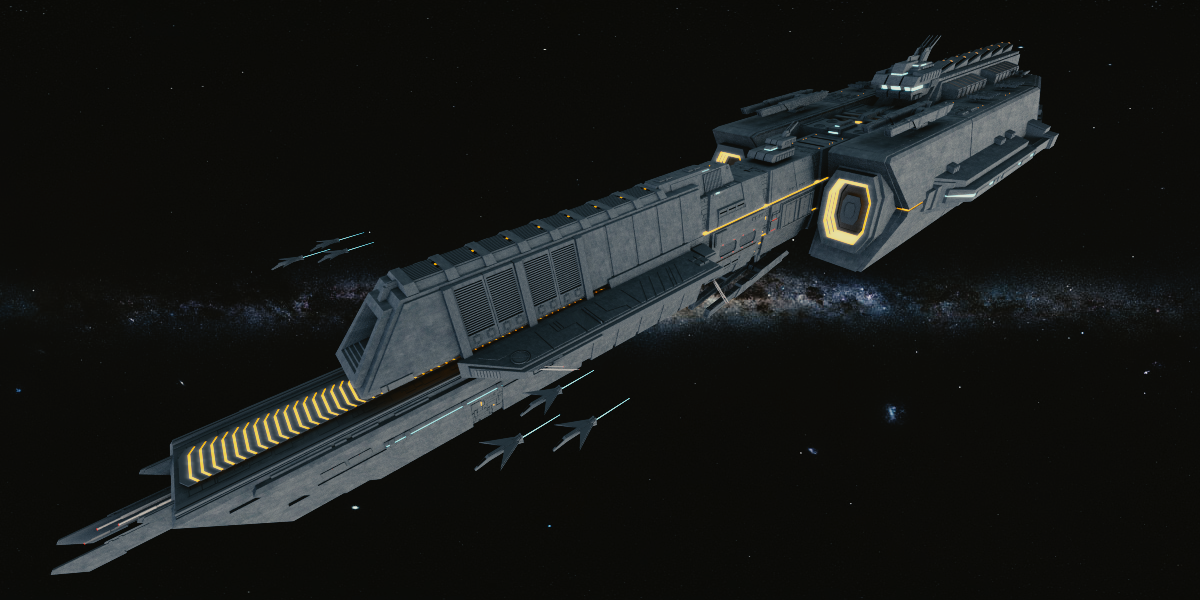
Thanks El Mustachio and juca, I also forgot to thank jdover for pointing out JDaniel’s youtube tutorial, damn his video opened my eyes on space lighting. I really appreciate all you guys’ responses.
This is what I have come up with after reading his tutorial Obviously still tons of room for improvement but now the lighting seems better because I’m using background enviornment texture in the world setting like JDaniel mentioned in his tutorial. I’ve also played around with another camera perspective as well