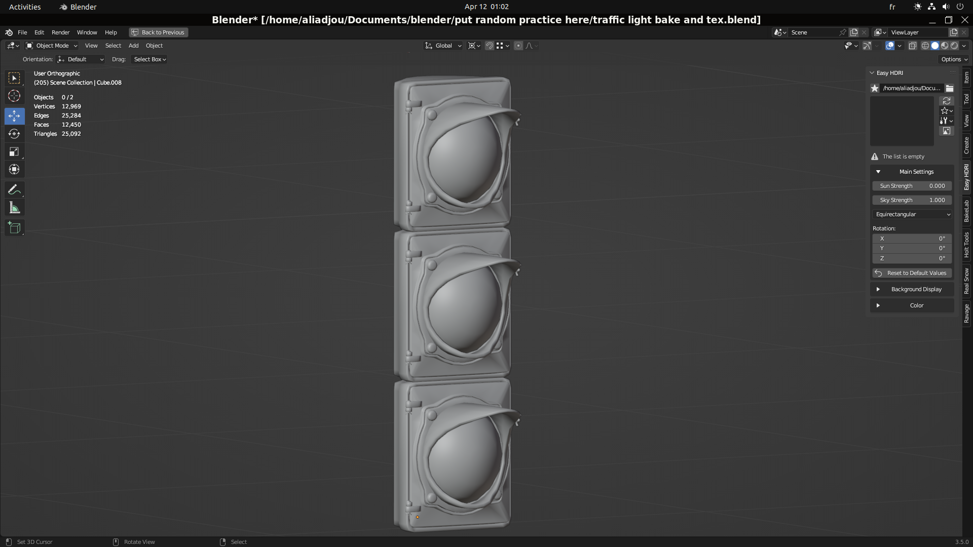
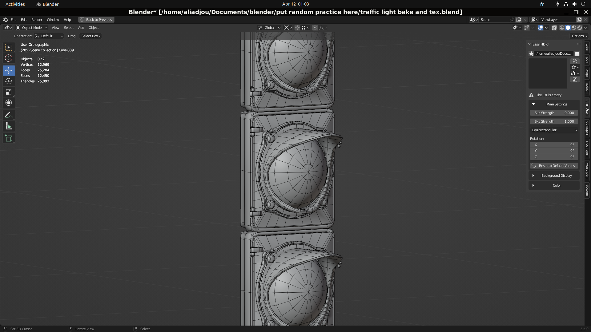
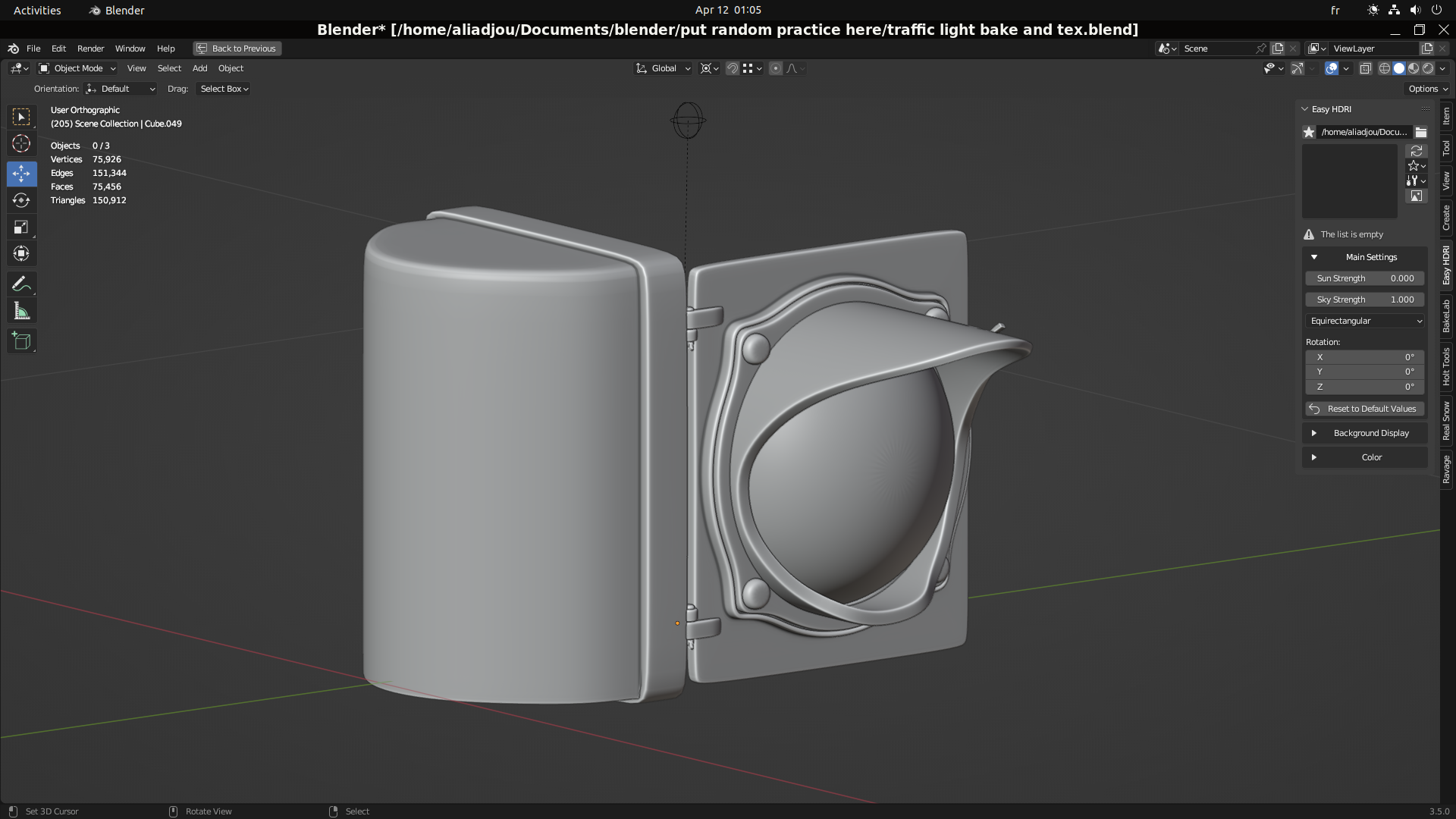
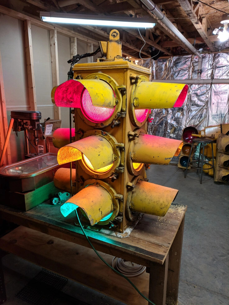
here i present to the result of my study fully textured in blender
i tried to do an approach like i see in substance painter i mean texturing with mask and hand layer and hand painted … u can see the low poly and hp model … with some of the map i did make … feel free to critic my work as you pleas … thanks in advance
''english isnt my first language …in case of mistake in writing"


8 Likes
Hahaha it’s cool !
No need to be harsh ![]() , if it’s supposed to be a regular props I think you’re done.
, if it’s supposed to be a regular props I think you’re done.
Now if it’s supposed to be a hero props, with some close ups, then I’d use more references.
There is a lot of edge wear on the paint, but the glass show no dust, so the yellow paint.
The way the asset is built and the texture done shows that you technically know what you’re doing, from there using good references helps a lot !
so :
Not that much edge wear, since probably people don’t access them a lot.

Interesting details, notice the dust :

Where the dust go ? notice the distortion and the color de-saturation on the paint.
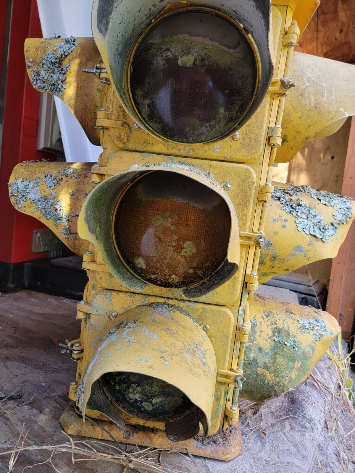
Distortion and interesting stains,
Interesting textures as well.

On the overall you did great, I think it’s better to exaggerate edge wear since it’s what we expect to see, even if it might not be what append in real life !
Keep up the good work !
7 Likes
Thank you for your constructive feedback … I really appreciate it ![]()
I’ll try to aply what u say in my next project
1 Like
You mention .we try to exagerate adge wear " so true ! I tried to do realiatic detail from similar image to your but it always end up soo not realiatic and fake … The i looked up on asset on artstation and i aplayed detail following them but keeping close to the real image and it looked way better … Guess i need more practice to get a belivable asset
1 Like
I think that’s generally fine ! You obviously know the technique !
What you can try is to put more context, or “story elements” .
If you model a mug, it’s probably going to look boring. So it’s best to put it somewhere. Like on a desk maybe. If you don’t think about it further, you are probably going to make the simplest choices, like probably a mug next to a random keyboard, with a pen, and / or a book… That’s probably going to look boring as well.
But if you start to think who is the owner of the mug/desk, and what his desk say about that person ? You can start to build a much more interesting image.
Would that be the high tech desk of tony stark ? or vintage kisch desk of Michael Scott, or an old abandoned mug from the last of us universe ?
That way it’s not about the mug anymore , but the mug help to describe someone, or an universe.
When you start to think that way, creative decision are driven by the “story elements” and it’s easier to know how much wear to add, or what kind of elements you should add around to support the main element / focal point.
It’s not that much a technical thing, but more about a way of thinking about your work. That’s what makes things looks more natural, and therefore makes images more impressive.
2 Likes
Sup bruv! I think it’s cool. Just think that the displacement on the light bulbs is too harsh.
Without trying to discuss how you did it, let me just give you my initial reactions to what you did. It’s a very interesting interpretation of a traffic light. But it also gives a “wide-angle lens” interpretation, only in the vertical direction. The hood of the top light points up, while the hood of the bottom one points down. The LED-pattern in each light is also different – and consistent. The “painting” treatment of the fixture is “weathered” in two specific areas: the edges of the lights and the gaps in-between them. In other words, it is neither “grimy” nor “noisy.” The position of the “latch” by which these light fixtures would be opened is exactly the same.
In short: I think that “the initial impression” works extremely well. It is “understood, I think, to be a stylized image,” and I think that it is quite striking.
Also: the fact that you blurred the outline of the traffic light, at least in the image which appears on the topic title, adds positively to the impression that “this traffic light is meant to be abstract.”
1 Like
In my humbe opinion the biggest issue would be the identical damage / worn edges on all three parts of the traffic light. Model looks pretty convincing otherwise.
thank you for your constructive feedback sir … i Appreciate it
thank you for your constructive feedback sir … i Appreciate itt