A game event inspired scene, intended to be printed on textile - not a job though, luckily.
Finished so far: sand, rocks, portal, background, composition, and most sea monsters (to be linked instead of cubes later).
Individual pieces look okay, great even, but the whole just looks bad and I can’t seem to zero in on a solution. I intend to ignore the characters as much as possible - gave the front one a cloak only because it covers everything. I’ll give it better textures at the end and leave it there.
If anyone has ideas on how to make the scene look interesting… any suggestions welcome. shrug
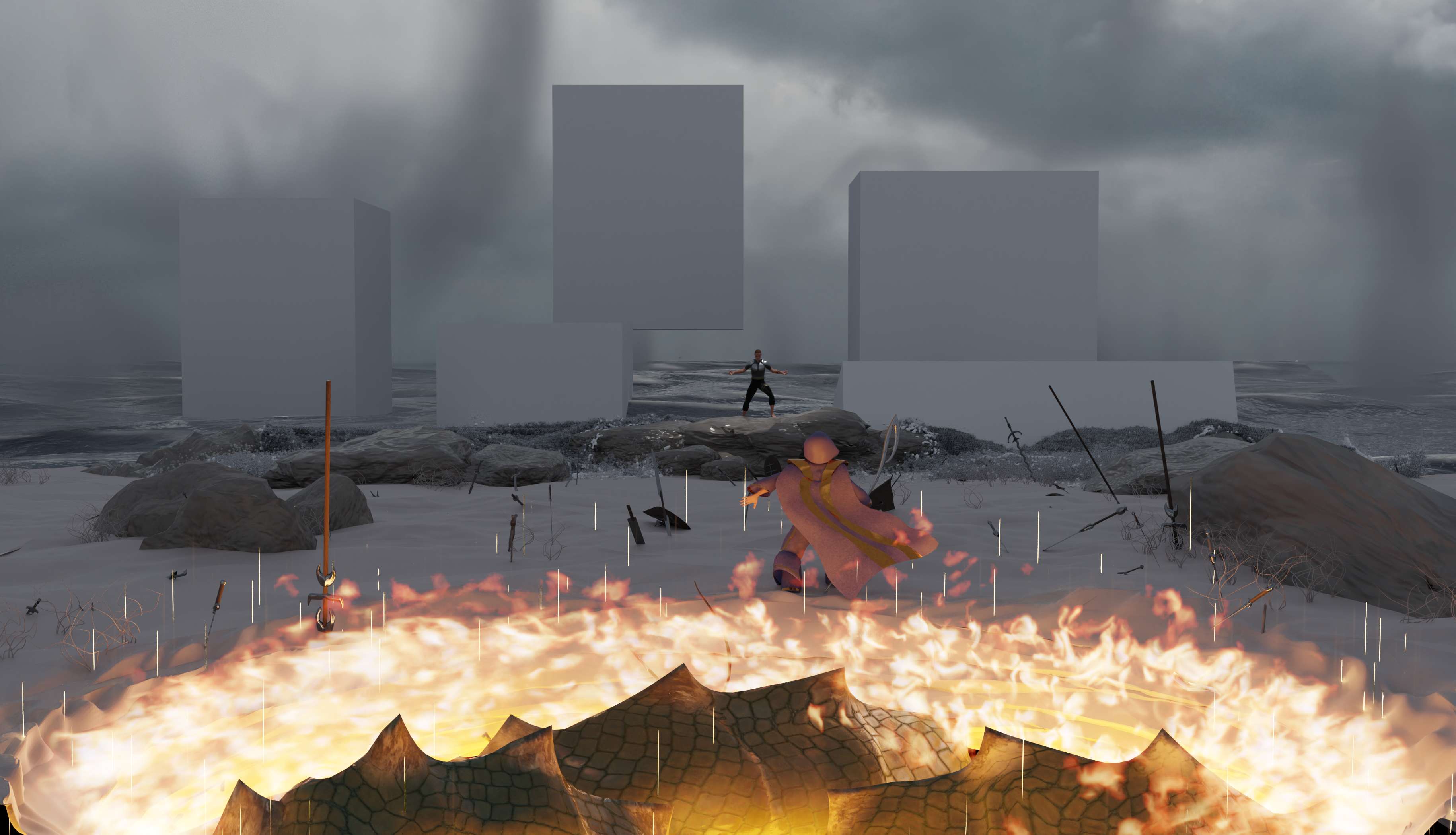
My thoughts are that first, I need interesting light. I thought a textured area lamp would work, but it just looks weird, I guess I dont know what to light with it and how much. Currently there is one at 2 o clock but it’s not even visible.
Tried making sun rays through soft clouds and mists to give scene depth, but… well, not very visible.
Water looks horrible - balls instead of foam, but it was the best I got. Is there a proper way to do it that makes it look like actual liquid? Resolution was over 200 for this bake, but print will be around 50cm long.
The sand needs some definition too. It’s good sand, you just can’t tell it’s even there. Maybe a fresnel node to make it shinier… and maybe I should make it wet, somehow.
Does anyone else think something is missing between the rocks and sand? Like there should be some interaction there and that the rocks look like they just “appear” from the sand? I tried putting plants there and it sort of helped.