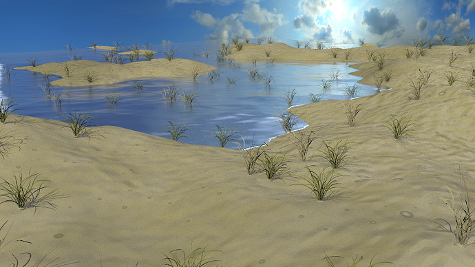
A project I have been working on in the last few days. Please tell me what you think.
Not bad as a start, however the water needs some work. First, water reflects a clear image. If you look down at yourself in the water, you’ll see a clear reflection, not a blurry you. It gets fuzzy further out, but that’s only because the individual waves break up the clarity. So, it should be more reflective near the shore. Second, it should also be transparent at the shore. Right now it’s solid and looks a bit like mercury. You can achieve this by using the fresnel option under alpha - that is, if you’re using BI, which I assume you are by the look of the image. Another thing is that the lighting is very weak. In midday, the sand would be more saturated and 3 times as bright, and individual particles would be reflective (you can achieve this with a noise texture affecting specular intensity.) But if I’m not being clear, here’s a link to a good tutorial on sand: http://www.blendercycles.com/tutorials/make-a-desert-in-blender/
Indeed a good start. Try pushing back the horizon, at the moment it is quite obvious that the scene ends soon after the rearmost dune. Also, the horizon cuts off some clouds in the background, which looks a little weird. You might want to lower the camera and add some element close to the camera to increase the perception of depth.
I didn’t say this originality but the main focus on this scene was to try and get the sand/sea line to look ok. I know the water doesn’t look that realistic. How is the sand/sea line and is there any thing I can do to improve it?
Before I go much further with materials (texture painting in foam and such) I wanted to see what people thought.
OK…so I have had a look at some reference images and I noticed that most beaches are a lot flatter close to the water due to the tide taking out a lot of sand with time. Also there is a distinct area of wet sand that is glossy, so you might add a spec map to the sand.
Looks good! but to me, it looks like a flooded desert (no offence)
You should use a different sky image. The one you’re using now looks like an upward shot of the midday sun.
