Beach

Hello everyone, my name is Alex.

I’ve recently been working on a stoney beach type scene in Blender and any and all critique is welcome.

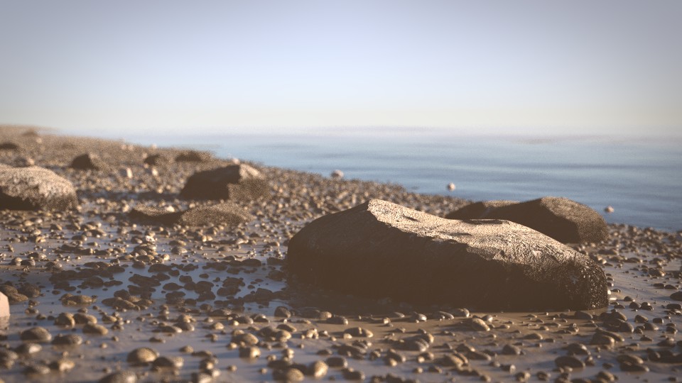
Here is the latest version of the scene:


My main concern with this scene is how computer generated it looks. I’m aiming for complete photo-realism which I know I’m currently not achieving.

The problems I’m currently aware of and will fix in the morning are that the colour correction is making it seem unreal and another problem is that the dry parts of the rock look too dry especially compared to the soaking areas on the bottom of the rocks.

Another problem which I’d like to fix but I’m not entirely sure how to fix is making the water (made with the ocean modifier) to transition smoothly into the ground. I’m also not entirely sure the shader is quite right.

The areas I’m not sure about are:

-Pebbles. Are there enough? Is there enough variety? Do they look realistic?

-Rocks. Are there enough or too many? Are they right size? Do they look realistic? Right now, the dry parts of the rock is using the generic diffuse / glossy mix with a bump map. The wet part is the same with some emphasis on the gloss.

-Focus. I’m not sure if there is too much depth of field.

-Balance. It seems a bit biased to the left. If there is a bias, I’d ideally like to fix it in a subtle way, so no boats or suns in the sky in the background etc.

-Lighting. Not sure to go with sunset or a brighter sun to get more exciting lighting and contrast.

-Colour Correction. Too strong? Does it look fake?

-Mist. Too much? Right colour?

These are the main areas I’m not sure about. I’ll address the problems I’ve already noted in the morning as it is currently 0:46 where I am so I need to sleep now but I thought I may as well obtain some feedback whilst sleeping hence me posting it now.

Anyway I’d like you to be brutal about every aspect even if it’s just a personal preference type thing.

Also, I’d like to keep everything subtle. I don’t want to have anyone walking along or have a landed wale or a dead body floating up to shore or anything like that. I just want a peaceful, realistic looking rocky beach. I want the environment to speak for itself in this scene if you know what I mean; I’d like it to be the focus.

If there’s anything else you notice that I haven’t mentioned, please do say. It’s easy to overlook flaws in one’s own work.

Thank you in advance for any feedback you give me :slight_smile:

I think the pebbles and depth of field are good. The rock in the foreground seems a bit off, but I don’t have enough experience to tell you exactly why. Too much contrast maybe?

Rocky beaches form when wave action breaks rocky cliffs into small pieces. The pieces tend to be roughly the same size, but tend to get smaller (and rounder) the further away from the cliff they are. Sandy beaches form from sand washing in on the waves from someplace else.

My impression, and I am sure there are exceptions, is that beaches with sand may have large rocks (the rocks that didn’t break) but there generally won’t be both sand and pebbles. The pebbles will either be buried by the sand, or there will be no sand, just pebbles and larger rocks.

Balance, I assume you mean composition?, anyway, the white patch on the large rock in the foreground leads the eye down and out of the frame, as does the shoreline, which it parallels. I’d try flipping that rock horizontally.

Photographs of beach scenes are heavily filtered and post processed in real photography, to make them picture postcard perfect. Since that informs our impression of what ‘photorealism’ is, I’d research what kind of color corrections actual photographers use on their beach scenes, and do the same.

Given the shadows and the mist, you have an early morning scene. So it’s on an east coast somewhere.

DoF is generally used when the photographer wants to draw the viewer’s attention to something. Here, DoF is asking the viewer to look at the large rock. Why? There doesn’t seem to be anything special about that rock. I know you’re going for subtle, but if you keep the DoF, consider attaching a barnacle to the rock.

Btw, are those blurry birds walking around in the midground looking for breakfast? You might want to focus on them, or, if they are rocks, remove them, so people don’t think they are birds.

Thank you.

Yeah the things you thought were birds were in fact rocks. I’ve been thinking about removing that particle system for a while actually because the rocks just look strange sticking out the ground like that.

I’ll also get to work on everything you just said now, thank you very much for the feedback :slight_smile:

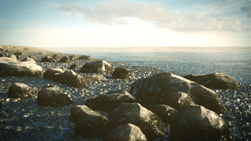
Here’s what I have now:


My main concern now is making the sea transition into the beach properly. Right now it goes strait from ocean to the beach without it seeming like the two interact with each other in any way.

I’ve tried adding some transparency to the sea so it would look like the beach slowly fades into the sea as it gets deeper but it’s not quite working as planned. I’ll experiment some more.

Another change I made was using the Sun Beams node. I’d never seen it before so I added it without intending to use it just to see what it did and soon realised it could work nicely with the scene. It’s let me add subtle light streaks for some faked volumetric lighting. Does it look good or should it go?

What’s better and what’s worse about this render?

you could add a semi-transparent layer with foam to the shore line to create an interaction between ocean and beach. A more curvy shore line with small “bays”, “hills” and “valleys” would also serve well.
The “fading” of the ground beneath the water is a bigger problem. I think you need volumetric water for this effect. Because the light looses Power by passing through the material - but for Blender there is only the surface. Maybe you could try this one: add some glass-layers beneath the ocean surface - everytime the light passes it will get darker. But the render time will also increase (and the noise). Or try adding a color ramp to the sand beneath the water from light to dark to fake the effect.

I like the warmer tones in the first render. I also prefer the softer look of the first image…the second one has harsher shadows that make it look more cg than the first. I like the way you have brought the mist onto the beach in the background. Maybe bring it forward more? Also…I preferred the simplicity of the first image…the second has a lot going on with the additional rocks. It is less ‘peaceful’ than the first image.
That being said, both images show good work! I’m sure you will end up with something nice here.

I prefer the new rocks, previously the rocks seemed out of place as they were scattered about and there were only six or seven of them but now that there’s more it brings some extra life into the scene.

I like all your other ideas though, and have made some changes to make this:


What are your thoughts?

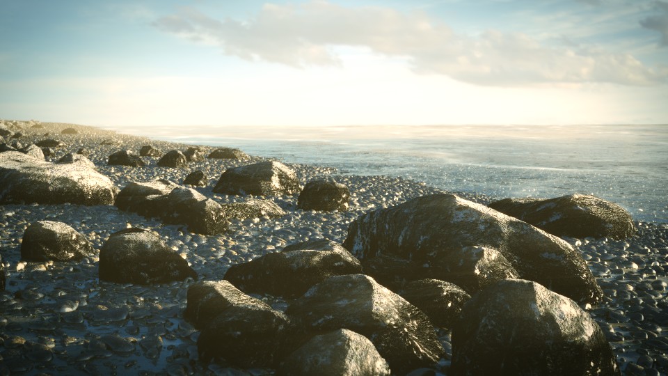
Yeah…I like the warmth you’ve brought back. Looks like you found a way to manage the beach to ocean transition too. Looks good. I think the sea foam/froth idea that was mentioned would add a lot here too and it’s a detail that keeps your environment as your focal point (although a less subtle focal point might makes more impact? ) That could be a preference on my part though. Would be interested in knowing how you did that transition! Nice work.

For some reason I didn’t see your message earlier, but I’ve made some progress in fixing it anyway. What do you think of the latest render? There aren’t any or volume involved, just transparency, gloss and a very carefully tweaked fresnel as the factor.

I did try some foam but it didn’t particularly look good, although that was before I got the rest of the material looking good so I’ll give it another shot.

Okay here’s the latest:


Only change is the addition of foam. Does anything else need to be done?

Very appealing images! Great composition and focal points.

I like the macro feel of the first image, you may consider another angle/camera for this scene to complement the latest.

Also, I’m not sure if this image has a haze/mist or if it needs some contrast/curves applied to it, but it feels almost there.

Only thing that might make it a bit more realistic is to put some seaweed. Depending on the climate, you almost always see some seaweed lying along a beach like this. Most commonly types of kelp, such as this:


Google search

But even without it, very appealing image.

And lastly, the sharp edges on the rocks are a bit distracting to me. If you reference the google search I linked to above, you almost never see sharp edges like this on rocks along the beach unless maybe inside a bay where crashing waves don’t erode the rocks smooth, or if they broke away from a larger rock formation.


Keep it up!

Yeah, my girlfriend mentioned seaweed and I was going to add some but hoped I could get away with not having any because of the render times and time it would take making it look right. Clearly not though :smiley: I’ll add it eventually, right now though it’s being rendered into a 200 frame animation which will take almost 2 hours and it’s currently 10.18pm and I’m getting up at 6 so seaweed might have to wait 'til tomorrow. Great suggestion though :slight_smile:

Yeah, to make it look right you’d probably have to use a SSS shader, which kills render times.

I like to fire up an Amazon AWS EC2 Spot Instance when I’ve got a lot of crunching to do and not a lot of time. Costs are great at around $0.20-$0.30 USD/hr for a 36 core (roughly 2.6GHZ each), 60GB RAM Linux instance.


Takes a little bit of technical knowledge, but it’s a great poor man’s render farm.

Wow those are good prices, I’ll take a look but I’ll try to just keep low render times and do the rendering myself if I can. I’ll swap SSS for translucency most likely. It usually works pretty well and if I use a fresnel node with it then it should be practically indistinguishable. I’ve also been getting 35 seconds per frame so that could easily double without causing much fuss, I’ll just render over night. We’ll see how it all pans out :slight_smile:

Here it is as an 8 second animation for all those interested. Although the more important thing is the still image so please focus more on that than the animation, although of course feedback on the animation is also helpful.

I already know the waves look a bit weird and the sound isn’t particularly great :smiley:

I’d make the animation longer with some jerky motion and more stillness… or have is pan a little and zoom a little… it seems like the camera is floating on water but is positioned in the rocks… I hear waves but see none… not sure if adding an armature could help make waves that hit the beach… some foam or bubbles at the edge… a crayfish in the shallows… rock the camera side to side maybe… add some wind sound to mask the congruency of the waves to audio matching… other background noise faintly in the distance… cars ect. good luck

Not your fault :slight_smile: - I am quite new to this forum: my posts have to be checked by a mod.^^
It looks better indeed - especially the animation. But I would darken the transparency of the water a little bit and use a crisper gloss on the waves. Water reflections are sharper in my opinion. Also the waves could need some more alignment.
But the ambience is already perfect. I would like to spend some time there.

Yeah the sound I used was the first Creative Commons 0 sound of waves that weren’t from what sounded like tsunamis. There’s about 50 seconds in the entire clip but I didn’t really think it was overly important at the time otherwise I would have searched some more. And the camera animation was lazy on my part, I just rotated it slightly and then added noise to the IPO curves hence it just floating about.

I’ll get to work on all those things though. Thanks for the tips :slight_smile: