Hi.
My first project here. It was made for november contest “beauty and the beast”(on blender3d.cz).
Perhaps have the street lights have some lightrays coming from them and illuminate the surroundings a little bit, otherwise I’d suggest zoming the camera in and focus more on the two main characters and less on the scene. Looks like it’s good but very hard to see, and not at all in some spots. 
Yikes! Give her some clothes!
That, and bring her out from behind that dumpster. Nice hair.
I like the design of the beast, but currently (probably because it’s so dark) he looks like a head on a couple of legs (no body, no arms).
Nice start!
Thanks for comments. I have made some modifications. Hope it seems better now.
to first image :this was the first attempt - modified in postprocess
Yes, much better.
Two final suggestions:
composition
You’ve turned Beauty to face directly away from the observer, even though she is the focus of the piece. By turning her away, it defocuses the composition. You’d rather tie everything together.
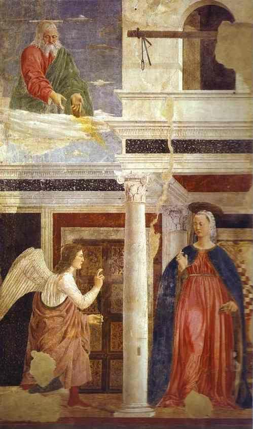
Note how in this piece (Cinderella by Maxfield Parish) the girl is directly facing the camera while her attention is focused off past stage left. Notice also the strong contrapposto in her stance.

Here’s another famous Maxfield Parish (I don’t remember the name and don’t want to pull out the cagalogue just for it…). Again, notice how the posture of the friends are turned to face the camera, while they twist to talk one to another.
http://www.rezo.odamour.com/maxfield-parish-elles-eau.jpg
I looked first for Maxfield Parish stuff because he did it very well, but here’s an old piece by Piero della Francesca (Annunciation) that also shows the ‘staged’ or ‘posed’ posture. Notice how the virgin, while directly receiving the angel, nevertheless faces the camera.
contrapposto
This is a natural stance of the human body which is very attractive. People only stand up perfectly straight when frightened or anxious. When done right, it can also add a great deal of sensuality and feeling to the character of the image.
Here’s a cute girl modelling a shirt with perfect contrapposto.
http://www.longtallwoman.com/images/products/Scoop%20Neck%20SSS.jpg
the suggestion
Turn Beauty to face the camera, place her in a nice contrapposto (as if she’d been waiting there demurely for Beast) and turn her head to look past the shoulder toward Beast’s arrival.
This will place the focus back on Beauty. Her posture (her looking at Beast) will draw the eye to Beast.
Finally, move her just a little off-center toward the left (away from Beast). This is a classical arrangement which will add a nice tension to the image and integrate the illuminated building above.
Hope this helps.
Duoas : Thank you very much for references and great help. I tried to “improve” the image but i’m only beginner in organic modelling.
Here is the update
Oh yes! Very much improved.
Does she not have a face? If she does, show it.
She doesn’t have to be actually looking at the Beast, just turned a little in that direction. You could probably get away with a profile view here, but I’d be inclined to use a 3/4 view personally.
If you’re having trouble with organic modelling, welcome to the club! I assume she’s just got a default expression. You can easily change it with the proportional edit tool (O key). Grab a vertex at the corner of the mouth (on her right side), press O to turn on proportional editing (preferably smooth fall-off), press G to grab, use the +/- keys to make the circle relatively small (encompasing perhaps up to the middle of the lips and cheekbone), and move up a little to create a soft smile.
That, and drop the eyelids a little and you’ve got a soft, sympathetic expression.
The eyes should be angled to set the iris at the left side of her eyes (or at the very least, so that they can be seen by the camera).
If you pay attention on TV, in movies, and (most obviously) in stage plays, you’ll notice that people are often positioned (though less and less today… alas) in a realisticly unnatural way, but oriented more toward the camera. Their actions appear, to us, to be one toward the other, but they are really (from the actor’s point of view) more toward one side of the audience or the other. They only know where the other actor is because that’s where he’s supposed to be.
Do the same with your image here. You’re 99.9% of the way there. If you can see both of their faces, and her sympathetic expression paired with his noble and proud one, you’ll have a winner.
P.S. I hope you realize that I’m being so picky because I like your image. You’re doing a great job!
Again thanks for tips and help. It’s nice to meet people, who are patient with newbies :).
The proportional edit tool is for organic modelling realy great . I will change “even” the position of lion and also add something to the right corner.
Attachments
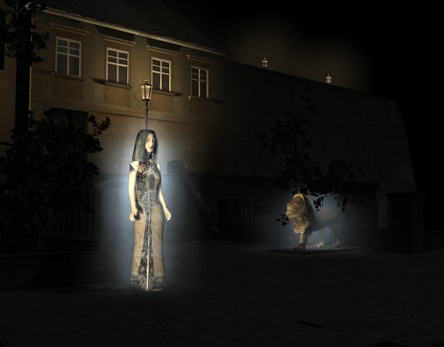
Photographically speaking, I think that you need to raise the light-levels overall throughout the picture. Aside from the streetlamp and the two figures, the picture consists of opaque blackness. There needs to be detail, even if it is dusk. The so-called tonal range of the picture, which you can see using a Histogram tool, should be fairly evenly distributed, and the ethereal glow which accents the two figures (and denotes Magic) is only slightly brighter than the surroundings. (The human eye registers contrast, not absolute brightness levels.)
Compositionally, I would crop the photograph to more-tightly frame the action. There’s a lot of space to the left and right that’s really not doing anything for you. Print off a copy, or use some L-shaped pieces of cardboard or paper, to experiment with different crops.
Get the camera closer to the shot, and make the camera work for you. A long focal-length lens (higher numbers) will act like a zoom-lens and wil make Beast appear closer to Beauty. Experiment with placing the camera above and below the plane of action. The low-resolution “render this window” button at the right side of the 3D window is good for quickly producing experimental shots. Try over-the-shoulder shots.
Finally, think about staging these two characters. Make their eye lines meet. Arrange them so that they don’t exclude the viewer, and once again, experiment. Try to make the staging, the framing, the Cinematography of the shot, tell a story.
May I recommend the book: Digital Cinematography & Directing, by Dan Ablan. (New Rider Publishing.)
P.S: The fact that you are getting good, strong, detailed responses should be taken to mean that this is a very good image with lots of possibilities. Well done!
regardless of the pose, the image is way too dark.
sundialsvc4, Khnum :Thanks for comments
- udated camera, lighting
Hopefully is the image not so dark now, but there are still much work to do.
Finally i’ve completed the image. There are still many faults - primarily on the unicorn.
I think its looking pretty good! I would add more detail in both characters, unless this is for a low poly game. The lighting could be lightened just a tad, but its definetly getting there.
BTW DUOAS I like the contrapposto example, she was quite the looker.  Contrapposto is when all of the body weight is on one leg, which forces the rest of the body to compensate. The hip will tilt so that the side connected to the weightbearing leg is downward, and the otherside will go upward like a seesaw. I think the upper body moves over the weight bearing leg since the line of gravity runs on the inner side of the leg. This is basically flexion of the external ab obliques.
The leg not bearing much body weight is slightly bent. It also appears that its common for the head to appear over the weight supporting leg.
This is just my observations though, I may be wrong. :-?
Can we have a shot closer in to the object and a bit bigger render. These are pretty small and hard to see. They look nice as far as I can tell.
