
3 Likes
Welcome!
This looks nice overall, the main thing I would do different is to give the roof an overhang instead of having it just finish right at the wall’s location. Don’t forget to look at real world photos as a reference.
Apart from this, the model’s final quality will probably be more in the textures than the mesh, so that’s when you should really evaluate your work.
--
I see some floating black lines in multiple spots, are those lines floating edges disconnected from the model? Maybe it would be worth investigating and deleting them if that’s what they are.

Thank you alot, I look at most references photos for details and base shapes but This one was more of a freestyle for a render, but are there any other details you would like to see
1 Like
Apart from the roof borders, it’s also likely there would be a visible foundation at the bottom of the house that looks separate and different from the rest of the wall. This would be especially visible if the ground around the house is not perfectly level. But I would also tell you to rely more on reference images that what I can say in a comment.
The rest of the model is good and will look fine once textured and rendered.

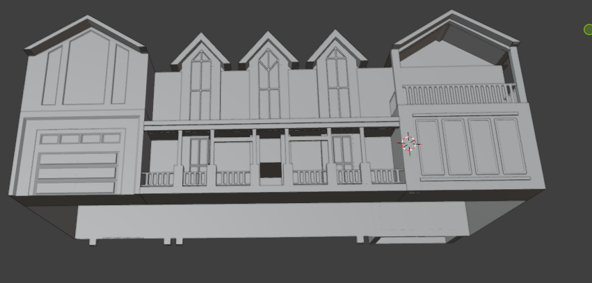

Hey ! This is great , there is already some sense of proportions details and on the overall it looks good.
I think to answer what is missing the question goes down to what you expect as a result ?
You can model something and make some generic choices in terms of details, so it looks good in general. In the meantime, if it’s shown in the distance maybe you’ve added too many details.
Or if it’s shown in close up then maybe some areas won’t be detailed enough…
My advice is to start doing a first pass on textures and materials, if you want the model to look more finished.
Then decide if you just want to model something or go a bit beyond that and put that house in context, starting with a good camera , then work on surroundings !
Then you can start looking more into “story elements” , is the model supposed to be brand new or more aged and a bit destroyed…
It’s from those kind of constraints / creative decisions that we’ll expect more or less things.
This will also help you progress because you’ll have more problems to solve forcing you to go a bit out of your comfort zone.
Anyway, it’s not necessarily something you should do right now, but give it a few though and see if that sounds appropriate right now !
On the overall it’s very promising so keep up the good work !
Have fun !
2 Likes
It is supposed to be newer house, I was just going to do the exterior but maybe ill make it surrounded by either a big plain of grassland, or in a spruce forest. Im not really sure yet as it will be my first serious one.
1 Like

This is better !
The contrast between the white parts and the darker ones might be a bit too extreme.
It’s great to have a clear separation of elements like you did ! However if we consider color values/intensity like a scale, you go from dark tones, to a very dark gray and then you make a high jump to very light one. Therefore those white parts are a bit disconnected. You can add intermediary steps by making parts like beams more on the medium gray side.
Or you can bring those actual 3 value closer either by making the dark parts lighter, or the white one darker…
Obviously this needs trial and errors I might be wrong here 
I tried to darken the stone a little, and the garge is a little light, the 6 beams were changed to the wood,

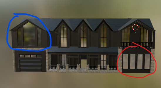
So the blue circle, I’m thinking of changing it to something else, it looks alright I might end up just leaving it. However the Red circle needs something else, it is really bothering me and looks pretty bad. If anyone wants to give a little sketch for the window design or something else entirely thatd be nice, if not I might just do A basic smaller rectanlge with some vertical subdivides and wireframe it
1 Like
Maybe those windows just need to be split into smaller sections? Windows are rarely a single giant glass pane like this.
I think the red circle looks especially weird because the glass is level with the wall (or at least, that’s what it looks like in the screenshot). Real windows tend to be inset into the wall, often with a more detailed and layered frame around them. And do I see a rounded window frame around them? I have never seen that on a real building, windows tend to be very angular and sharp.


Great start! Very interesting to follow the progress.
Depending of which level of detail you’re going for, I think this building could use gutters and downpipes to direct the flow of rainwater. These small things are important for a real building and would help make the model appear more realistic.
1 Like
I would like to add gutters but where would I add them
A fantastic thing about 3D modeling is that you learn about a lot of things you wouldn’t think of otherwise. Now you get to learn about rainwater discharge systems!
I’m far from an expert on the topic, but the point of the gutters and downpipes is to collect rainwater and lead it away from the house. So anywhere the rain would otherwise flow freely from the roof should have a gutter to collect the water, and downpipes from these to lead the water down into a drainage system in the ground. Best thing to do is read up a bit and find reference images of similar roofs designs and see how they handle rainwater.
Good luck!

I will get on the Gutters soon but should I take some windows off. Also What other color changes could I make so that it keeps a modern style but not so black and white.
So the Gutters are not working out to well, its hard to find a way to align them and adding them changes the whole feel. So once I do another house in the future I will go for realism as the goal, but I think for this one I will move one to scenery after I add some windows and doors.