Ok I did this today in only a couple of hours. I’m still not very good so it’s hard for me to complete a scene. After finding a photo to inspire this piece, I got to work and was very impressed with my results. But I want to get better so I’m asking for a professional critique to be done. I am excited to learn what I did wrong and what I missed and how to do better next time. Thanks!
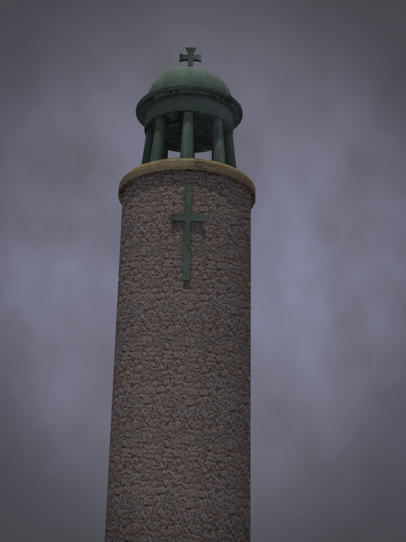
If this was part of a scene or a background prop I’d say the modeling was just fine. The rocky textures may need work, though. It doesn’t look like the kind of stone laying a tower would be build out of (but then you could have worked from a real example and that is exactly how the structure was built, so then I’m wrong!)
As a stand-alone image you may want to consider the angle of the shot to give this bell tower the sense of scale and perspective that we’ve come to expect from bell towers.
Great! Thanks. And yes, I did reference an image. The original tower had a similar structure and was taken from almost the same angle (I thought it was a lighthouse at first, hence the image name). I will apply your critique to my future projects.
Honestly, form a modeling point of view, you’ve done a great job. You’ve captured what the bell tower looks like and that’s awesome. If all you’re doing is showing off the model, mission accomplished.
However, if you’re presenting this image as a piece, I would experiment with making the scene brighter (Yes, I see the clouds. I want to see more of your beautiful work though.) Also see if you can shift focus more onto the the tower. Right now my eyes think their supposed to go to the tower, but they aren’t being pulled towards the tower. Some color correction could help, and maybe add a 3 point lighting system for some kick ass composition.
Hi there,
not really sure - but I think I see some tileing (repeating texture) issues at the base ? - you could try turning/rotating the texture so that the tiles are not parallel to the ground ?!? (not sure if that would make it better)
The second thing is the sharp edges of the tower on both sides - a displacement map could make the edges look rough (or you edit the mesh directly to give it some roughness) …
Not sure if links to Blenderguru are ok?
But this video helps with understanding how to use displacement maps (and other texture stuff …)
http://www.blenderguru.com/videos/the-secrets-of-realistic-texturing/