Dtto. Same opinion here
i agree not a wise idea
Just recompiled and Im not seeing any embossed text.
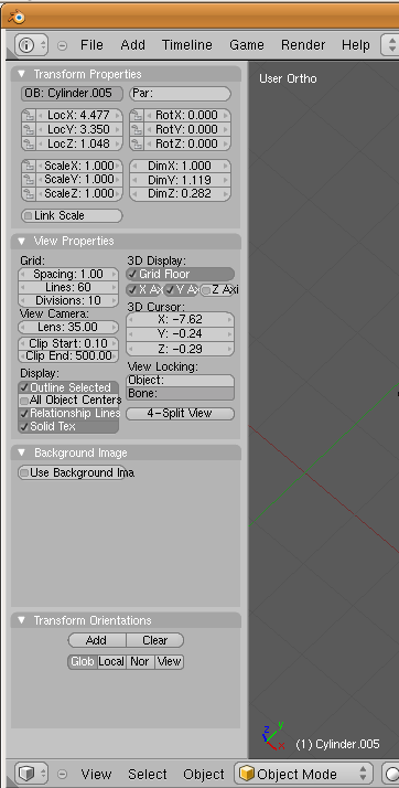
I really do hope that they include a way to make the transform properties box a floating window again. Im not a big fan of it forcing a new window division every time it opens when I just need one little box to display numbers for me.
The work on the new interface has its first commit from Brecht
http://lists.blender.org/pipermail/bf-blender-cvs/2009-March/018461.html
Just recompiled and Im not seeing any embossed text.
That’s good, the embossed text doesn’t look too good from the screen, just keep the text as simple print, as long as people can read it.
Just recompiled and Im not seeing any embossed text.
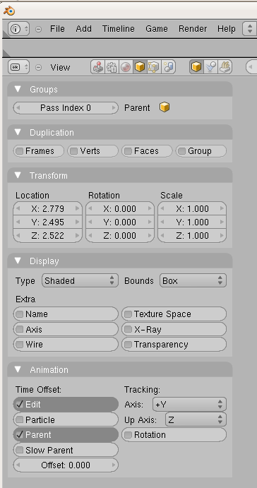
The screenshot you just had was of the Transform properties in the 3d window, my
screenshot was in the Object category in the buttons window.
This is what Im seeing for that panel right now. Maybe its drawing based on system text settings? Or maybe Im somehow using a different version than Mikahl.
I’m not wild about the checkboxes. But your probably could change the font color and font on the embossed letters.
Ah yes, the emboss was part of my theme.
Weird, as the emboss doesn’t show up on 2.48 ( where the theme was made from ).
Maybe you can push anywhere in the button and the checkbox checks itself, even if not on the actual check thing?
I wonder how multi-state buttons will work if there are any?
I like the check boxes. They are a departure from everyone elses UI, which keeps Blender unique. Also, it makes it much easier to tell at a glance what is enabled and what isn’t. I say keep them.
Yea, check boxes are cool, but maybe they will be more readable(less visually intrusive) if they are a bit smaller.
I don’t think using check boxes is a very efficient use of space and I think it adds a little to much visual clutter. Buttons that change color when enabled or disabled work well. They use less space and don’t add a lot of visual clutter.
That being said, the interface is coming together really nicely. I’m glad the transform, rotation, and scale options have a place in the side panel. It’s a little annoying having to mange the floating window in the viewport.
Sorry for quoting myself, but Ive been looking at the panel for a little while now and I think its starting to grow on me. Sure it takes up usable 3d view space, but it also pulls all of the dialogs at once and is easily hidden with the press of a hot key. Im changing from thumbs down to thumbs up!
@ jrs100000
i’m glad you changed your mind. as far as it taking up additional 3d space, it’s not because it’s in a column of buttons that are already there and it’s only taking up vertical space in the column.
tak has a good idea about the check boxes. color indicators, like a green box for ‘on’ and grey for ‘off’ instead of check marks would be an interesting experiment. as far as the graphics of the GUI are concerned, this is all just temporary i believe and only layouts are being committed for now, except of course for the cool new icons from jendrzych.
I wonder what sort of solution jendrzych would come up (nudge, nudge) with regarding the checkbox issue. He’s done such an excellent job with the icon set - it would be logical to extend his design to other parts of the interface.
I dunno, icons have been kind of hit and miss for me… As was the old set, just in different ways. hehe
Oh, good grief,
a box with a tick in it is fine, obvious and readable, far superior to the current crap… and much preferable to arcane icons/ colour coding…
Isn’t there anything better to argue about?
looks great!
i really like the checkboxes…


