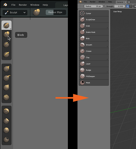
As for the icons, I am really, really sad to see those flat, washed out, high pass filter like icons in recent build.
I mean how could we possibly get from something as beautiful and professional looking as that to something as ugly and open-source looking like this?
Judging by all the mockups and design proposals on developer.blender.org code quest task list, William is an astonishingly competent and talented designer. We should let him do his work for at least a few weeks to give him a chance to put all the visual design together before we start to fuck up his work with our uninformed feedback, so we avoid debacles like this.
EDIT: With this said though, I do find the new Move, Rotate and Scale icons better. The manipulator widget style ones really did not fit ![]()
