About icons… as there’s an alpha option, could that be used for alike flat icon option with HSV ability influencing all icons in one setting - as is now but while all others become transparent/invisible, those on t-bar stay?
OH YEAH … the new flat icons are awesome!
It is so nice to see that after many many months and even years of hard and hidden dev work finally everything comes together. And i’m not only talking about the UI improvements. The speed of development is just crazy at the moment. I’m overwhelmed by all this new goodness.
It doesn’t have to be a toon shader, with just a regular shader the penumbra based on the “fake” smooth surface normal should agree more or less with the penumbra from the shadow maps. The reason that this doesn’t happen seems to be the “look” they are going for.
Either way, the problem remains that the shadow maps work on the actual geometry, which isn’t smooth, so there would still be some faceting where the penumbras (penumbrae?) overlap. To really get rid of the facets, you need to blur and/or bias the shadow maps (which you can do in Eevee), which may need a user setting.
Even Cycles has this faceting problem, it’s a fundamental problem called the “terminator artifact”. Technically, the artifact is the “real” shadow. The simplest solution is to just add geometry until it’s not noticeable anymore.
^ More on the subject:
Terminator Artifact Treatment (@ Thea Render Forums),
based on “It’s Really Not a Rendering Bug, You See…”
from “Mistakes to Make on a Raytracer” (@ geekshavefeelings.com)
Terminator Artifact Treatment
by giannis » Sun Dec 12, 2010 10:16 pm
In the next revision to come, there is an important fix, for a problem known as the “terminator artifact”. For your information, this artifact is seen at the limit of lighting models that have low-poly subdivision (it is more obvious in low-poly meshes - it actually can be seen on arbitrarily detailed meshes on close up). It is very nicely described inthis paper where it is identified as an inherent render artifact rather than a bug! This is why, you probably have seen this in a lot of other renderers as well.
As far as we know, the majority of unbiased renderers suffers from this problem. In biased renderers, it is somewhat easier to fix the problem. A nice (biased) solution used, is to appropriately tweak the material reflectance, compressing it and “pushing out” the jaggy artifacts. If an inherent solution does not exist on the renderer, the typical workaround is to subdivide models to a finer degree (something that costs both memory and speed).
In Thea Render, we didn’t want a solution that could alter/bias material appearance but instead we very carefully compensate for the energy loss due to the terminator artifact dark zones. Our solution produces smooth renders even for very low-poly models with only the basic assumption that the subdivision is uniform (i.e. not abruptly changing). We are actually very happy that we have this working out-of-the-box for all engines. As an example, you can see in the images below some spheres rendered with sun light in current and next (forthcoming) revision (note that the spheres have increasing subdivision detail from left to right).
Current revision showing terminator shading artifacts.
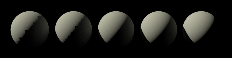
New (forthcoming) revision produces perfect/smooth shading, artifact-free.

With this enhancement, Thea moves ahead and we believe as an established world class renderer, quality-wise. We are proud of making Thea better and we hope that you are proud of being a Thea user and getting artifact-free renders - getting ahead of unbiased competition.
Corona dev. also implemented a solution in Corona 1.6 Release Candidate (2017-04-07)
as “The terminator fix”.
Example from Corona forum thread: General CG discussion: CAD / NURBS surfaces vs clean topology


… and another mention on Corona forums: Re: Incorrect shading on imported geometry
Thank you all
Updating icons is simply running a single command and committing. It hardly takes developer time.
The process is automated, including edits to CMakeLists.txt.
3 Likes
They’re using git, so there’s no need for swapping anything by devs. Designers pullrequests their changes and devs just click ‘accept’.
This is the github workflow, we’re using git with Phabricator which doesn’t work this way (see phabricator /arcanist docs if you’re interested in the details).
Currently the icon blend file is committed directly to subversion (which beats git for binary file handling), the rest of the generation is automated.
Hi, I know it’s a bit off topic from the current conversation, but here’s one of my concerns related to the new tool system based manipulators:
One problem with widget manipulators in 2.79 was that when you were rotating with manipulator, you still often had to resort to reaching for numpad to type precise rotation, because it happens very frequently that you want to rotate something exactly 90 or 180 degrees.
You can use snap for that, but a big problem with snap in Blender is that it groups incremental move snap with incremental rotation snap. Let’s say you are working on a precise scene so you use vertex snap very often. Every time you want to rotate something precisely, you have to first switch snapping mode to increment, then activate it while rotating, and once you finish rotation, you have to switch snapping mode back from increment to vertex. This is quite frustrating experience.
So my suggestion would be to have hard-coded snap for rotation widget, which is unrelated to the state of move tool snapping mode, so that when you hold down whatever is assigned as a snap key, in rotation mode, it will always snap to angular increments regardless of if the active snap mode is increment or not. It would help a lot with the workflow.
Thanks
As for the icons, I am really, really sad to see those flat, washed out, high pass filter like icons in recent build.
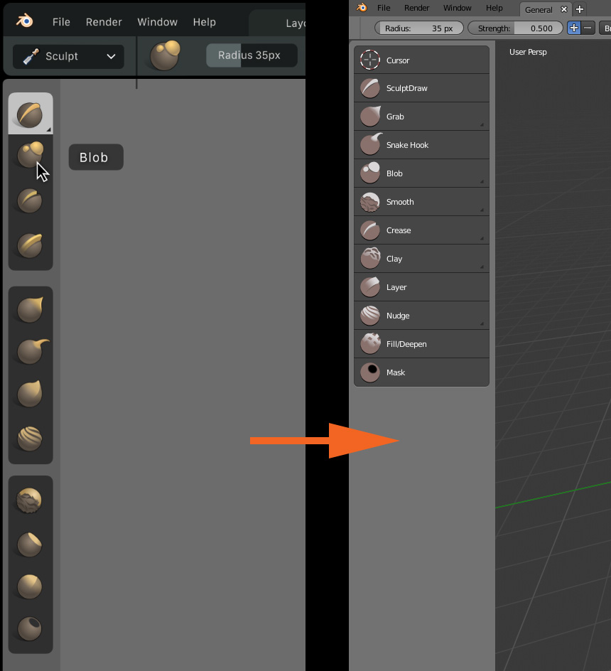
I mean how could we possibly get from something as beautiful and professional looking as that to something as ugly and open-source looking like this?
Judging by all the mockups and design proposals on developer.blender.org code quest task list, William is an astonishingly competent and talented designer. We should let him do his work for at least a few weeks to give him a chance to put all the visual design together before we start to fuck up his work with our uninformed feedback, so we avoid debacles like this.
EDIT: With this said though, I do find the new Move, Rotate and Scale icons better. The manipulator widget style ones really did not fit ![]()
5 Likes
Aggreed. I liked the “old new icons” much much better.
1 Like
It’s just the flat icons set, you will be able to choose the ones you prefer I think.
That’s a very unfortunate family of colors, even for the iterated version.I wouldn’t mind neutral colors, but those are in the family of repulsive colors - like the color they started to put on cigarette packs.
Would be nice to not have to associate sculpting with … chocolate.
1 Like
sadly thou, Mud is already taken. 
Just hold CTRL
I don’t remember nobody asking for this type of icons to “fuck up” something.
The sculpt icons must had only few basic rules
- Easy to read
- Easy to generate new icons
All people in industry uses same icons style because it meets the requiriments

We have a lot of brushes really similar and it’s necessary that you can differenciate all brushes, with simple icons is not possible because it lack information.
5 Likes
Have you actually read my entire post? 
Try to switch snap mode to vertex instead of increment, and then try to hold down Ctrl while rotating. You will see that angle snap no longer works. So if you are working with vertex snapping, you actually have to switch to increment snapping mode every single time you want to rotate something with snapping, and then switch back from increment snapping to vertex snapping mode to carry on with your vertex snapped modeling.
2 Likes
Well, just take a look at your example and at the picture in my post. You can see that the older concept with plastic looking icons is much close to what’s on your example than the new flat look.
I think we are getting bogged down with the style of the icons…
The real task is to make things work better.
We don’t want William to spend all his code quest time redoing icons and never satisfy anyone in the process.
Plenty of other stuff to attend to.
(Incidentally I vote for the previous set…) 
2 Likes
Yes, but they still generated with 2D program and nobody will keep the style. And those icons are also hard to read.
I though that you was working with UI team to give feedback.